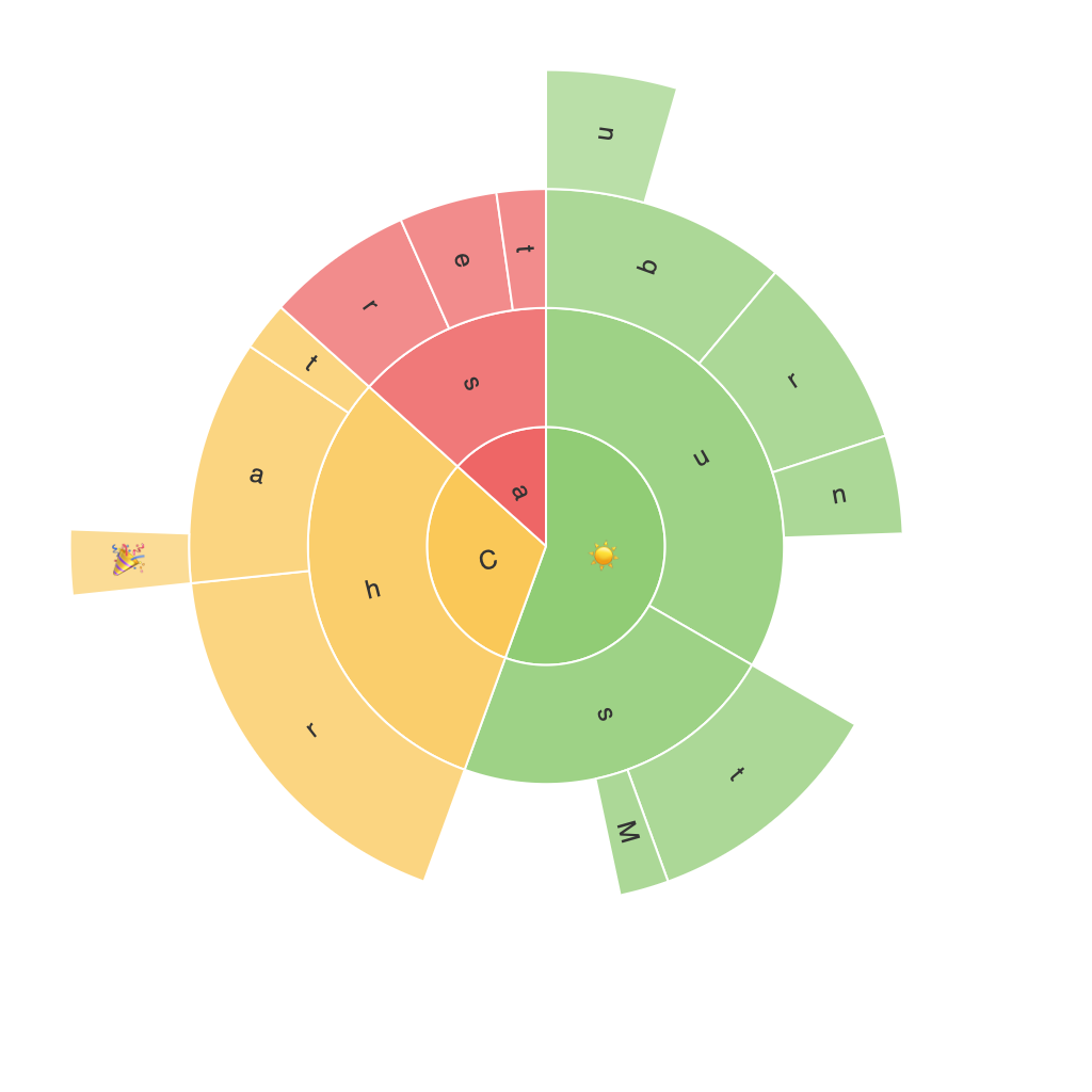
Exploring the Visual Potential of Sunburst Charts: A Comprehensive Guide to Data Visualization and Analysis
Sunburst charts are an often underappreciated but incredibly powerful tool in the data visualization toolbox. With their intricate radial structure and layered design, these charts offer a unique way to present hierarchical data that can be both visually appealing and informative. In this guide, we delve into the world of data visualization and explore how to leverage the power of sunburst charts to uncover insights and communicate them effectively.
Understanding Sunburst Charts
Before we dive into how to create and interpret sunburst charts, it’s important to understand the basics. A sunburst chart, also known as a sun chart, multi-level pie chart, or hierarchical ring chart, is a type of chart that represents hierarchical data by using concentric circles. Each circle represents a level in the hierarchy, and the child nodes are represented as subtending arcs.
Key Features and Advantages
– **Hierarchical Data Presentation**: One of the main advantages of sunburst charts is their ability to effectively represent hierarchical data in a way that’s easy to comprehend. The radial layout allows for the display of multiple levels of data within a single chart.
– **Color Gradient**: Sunburst charts often use color gradients to distinguish between different levels of hierarchy or to represent different data categories, which can make the chart more visually engaging and easier to interpret.
– **Space Efficient**: Compared to traditional tree diagrams or pie charts, sunburst charts can display a significant amount of information in a compact space, making them useful for visualizing complex datasets on limited display areas, such as dashboards or infographics.
Using Tools for Creation
Several data visualization tools provide easy-to-use solutions for creating sunburst charts. Tools such as Tableau, Python’s matplotlib and seaborn libraries (with the pygal package often used specifically for sunburst charts), or even R with the circlize library, offer a range of customizable options to create your own sunburst chart.
Creating Your Chart
1. **Data Preparation**: Start by preparing your hierarchical data. This should include at least a parent node, child nodes, and optionally, categories or subcategories at each level.
2. **Choosing the Tool**: Select a suitable data visualization tool or software based on your project’s requirements. For example, Tableau offers a drag-and-drop user interface, while Python libraries like matplotlib and seaborn provide more flexibility for customization in dynamic environments.
3. **Mapping Data to Chart**: In your chosen tool, map your data to the various components of the sunburst chart. This involves defining which data represents the central node, which represents the child nodes, and optionally, assigning colors to differentiate levels or categories.
4. **Customization**: Tailor your chart’s appearance according to your needs. This can include adding labels, adjusting color schemes, setting text and size, and applying effects like gradient colors or 3D appearances for a more professional presentation.
5. **Analysis and Reporting**: Once your sunburst chart is created, spend time analyzing the data it presents. Look for patterns, correlations, or anomalies that the radial layout might reveal more clearly than traditional charts. This analysis can help inform decision-making processes, highlight key trends, or assist in explaining complex hierarchical relationships to stakeholders.
6. **Presentation**: Finally, present your sunburst chart using the chosen tool’s share or export functionality. Embed it into reports, presentations, or dashboards to communicate insights effectively to your intended audience.
Sunburst charts should be employed strategically, considering the nature of your data and the audience’s level of expertise. These charts are particularly beneficial when you need to visually explore and communicate hierarchical or multilevel data, offering a compact, yet insightful, view that is both aesthetically pleasing and effective in promoting data-driven decision-making.
