Exploring the Visual Potential of Sunburst Charts: A Comprehensive Guide to Data Presentation and Analysis
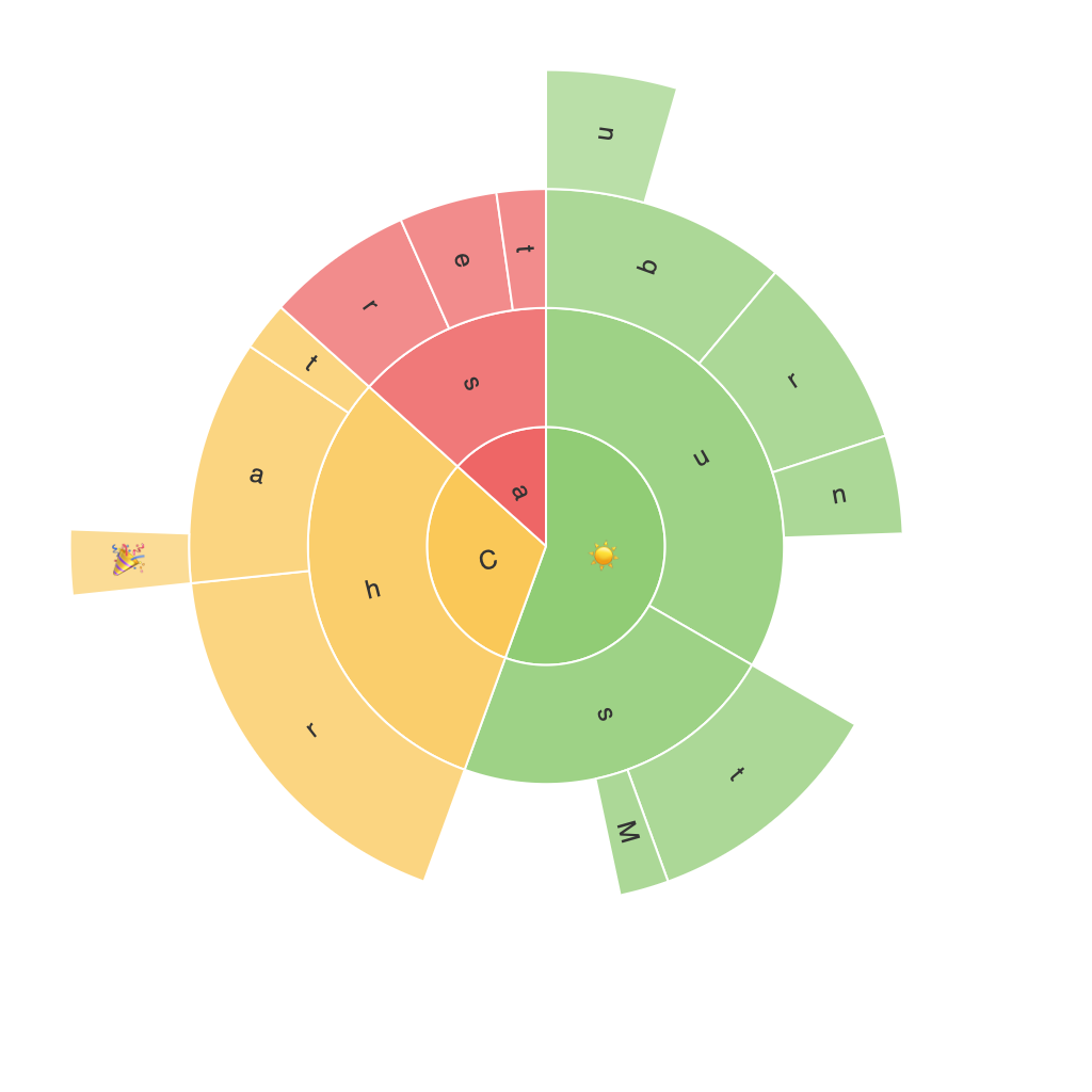
In the vast landscape of data visualization, sunburst charts stand as an intriguing and sophisticated graphical representation, offering a unique approach to the traditional pie chart. Sunburst charts, also known as sun charts, star charts, or radial treemaps, provide a multi-level hierarchical view allowing for the exploration of complex data sets in a compact and visually engaging format. This article serves as a comprehensive guide to understanding the visual potential of sunburst charts, their applications in various fields, their benefits, limitations, and effective usage tips.
### Understanding Sunburst Charts
The fundamental principle of a sunburst chart is its radial structure, reminiscent of a sun, with concentric rings depicting hierarchical levels. Each sector starts at the center, with the innermost circle representing the highest level of the hierarchy. As the radii expand outward, sectors representing lower levels of the hierarchy are inserted, creating a layered, sun-like structure. Each spoke originates from the center, representing categories or attributes of data. This design enables the quick comparison of size, proportions, and relationships among categories within the same hierarchy.
### Applications of Sunburst Charts
Sunburst charts find their application in various fields, particularly in where hierarchical structures need to be effectively communicated within a small space. Some common scenarios include:
– **Business Intelligence**: For visualizing organizational structures, product hierarchies, or breakdowns of revenue streams.
– **Economics and Finance**: To depict market shares, sales figures broken down by various categories, or geographical distributions of investments.
– **Data Analysis**: Useful in visualizing data with multiple categories and subcategories, such as website navigation paths or product categories in e-commerce.
– **Sociology**: In representing data related to social structures, family trees, or community hierarchies.
### Benefits of Sunburst Charts
1. **Hierarchical Structure Visualization**: Sunburst charts excel at showing hierarchical data in a compact format, making it easier to understand the levels and proportions within a hierarchy.
2. **Comparison Ability**: It’s straightforward to compare sizes of different categories over multiple levels without being cluttered.
3. **Compactness**: The design allows for the visualization of large datasets in a compact form, making it suitable for presentations or dashboards.
4. **Interactive Engagement**: With the advent of web-based and interactive versions, users can hover over segments for detailed information, enhancing the user experience.
### Limitations of Sunburst Charts
– **Complexity and Clarity**: Sunburst charts can become confusing if the hierarchy is too deep or if there are too many categories at each level.
– **Orientation**: It can be challenging to convey direction, particularly in multi-level segments, though this can be mitigated with careful design conventions.
– **Accuracy in Representation**: The human visual system might struggle to accurately estimate the size differences between sectors, especially at higher levels of the hierarchy.
### Effective Usage Tips
1. **Keep it Simple and Limited**: Limit the hierarchy depth and the number of categories to keep the chart clear and comprehensible.
2. **Utilize Colors and Labels Wisely**: Employ distinct colors for each hierarchy level and use labels sparingly, focusing on the outermost rings for clarity.
3. **Consider Interactivity**: In digital formats, leverage interactivity features to allow users to explore data more deeply, such as tooltips, clickable segments, or zoomable charts.
4. **Focus on Key Information**: Emphasize the most relevant data by prioritizing information near the center or using larger segments for important values.
### Conclusion
Sunburst charts offer a visually appealing and compact way to present hierarchical data, providing insights into complex information through an intuitive and aesthetically pleasing format. Whether it’s utilized in business contexts, educational materials, or exploratory data analysis, the flexibility and clarity of sunburst charts make them an invaluable tool in the data visualization arsenal. By following the guidelines and tips provided, users can effectively harness the visual potential of sunburst charts, enhancing comprehension and engagement with the data presented.
