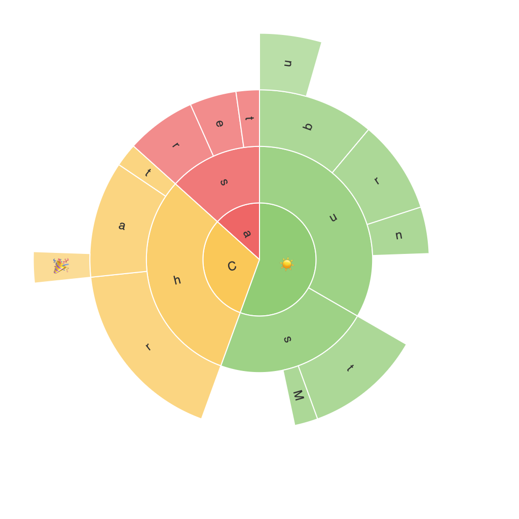
Title: Exploring the Visual Impact: Unveiling the Insights with Sunburst Charts
In the vast landscape of data visualization, sunburst charts emerge as a powerful tool for revealing intricate details in hierarchical data with elegance and clarity. These charts, with their unique structure and engaging visual appeal, offer insights that are difficult to uncover using traditional tables or linear graphs. This article will delve into the world of sunburst charts, uncovering their capabilities and exploring the insights they offer, particularly in the realm of hierarchical data analysis.
### Introduction to Sunburst Charts
Sunburst charts, also known as radial treemaps, are a variant of treemaps that display hierarchical data using concentric circles, each of which radiates out from the center. The central circle represents the root node of the hierarchy, and each subsequent circle breaks down to represent child nodes, visually depicting the structure of the data. This layout makes it straightforward to represent, compare, and analyze data at multiple levels of detail.
### Key Features and Benefits
#### 1. **Hierarchical Visualization**: One of the primary benefits of sunburst charts is their ability to represent hierarchical data very intuitively. The concentric circle structure allows for easy navigation and comparison across levels of the hierarchy, making it simple to grasp complex structures at a glance.
#### 2. **Space Efficiency**: Sunburst charts are particularly space-efficient when dealing with data with multiple levels of hierarchy. They fit vast amounts of information in a relatively compact design, which is especially advantageous in space-constrained environments.
#### 3. **Ease of Recognition**: The use of radiating circles makes it easier for the human eye to perceive the relationships within the data, facilitating quicker decision-making. Colours and size variations help in identifying patterns or anomalies in the data, adding layers to the depth of understanding.
#### 4. **Customization Flexibility**: Sunburst charts offer a high degree of customization. Custom patterns, colors, and interactions can be applied to enhance user engagement and guide the focus towards specific areas of the data.
### Applications and Industries
Sunburst charts find extensive application across various industries:
– **Business Intelligence**: They are used to analyze company structures, product categories, sales data by region and product categories, and market share analysis.
– **Website Analytics**: Sunburst charts can reveal user navigation patterns on websites, showing which sections are most visited and the paths taken in exploring different elements of the site.
– **Healthcare**: In epidemiology, sunburst charts can track the spread of diseases and their characteristics, such as transmission rates or risk factors, within populations.
– **Tech and Software**: To visualize the structure of software systems, dependencies, or the usage patterns on platforms and applications.
### Case Study
In a recent project analyzing the content hierarchy of a popular online encyclopedia, a sunburst chart was used to display the structure of main categories, subcategories, and individual articles. The size of each circle represented the popularity of the content (measured by page views or usage frequency), making it easy to identify the most crucial sections of the site.
### Conclusion
Sunburst charts are a sophisticated yet simple tool for revealing insights in hierarchical data. Their unique layout not only captures complex hierarchical structures but also enables easy recognition of trends, patterns, and anomalies. Whether exploring business strategies, website navigation, or understanding the dynamics of large datasets, sunburst charts offer a powerful means to visualize and comprehend information, making them an invaluable resource in the data-driven world.
