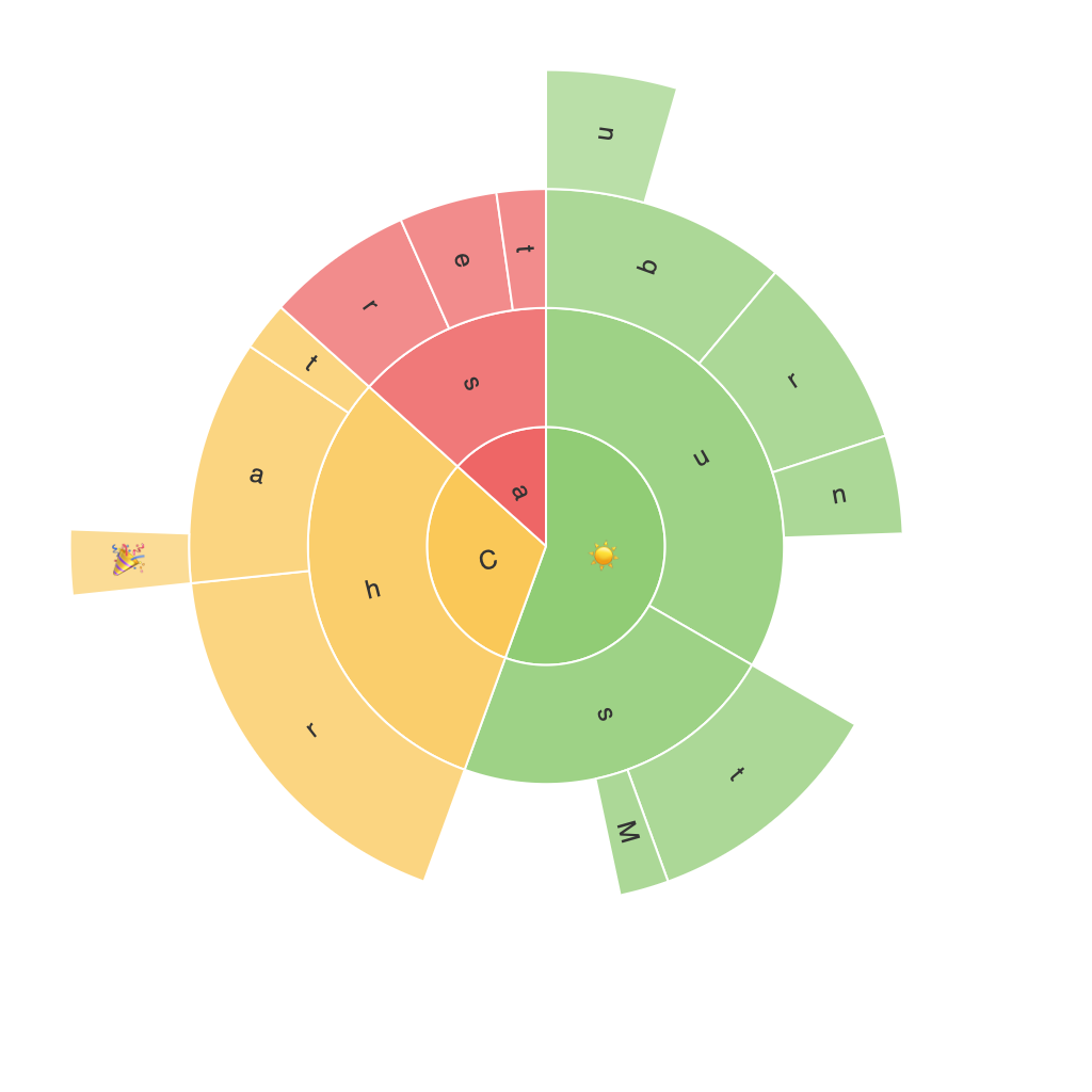
### Exploring the Visual Impact: A Comprehensive Guide to Understanding and Utilizing Sunburst Charts for Data Visualization
In today’s data-driven world, effective data visualization is not just about presenting numbers and facts. It’s about transforming those numbers into engaging, understandable, and insightful narratives that capture the essence of complex datasets. Amidst the plethora of visualization formats available today, one relatively underutilized but incredibly powerful tool that deserves a closer look is the sunburst chart. Sunburst charts, also known as Ring charts, Rose charts, or Coxcomb charts, are radial tree diagrams that help visualize hierarchical data and represent different dimensions within datasets. In this guide, we delve into the world of sunburst charts, exploring their unique features, applications, and steps to implement them efficiently for data visualization.
### What are Sunburst Charts?
Sunburst charts are a type of hierarchical data visualization where the different dimensions of the data are represented as concentric rings, each ring denoting a level in the hierarchical structure. The most significant and deepest levels are typically positioned at the outer most circles, while lesser levels move inwards. Each sector of the rings represents a data point, with attributes and hierarchies contributing to the overall visual appearance of the diagram. This allows the viewer to understand both the depth and breadth of the data simultaneously.
### Key Features of Sunburst Charts
1. **Hierarchical Structure**: Sunburst charts excel at displaying hierarchical data, where each segment is a parent to one or more child segments, creating an easy-to-follow structure.
2. **Color Coding**: Colors can be used to distinguish between various categories, enhancing visual differentiation and helping in quick data analysis.
3. **Flexible Data Representation**: They can represent data at multiple levels, making them ideal for datasets with high dimensions and hierarchical structures.
4. **Comparison and Trends**: By comparing segments in the inner and outer rings, trends and comparisons across different levels can be easily observed.
### Applications of Sunburst Charts
1. **Financial Audits**: For showcasing budget allocations and spending patterns, especially within public sector organizations or large corporations with multiple departments and funds.
2. **E-commerce**: Retail websites can use sunburst charts to display product categories and subcategories, or customer behavior (e.g., navigation paths across different sections of the website).
3. **Healthcare**: Hospitals can visualize patient flow within departments or across different stages of care, helping identify bottlenecks or areas for improvement.
4. **Education**: Universities can use sunburst charts to represent course offerings at different levels, from broad bachelor’s degrees to specific modules.
### Implementing Sunburst Charts
To effectively implement a sunburst chart, follow these steps:
1. **Data Preparation**: Ensure your data is in a hierarchical format, typically provided as nested dictionaries or arrays to outline the structure of the chart.
2. **Choosing the Right Tool**: Tools like Tableau, PowerBI, Python libraries such as Plotly or Matplotlib, or JavaScript libraries like D3.js can be used to create sunburst charts. Choose a tool that best suits your proficiency level and project requirements.
3. **Design Customization**: Customize the chart’s visual aspects, such as color schemes, sizes of segments, and the ability to explode certain segments for emphasis.
4. **Interactivity**: Enable user interactions where possible, such as hovering over segments for more information, expanding or collapsing sections for deeper exploration, or linking to related data points.
5. **Accessibility**: Ensure your chart is accessible to visually impaired users by providing meaningful text descriptions alongside the visual elements.
### Conclusion
Sunburst charts offer a unique and insightful way to visualize complex data, especially when hierarchical structures are involved. Their ability to display multiple dimensions of data makes them a valuable tool for decision-makers, from financial auditors to education administrators and beyond. By following the guide, you can not only create compelling visualizations but also ensure they effectively communicate information to your audience, maximizing data impact and understanding.
