### Exploring the Visual Impact: A Comprehensive Guide to Creating and Interpreting Sunburst Charts
In the vast landscape of data visualization, pie charts, treemaps, and stacked bar charts have been the go-to formats for representing hierarchical data. However, with the advent of data-driven processes, the complexity of data has drastically increased, pushing the need for more visually sophisticated charts. Enter the sunburst chart – an intriguing and visually captivating way to represent hierarchical structures. This article aims to guide you through the creation and interpretation of sunburst charts, emphasizing their role and utility in visual storytelling.
#### **Understanding the Visual Anatomy of Sunburst Charts**
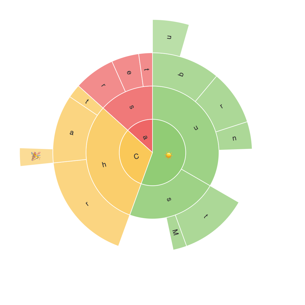
Sunburst charts are a radial version of a treemap, where each level of the hierarchy is represented as a ring. Each ring denotes an increasing level from the outermost (root level) to the innermost (leaf level). This structure allows for a clear visualization of a hierarchy’s division, overlap, and relationship, making it ideal for datasets with multiple levels of classification.
### **Creating Sunburst Charts**
#### **Tools Consideration**
Creating high-quality sunburst charts is made easier through a variety of tools. Options include Datawrapper, Microsoft Excel, Tableau, Processing, and even Python libraries like Plotly and Matplotlib.
#### **Designing Elements**
1. **Hierarchy Levels**: Define your hierarchy by assigning categories and values. The outer rings represent the top-level categories, while subsequent rings represent subcategories.
2. **Color Coding**: Use distinct colors for different categories to enhance readability and visual differentiation.
3. **Labeling**: Ensure that labels for categories are correctly placed within their respective segments to avoid clutter. Consider using hover texts to explain dynamic labels or complex data points if space is limited.
4. **Interactive Elements**: For digital platforms like Tableau or Plotly, interactive features such as zooming, clickable segments, and tooltips can be implemented to engage users and allow for in-depth exploration of the data.
### **Interpreting Sunburst Charts**
#### **Hierarchy Visualization**
One of the key aspects of a sunburst chart is its ability to visually represent the depth of a hierarchy. The radial layout naturally guides the viewer through the levels, providing a clear path from the top-level categories to the underlying details.
#### **Comparative Analysis**
Sunburst charts excel in showing how parts relate to their parent categories. By comparing the size of segments within each ring, it’s easy to understand the contribution of lower-level categories to their parent categories, revealing insights into how the data is composed.
#### **Identifying Trends and Relationships**
The layout itself offers a unique perspective on how different hierarchies are connected and distributed. Trends in the data, such as which categories dominate within a higher-level structure, can be quickly identified through the size and position of segments.
### **Best Practices in Deployment**
– **Focus on Clarity**: Ensure that your sunburst chart is not overly complicated. Limit the number of branches per node to maintain clarity and readability.
– **Use of Legend**: Where necessary, utilize a legend to explain complex elements that may require additional context, especially when colors or specific symbols are used consistently.
– **Consistency and Aesthetics**: Maintain a consistent color scheme for categories that are related, and leverage visual design principles to enhance the presentation and readability of the chart.
### **Conclusion**
Sunburst charts remain a potent tool in the data visualization arsenal, offering a robust method for comprehensively understanding hierarchical data structures. Whether you’re presenting a business’s organizational structure, classifying items in an e-commerce catalog, or mapping out geographic data, sunburst charts excel in making complex data comprehensible with a dynamic visual impact. By considering the unique visual properties of sunburst charts and applying best practices in their creation and interpretation, you can effectively leverage these charts to communicate insights and drive data-driven decisions.
