Title: Decoding the Visual Echoes of Sunburst Charts: Unraveling Their Structure, Scope, and Singular Benefits in Data Visualization
Sunburst charts emerge from the creative intersection of circular diagrams and hierarchical data, making themselves a fascinating tool in the vast universe of data visualization. At once a beautiful blend of aesthetics and functionality, these charts take a unique, layered form that allows for the effective display of categorical and hierarchical data. In this article, we aim to delve into the depths of the Sunburst chart, exploring its intricate structure, expansive usage, and invaluable advantages.
### Understanding the Structure of Sunburst Charts
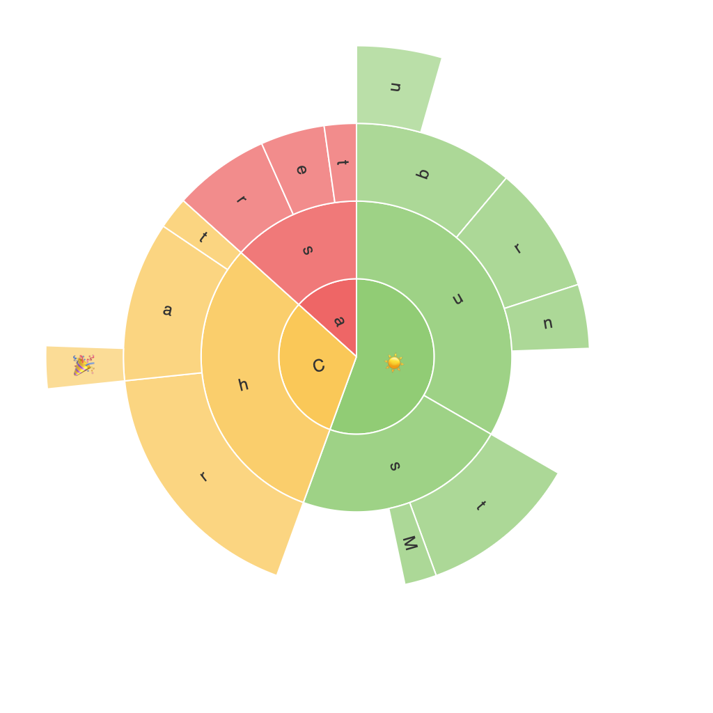
Sunburst charts are designed to show multiple levels of data partitioning, with the central sector, often referred to as the root node, expanding to sub-sectors representing various child nodes. Each sector, from root to sub-sectors, can further branch out into smaller sectors and so on, depending on the depth of the hierarchical data. The outermost segments represent the lowest level of detail or the leaf nodes, providing a clear, hierarchical breakdown. The chart’s concentric radii and varying radial sizes can visually represent the importance of each node or category within the hierarchy.
### Applications and Usage in Data Visualization
Sunburst charts find their prime utility in situations where data has multiple levels of classification. Industries such as marketing analytics, finance, and telecommunications frequently leverage this chart type for understanding complex hierarchical data structures, whether demographic breakdowns, product categories, or customer segments. Their visual representation aids in quickly identifying proportions and relationships between different data categories, making it particularly favored for insights-driven decision-making processes.
### Advantages of Using Sunburst Charts
1. **Visual Hierarchy Clarity**: By breaking down data into layers, Sunburst charts offer a clear sense of the hierarchical structure. This feature makes it easier for viewers to understand the organization of data and the relationships between different categories.
2. **Comparison at Multiple Levels**: Across different layers, Sunburst charts facilitate easy comparison of various categories both by size and by the frequency of appearance. This is particularly useful when analyzing data across multiple levels of a hierarchy.
3. **Space Efficiency**: Sunburst charts can display a vast amount of hierarchical data using a relatively small space, making them a valuable tool for dashboards and other interfaces where space is limited.
4. **Improved Data Insight**: The visual nature of this chart type helps in intuitively grasping complex data relationships, making it beneficial for presentations and reports.
### Conclusion
Exploration of Sunburst Charts unveils a rich tapestry of visual depth and information density. Their structured layout, effective for hierarchical data visualization, empowers data analysts and decision-makers to navigate through complex datasets seamlessly. By offering detailed, comparative insights, these charts are not just graphical elements but powerful tools in the data visualization arsenal, offering clarity, efficiency, and insight into multi-level data structures. Incorporating Sunburst charts in your data visualization toolkit can considerably enhance your ability to communicate complex information simply and visibly.
