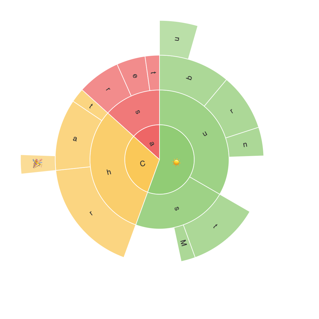
Exploring the Visual Depth of Sunburst Charts: An Effective Tool for Data Visualization and Analysis
Sunburst charts represent a unique approach to visualizing hierarchical data, with its layout and structure designed to help viewers quickly grasp complex relationships. This article aims to delve deep into the capabilities of these sophisticated data visualization tools and discuss how they can amplify the analytical process in numerous fields, such as business, finance, marketing, and data science.
Introduction to Sunburst Charts: A Visual Perspective
Sunburst charts, also known as sun charts or multilevel ring charts, depict hierarchical data through concentric rings radiating from a central point. Each level of the hierarchy is shown as a ring with segments (or slices) representing the proportion of the whole. The outer rings typically represent the higher-level categories, followed by lower-level categories in subsequent rings.
The visual depth of sunburst charts allows data to be layered and dissected into meaningful components, making it an excellent tool for analyzing multilevel data. By visually representing hierarchical structures, these charts facilitate easier understanding of the relationships between different parts of the data and the contribution of each subset to the entire dataset.
Benefits of Sunburst Charts for Data Analysis
Advantages of using sunburst charts in data analysis extend beyond mere visualization. These charts provide a multi-level view, helping analysts understand correlations between different data subsets. They are particularly beneficial when dealing with large structures and intricate hierarchical data, such as organization structures, product categories, or categories in a breakdown of expenditures.
Sunburst charts enable quick comparisons of the magnitude of elements, with their size directly reflecting the quantity or percentage they represent in the dataset. The radial layout facilitates the comparison of proportions within multiple dimensions, making it easier to detect patterns and trends across the different levels of hierarchy.
Incorporating color, labels, and different shapes (like circles or polygons) can further enhance the readability and engagement of sunburst charts, allowing for even more nuanced insights to be derived from the data.
Comparison with Other Visualization Techniques
When compared to other data visualization methods, such as treemaps or pie charts, sunburst charts offer a distinct advantage in visualizing hierarchical data. Unlike pie charts, which are limited in their comparative effectiveness as the number of categories increases, and treemaps which can become cluttered with many categories, sunburst charts maintain a clean and organized structure regardless of the data’s level of hierarchy.
Moreover, sunburst charts provide a more detailed and granular analysis compared to tree maps. They also offer advantages over traditional tables, as they can convey more information in a visually appealing and easily digestible format.
Implementing Sunburst Charts in Real-World Scenarios
Sunburst charts find application in various industries and situations:
1. **Business Analytics:** Sunburst charts can be used to analyze sales data across multiple categories, subcategories, and their subsubcategories. This helps businesses understand sales patterns, identify best-selling items, and make strategic decisions based on the hierarchy of product categories.
2. **Organizational Structure Visualization:** Enterprises can benefit from creating a sunburst chart to illustrate the hierarchical structure, showing relationships between the CEO, department heads, and individual employees. This aids in comprehending the organizational hierarchy at a glance.
3. **Financial Analysis:** In finance, sunburst charts assist in visualizing breakdowns of capital allocation across various investments, risk levels, or categories such as stocks, bonds, and real estate.
4. **Marketing Analysis:** Sunburst charts are useful for visualizing a marketing funnel, displaying how consumers progress through different stages – awareness, interest, consideration, and purchase – to gauge the effectiveness of marketing campaigns.
Conclusion
In conclusion, sunburst charts are a powerful tool in the data visualization arsenal, providing a unique approach to organizing and analyzing hierarchical data. They excel in showing complex relationships in a clear and engaging manner, which is particularly useful for decision-makers needing to digest large datasets efficiently and make informed decisions. With their versatility and scalability, sunburst charts are a valuable asset for businesses and organizations seeking to leverage data-driven insights for strategic advantage.
