Exploring the Visual Depth of Sunburst Charts: A Guide to Enhancing Data Interpretation and Presentation
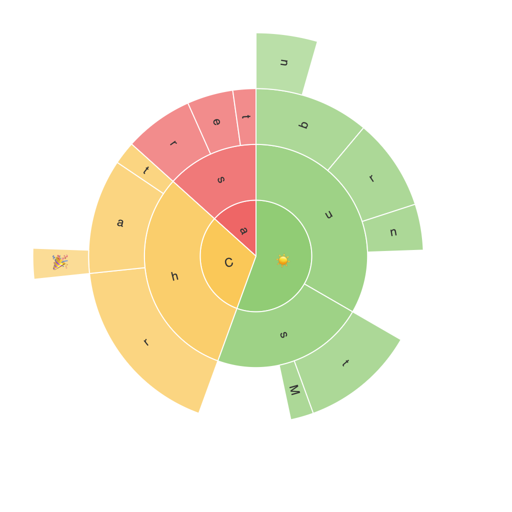
Sunburst charts, an exceptional type of layered pie chart, offer a unique and visually stimulating way to represent hierarchical data. By exploring the intricacies of sunburst charts, we can gain deeper insights into complex datasets and create compelling presentations that enhance our understanding of the underlying data points.
**Understanding Sunburst Charts**
Sunburst charts display hierarchical data in concentric circles, with the central circle representing the root node, and radiating segments depicting the subcategories or child nodes. This visualization makes it straightforward to perceive relationships between different levels of the hierarchy. The chart’s layered structure allows users to navigate through the data, exploring the relationships between various categories.
**Improving Data Interpretation**
Sunburst charts excel at highlighting the relative importance and distribution of data across various levels and categories. Each segment’s size reflects the quantity or importance of the corresponding data point within the hierarchy. Moreover, by arranging the segments in a distinct and logical order using a method such as “leaves,” users can easily identify patterns and trends within the data.
**Enhancing Presentation**
To further enhance the effectiveness of sunburst charts for data presentation, consider the following tips:
1. **Color Usage**: Choose colors that enhance readability and intuitively represent different levels of the hierarchy. Consistent color schemes for similar nodes can aid in identifying patterns and relationships more clearly.
2. **Labeling**: Opt for clear and concise labels, preferably adjacent to the segments. When dealing with a large number of categories, consider the use of tooltips that display additional information upon hovering over a segment.
3. **Interactive Elements**: Implement user-interactivity to help users explore the chart in more depth. Features such as zooming, filtering, and highlighting specific segments can facilitate a more engaging and insightful user experience.
4. **Simplicity**: Avoid cluttering the chart with too many data points or subcategories. Striking a balance ensures that the chart is not overwhelming and is easy to navigate.
5. **Consistency**: Use consistent chart styles across presentations to maintain brand identity and for ease of recognition in different contexts.
**Examples and Applications**
Sunburst charts are widely used in various domains, including organizational structures, financial data analysis, and marketing campaigns. For instance, a company might use a sunburst chart to show the breakdown of sales by product category, subcategory, and geographic region, visually emphasizing the market performance at different levels of the hierarchy.
**Conclusion**
Sunburst charts offer a powerful tool for visualizing complex hierarchical data, providing a clear and engaging way to explore relationships, proportions, and patterns. By carefully considering color schemes, labeling, interactivity, and simplicity, we can enhance the effectiveness of sunburst charts, leading to more insightful data interpretation and impactful presentations.
