Exploring the Visual Depth of Sunburst Charts: A Comprehensive Guide to Enhancing Data Interpretation
Sunburst charts, a visually rich representation of hierarchical data, are gaining popularity due to their intricate and detailed presentation of information. These charts offer a unique way to display multiple levels of data, making it ideal for presenting complex information efficiently. Whether you are dealing with financial breakdowns, content categorizations, or organization structures, sunburst charts can offer a wealth of insights that are hard to find in plain tabular or bar-chart formats. This comprehensive guide dives into the depths of using and enhancing sunburst charts to improve the interpretation of data.
### Understanding the Structure of Sunburst Charts
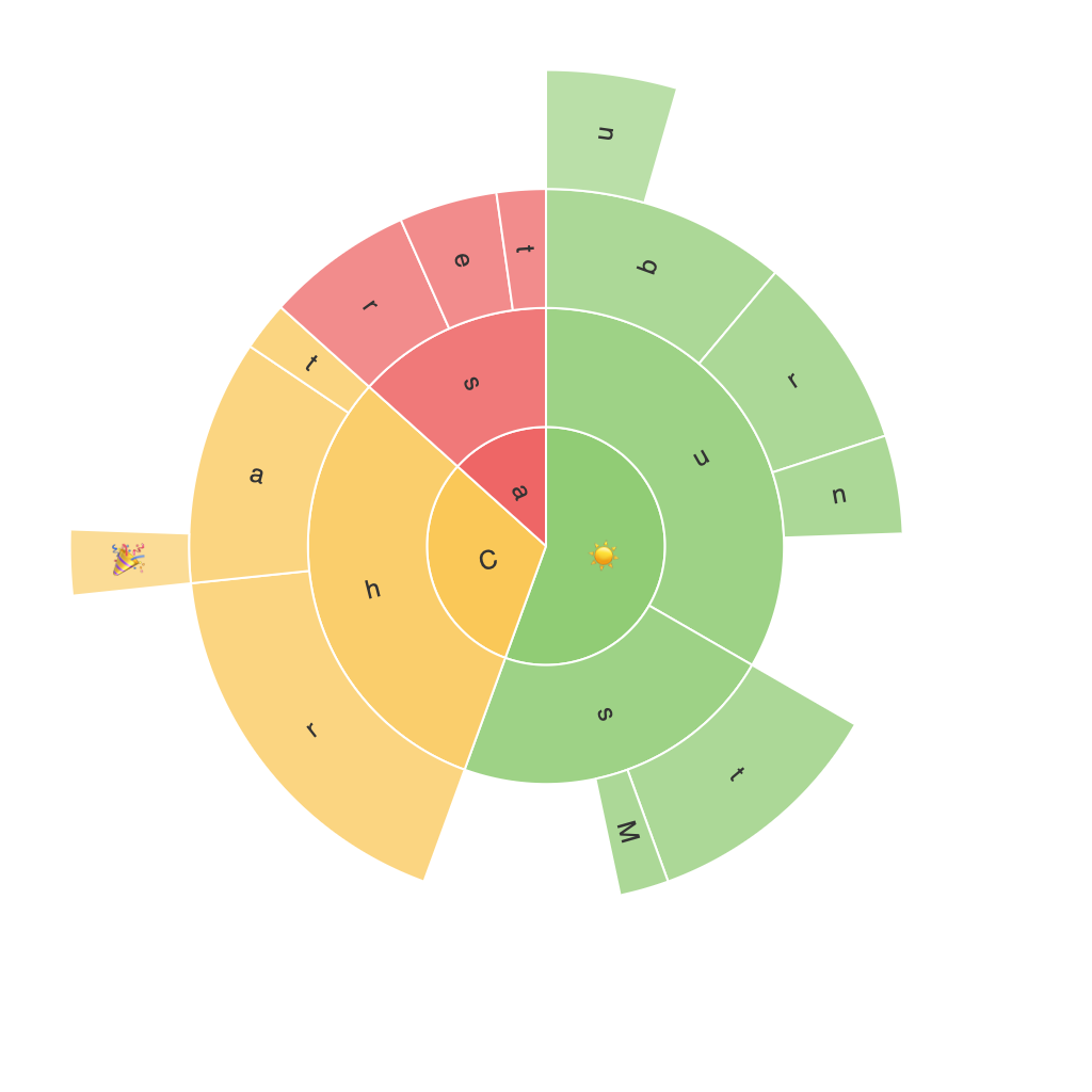
Sunburst charts typically start at the center of the diagram and radiate outwards like a sun, hence the name. The chart’s core represents the root of the hierarchy, growing into sectors for top-level categories, which then break down into further segments for subcategories or child categories. This radial layout makes it visually engaging and effective in showcasing hierarchical relationships clearly.
1. **Core**: This is the central point of the sunburst chart, signifying the hierarchy’s starting point or root node.
2. **Sectors**: These represent the top-level categories or parents in the hierarchy.
3. **Segments**: These smaller parts within the sectors are for subcategories or children in the hierarchy.
### Key Elements for Effective Sunburst Charts
#### 1. **Color Usage**
– Strategic use of colors helps distinguish between different segments and sectors. Utilize contrasting colors for parent sectors and child segments to make the chart visually appealing and easy to navigate. Applying color gradients within segments can further emphasize the hierarchical relationships.
#### 2. **Labeling**
– Clearly label sectors and segments with names or values to ensure data is easily readable. Use concise labels and consider implementing tooltips for more complex datasets that have limited space for direct text.
#### 3. **Navigation**
– Implement interactive navigation features if your chart is digital. Hover effects can highlight segments as visitors move over them, enhancing exploreability. Consider animation for smooth transitions between levels of the hierarchy for a better user experience.
#### 4. **Zooming and Filtering**
– Introduce zooming capabilities to allow users to expand or contract the view of a sunburst, especially useful when dealing with extensive datasets. Adding filter functions enables users to select specific data segments for a more focused analysis.
### Enhancing Data Interpretation with Sunburst Charts
#### 1. **Comparing Hierarchical Levels**
– Sunburst charts are particularly useful for comparing different levels of data. The radial layout makes it simple to compare quantities at various levels, providing immediate insights into which categories contribute more to the overall hierarchy.
#### 2. **Analyzing Dependencies**
– Understanding how different segments relate within the hierarchy is crucial for analyzing complex data. Sunburst charts offer a clear view of the interdependencies and distribution patterns of data, aiding in strategic decision-making.
#### 3. **Exploring Sub-Tier Details**
– The chart’s nested structure makes it easier to delve into sub-categories and trace the flow of data up the hierarchy. This feature is especially beneficial for detailed analyses in domains like finance, where transaction breakdowns need to be examined closely.
#### 4. **Enhancing Storytelling**
– To effectively communicate insights to stakeholders, a well-designed sunburst chart can serve as a storytelling tool. It visually encapsulates the narrative of the data, making it easier to identify trends, patterns, and anomalies in large and complex datasets.
### Conclusion
Sunburst charts offer a unique and powerful way to visualize hierarchical data, enabling users to explore, interpret, and communicate complex information efficiently. By carefully considering the design elements mentioned above, such as color usage, labeling, and interactivity, you can significantly enhance the effectiveness of these charts in data presentation and decision-making processes. Whether you are working within a digital or physical context, adopting a well-planned approach to creating and customizing sunburst visualizations can revolutionize the way data is shared and understood.
Incorporating these design principles and features will not only make your sunburst charts visually appealing but also a powerful tool for data exploration, analysis, and insight generation. As the popularity of data visualization continues to grow, mastering the art of creating informative and engaging sunburst charts is a valuable skill for any data professional.
