#### Exploring the Visual Brilliance of Sunburst Charts: A Comprehensive Guide to Enhancing Data Storytelling
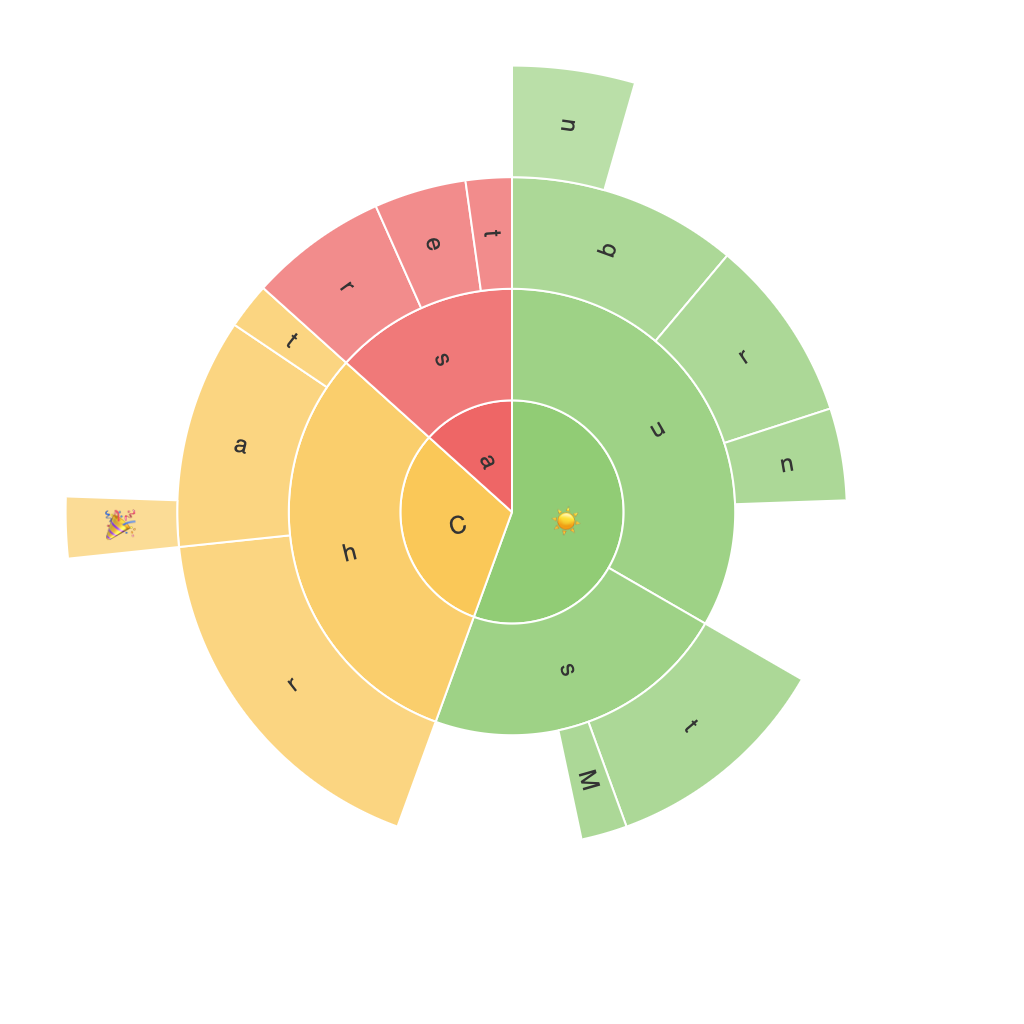
Sunburst charts, a part of the radiant family of data visualization tools, have gained attention for their unique and engaging aesthetic. They are typically employed to illustrate hierarchical data, offering a panoramic view of the relationships between data points of different levels. Unlike other chart forms, sunburst charts present complex data in a visually appealing and easy-to-understand manner. They excel particularly in scenarios where data has multiple categories that can be grouped into broader categories, showcasing a hierarchical structure that goes beyond the simple linear presentation.
Sunburst charts display data in a disk-shaped graph with concentric rings. The radial axis represents one hierarchy, while the angular axis represents the nested hierarchy. Each ring corresponds to a level in the hierarchy, while individual segments within the rings represent the specific values associated with that level. This layout makes it easy to compare quantities, understand proportions, and visualize the structure of the data. Now, let’s delve into how sunburst charts can be effectively utilized to enhance data storytelling and what considerations are necessary to make these charts truly illuminating.
### 1. **Structure and Clarity**
#### **Hierarchy Visualization**
One of the primary strengths of sunburst charts is their adeptness in visualizing hierarchical data. By arranging data in concentric rings, it’s straightforward to discern the relationships between different categories and subcategories. For example, if analyzing the structure of a company’s sales data, the top ring could represent overall sales, the next ring could show separate departments, and the last ring could correspond to individual products.
#### **Color Coding**
Utilizing distinct colors for each ring emphasizes the segmentation and progression levels in the data structure. This not only makes the chart visually appealing but also underscores the hierarchical importance of the segments. Consistent color schemes help in maintaining coherence and enhancing readability across the chart.
### 2. **Design Considerations**
#### **Space Utilization**
Sunburst charts effectively leverage space to present hierarchical data compactly. The radial layout minimizes clutter and ensures that even larger datasets can be accommodated without overwhelming the viewer. This compactness is particularly useful in dashboards where space is at a premium.
#### **Focus on Importance**
The design of a sunburst chart naturally directs the viewer’s focus to the center of the chart, typically where the root node (the largest segment) resides. This can be leveraged to highlight key insights and main categories as important focal points in the data narrative.
### 3. **Enhancing Readability and Insights**
#### **Proportional Sizing**
Incorporating the proportional sizing of sectors helps in easily grasping the magnitude of different components, even from casual observation. A larger segment visually denotes a higher volume or importance, making comparisons straightforward and intuitive.
#### **Interactive Features**
Adding interactive capabilities allows users to dynamically explore the chart. Hovering over segments reveals additional information or drilling down on subcategories can provide deeper insights. This interactivity is particularly advantageous when dealing with vast datasets, ensuring that users can uncover specific details at their own pace.
### 4. **Integration and Flexibility**
#### **Combining with Other Graphics**
Sunburst charts can be effectively combined with other types of visualizations, such as pie charts, line graphs, or even maps, to provide a multifaceted approach to data analysis. This integration can help in cross-referencing data from various sources or perspectives, enriching the overall narrative.
#### **Cross-Platform Compatibility**
Ensuring that sunburst charts are optimized across different devices and platforms is crucial for accessibility. Effective use of responsive design ensures that the chart maintains its visual clarity and functionality, no matter how the viewer is accessing the data.
### Conclusion
The visual brilliance of sunburst charts lies in their ability to present complex hierarchical data in an engaging and understandable manner. By considering the structure, focusing on clarity, and enhancing readability and insights, data storytellers can leverage this powerful tool to communicate meaningful narratives effectively. Whether it’s highlighting company structures, exploring category proportions, or showcasing network relationships, sunburst charts offer a unique visual approach that can significantly elevate the presentation of hierarchical data in professional and personal projects alike.
