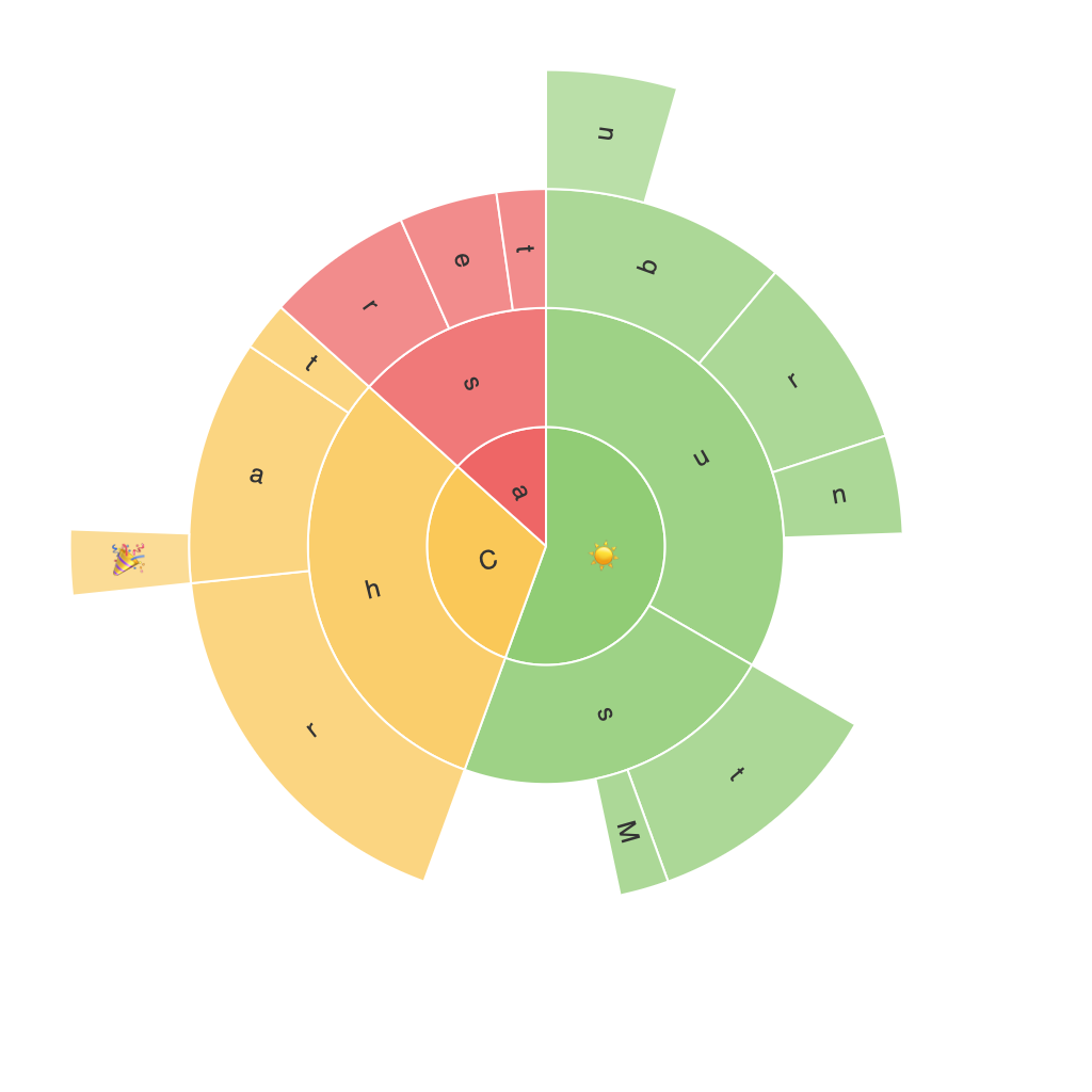
**Exploring the Visual Brilliance of Sunburst Charts: A Comprehensive Guide to Data Visualization**
In the expansive landscape of data visualization, a variety of techniques are employed to make sense of complex, hierarchical data sets. Among these, sunburst charts stand out for their unique visual presentation and the insight they provide. These charts, with their aesthetic appeal and clear organization, serve as a powerful tool to explore and communicate hierarchical data effectively.
### What are Sunburst Charts?
Sunburst charts are a layered visualization tool used to display multi-level sets of data, resembling the segments of a sun or pie chart. Unlike traditional pie charts, sunburst charts are radially organized, allowing for multiple levels of hierarchical data to be visualized. The inner layer typically represents the top-level categories, with subsequent layers subdividing into more detailed subcategories.
### Key Features and Benefits
#### 1. **Hierarchical Clarity**
Sunburst charts excel at showing hierarchical structures clearly and effectively. This makes it easier for viewers to understand complex data at a glance, without the need for detailed explanations.
#### 2. **Sizable Data Sets**
They can handle large data sets, making them particularly useful for projects where the number of categories exceeds what a pie chart can manage without becoming cluttered or illegible.
#### 3. **Comparison and Proportional Analysis**
The layered nature of sunburst charts facilitates comparisons between categories at different levels. It allows audiences to easily discern the relative sizes and proportions of categories, both visually and by area.
#### 4. **Interactive Capabilities**
Digital versions of sunburst charts often integrate interactive features, allowing users to click on segments to expand or collapse data, revealing more detailed information. This interactivity enhances engagement and the depth of detail that can be explored.
### Creating a Sunburst Chart
Creating a sunburst chart involves several steps:
#### 1. **Data Collection**
Gather and format your data. Ensure your data is organized in a way that each layer of the sunburst (outer circles) should contain at least two or more segments, with more complex structures allowing deeper categorization.
#### 2. **Software Selection**
Utilize data visualization software or platforms like Tableau, Power BI, or programming libraries such as Plotly or D3.js, which offer robust functionalities for creating sunburst charts.
#### 3. **Data Input**
Input your data into the chosen software or library. Assign each category to its designated level in the hierarchy.
#### 4. **Customization**
Customize the chart’s appearance, including colors, shading, and labels, to enhance clarity and aesthetics. This step can include adjusting segment sizes to reflect the data proportions effectively.
#### 5. **Review and Adjust**
Review the chart to ensure it communicates the intended message clearly. Adjust the layout, colors, or data presentation as needed until the chart is effectively communicating the information.
### Conclusion
In a world awash with data that needs to be translated into meaningful insights, sunburst charts provide a visually captivating and analytically robust means to explore and communicate hierarchical data. Their effectiveness lies in their ability to organize and present data in a way that is both intuitive and detailed, making them a valuable asset in the toolkit of any data analyst, researcher, or business professional. Whether using them for corporate reporting, academic studies, or any project requiring a clear visualization of hierarchical data, sunburst charts offer a unique and powerful approach to data storytelling.
