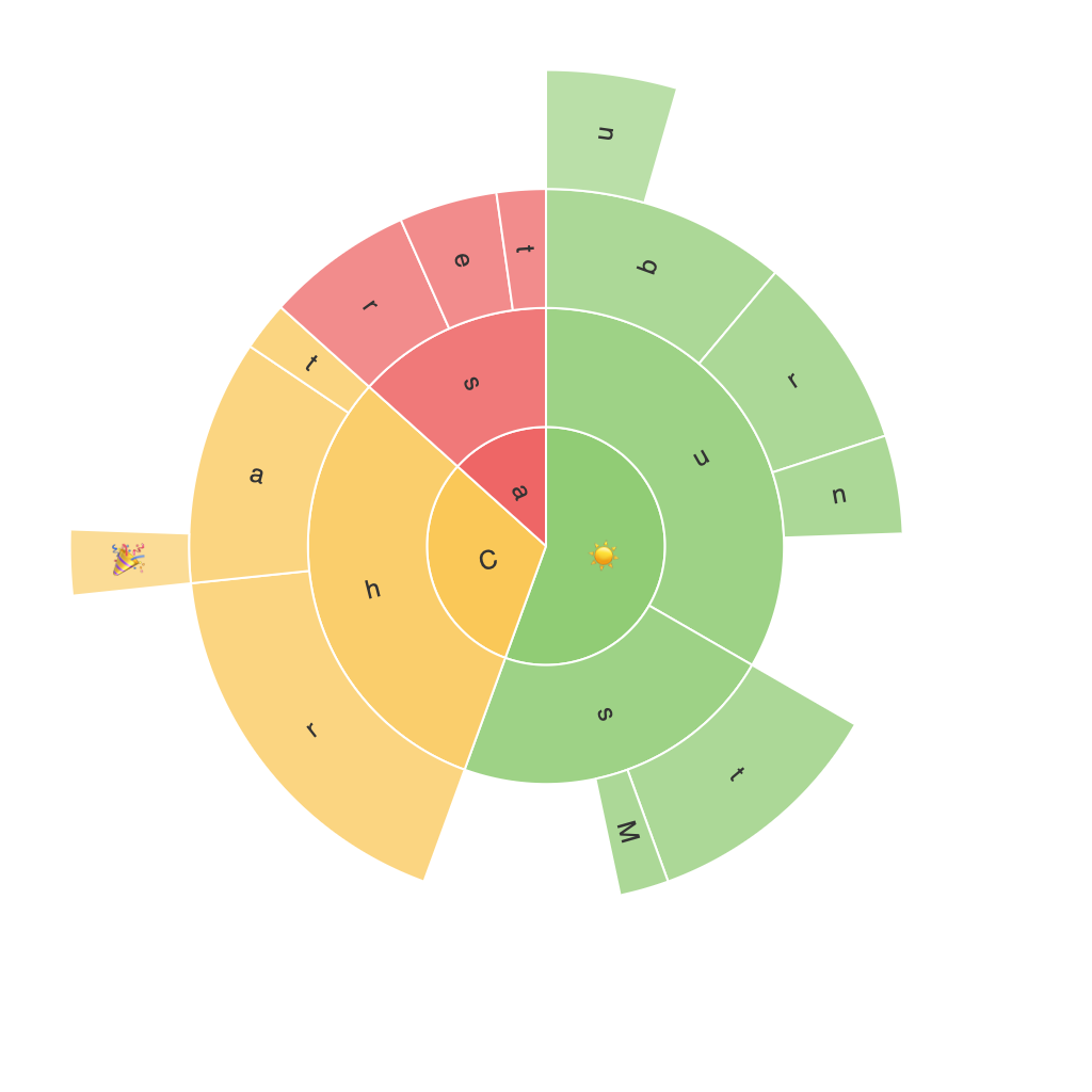
Exploring the Visual Brilliance: A Comprehensive Guide to Sunburst Chart Visualization
In the vast universe of data visualization techniques, one particular method draws attention due to its unique ability to exhibit hierarchical data in an aesthetically pleasing manner, enabling users to grasp complex information efficiently. This method is none other than the Sunburst Chart Visualization—a powerful graphical tool that encapsulates the essence of data with a visually appealing burst of color.
### Introduction to Sunburst Charts
Sunburst charts, also known as sun charts or concentric circle charts, showcase hierarchical data in a radial layout. The circle’s center represents the top-level category, with branches extending outwards representing subcategories, and sectors further out depict the leaf nodes—individual data points within these categories. Each level of the hierarchy has an inner circle of decreasing radius, forming sun-like patterns.
### Key Features of Sunburst Charts
Sunburst charts offer several key features that make them exceedingly popular for visualizing hierarchical data:
1. **Hierarchical Representation**: The radial layout naturally supports and effectively illustrates hierarchical relationships, making it easier for viewers to understand complex structures.
2. **Efficient Space Utilization**: Sunburst charts efficiently utilize space, allowing multiple hierarchical levels to be displayed on the same screen without clutter.
3. **Color Categorization**: Different colors are used to categorize various levels and attributes of the hierarchy, making it easier for users to distinguish between categories.
4. **Multilevel Analysis**: The concentric layout facilitates the investigation of data at different levels simultaneously, providing a dual benefit of top-down and bottom-up views on the same information.
### Applications of Sunburst Charts
Sunburst charts find applications across various fields, including:
– **Business Intelligence**: For visualizing company structures, product hierarchies, or budget allocations.
– **Web Analytics**: To analyze user navigation patterns on websites.
– **Financial Analysis**: Displaying organization structures, such as profit and loss statements on multiple levels.
– **E-commerce**: Showing product categories and subcategories, and sales data within each category.
– **Healthcare**: Presenting medical conditions, symptoms, and treatments in a structured format.
### Design and Implementation
Creating an effective sunburst chart involves considerations such as:
– **Choosing Levels**: Clearly define the hierarchy levels and use levels efficiently to avoid excessive complexity.
– **Color Schemes**: Employing distinct colors for each level and categories can enhance readability and make connections between different sections more apparent.
– **Labeling**: Choosing appropriate labeling techniques to maintain clarity without overcrowding the chart.
– **Interactive Features**: Implementing hover-over effects or clicks to reveal detailed data and facilitate deeper understanding.
### Conclusion
Sunburst charts represent a brilliant tool for visualizing hierarchical data, marrying simplicity with sophisticated elegance. Their capacity to deliver complex information in a visually intuitive format makes them indispensable in a wide array of applications. Whether it’s business analytics, web statistics, financial analysis, or any scenario requiring the interpretation of multi-layered, structured data, the sunburst chart stands as a testament to the beauty of data visualization—a true work of graphical art.
