#### Exploring the Versatility of Sunburst Charts: Enhancing Data Visualization and Understanding in Various Industries
In the ever-evolving landscape of data visualization, one chart type stands out for its exceptional capability to convey complex information in a visually engaging and comprehensible format – the sunburst chart. Originating from several fields, including astronomy and information theory, this now-mainstream visualization technique has revolutionized the way businesses, researchers, and analysts interpret and communicate hierarchical data. This article aims to delve into the depths of the versatile nature of sunburst charts and explore how they can be utilized across various industries to enhance understanding, provide insights, and facilitate decision-making.
### Visual Hierarchy Made Clear
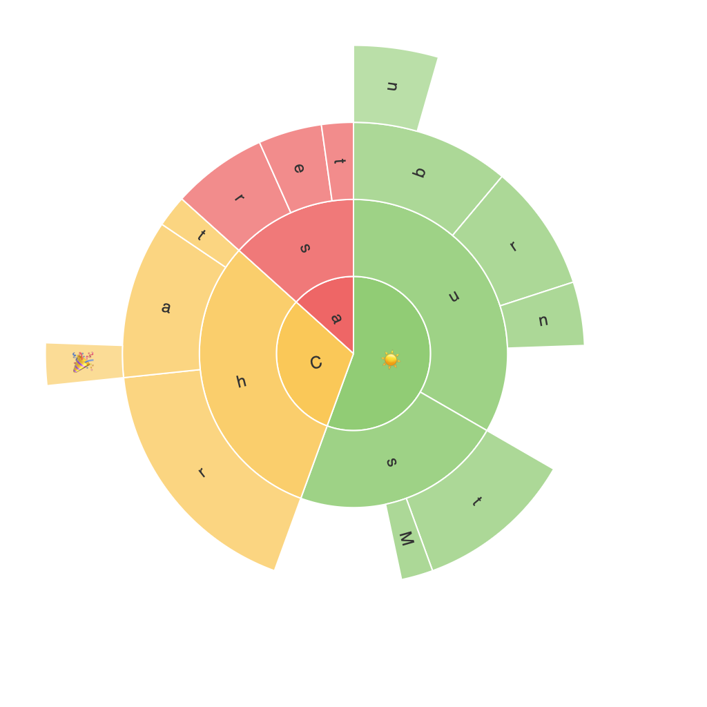
Sunburst charts are essentially a radial treemap, where each node in the hierarchy is a slice on the chart, displaying the contribution of each category and sub-category in a visually intuitive way. This radial structure makes it easier to visualize the parent-child relationships within the data, where the distance from the center of the chart reflects the level of hierarchy. This clear visual hierarchy is particularly advantageous in industries with complex, multi-level structures, such as finance, where understanding the contributions of different financial instruments or market sectors under broader economic conditions is crucial.
### Effective Clarity in Education
In the realm of education, particularly for subjects involving data analysis, financial management, or complex systems like the human body, sunburst charts can offer a compelling alternative to traditional tables or pie charts. The visual representation of categories and subcategories helps students grasp the interplay between different elements more effectively. For instance, a study of health funding can be visualized using a sunburst chart, categorizing funds by department, program, and specific health initiatives, allowing for easy comparison and understanding of distribution patterns.
### Enhancing Organizational Insights in Business
For businesses, sunburst charts can be implemented in multiple contexts to improve operational efficiency and strategic decision-making. In marketing analytics, for example, a sunburst chart can illustrate the flow of customers through various touchpoints and the performance of different marketing channels. This detailed breakdown helps organizations identify the most effective strategies and allocate resources accordingly, enhancing overall marketing effectiveness.
### Supporting Environmental Science
In environmental science and conservation, sunburst charts can be utilized to represent complex ecosystems or pollution sources that are hierarchical in nature. By showcasing the relationship between different components like species, pollution sources, or environmental impacts, sunburst charts facilitate a holistic understanding of environmental issues. This visualization can aid policymakers and environmentalists in prioritizing areas that require immediate attention and allocating resources effectively.
### Improving Public Health Data Presentation
Public health data can benefit greatly from the use of sunburst charts. These charts can visualize demographic breakdowns, health status categories, and healthcare utilization patterns, providing an immediate overview of the health landscape. By clearly displaying the interconnections between various factors affecting public health, policymakers and public health organizations can make data-driven decisions that address critical needs.
### Embracing Diversity in Data Visualization
Despite their versatility, sunburst charts are not without their limitations; they struggle with visualizing very deep hierarchies or large datasets where the hierarchical structure becomes less meaningful. However, these limitations have inspired the development of more advanced visualization techniques, such as force-directed graphs, which can complement or replace sunburst charts in situations where detailed hierarchy representation becomes too complex or less intuitive.
### Conclusion
In conclusion, sunburst charts stand as a powerful tool in the arsenal of data visualization techniques, offering a unique perspective on hierarchical data that enhances understanding and communication across various industries. Whether it’s simplifying financial analysis, enhancing educational experiences, informing organizational strategies, improving environmental awareness, or optimizing public health initiatives, sunburst charts provide a visually compelling and comprehensive way to explore and interpret complex data, thereby enriching decision-making processes.
As technology continues to evolve, the potential for enhancing and refining these visualizations to better suit specific data exploration needs grows, promising an even more impactful future for this versatile chart type.
