Exploring the Versatility of Sunburst Charts: An In-depth Guide to Visualization and Data Analysis
Sunburst charts, a relatively new addition to the arsenal of data visualization techniques, represent data in a visually compelling, yet versatile manner. Often underutilized compared to more traditional chart types like bar charts or pie charts, sunburst charts provide a compelling method for showing hierarchical relationships and detailed information. This article delves into the world of sunburst charts, examining their versatility, explaining how they work, showcasing their benefits, and demonstrating how they enhance data analysis.
Understanding Sunburst Charts
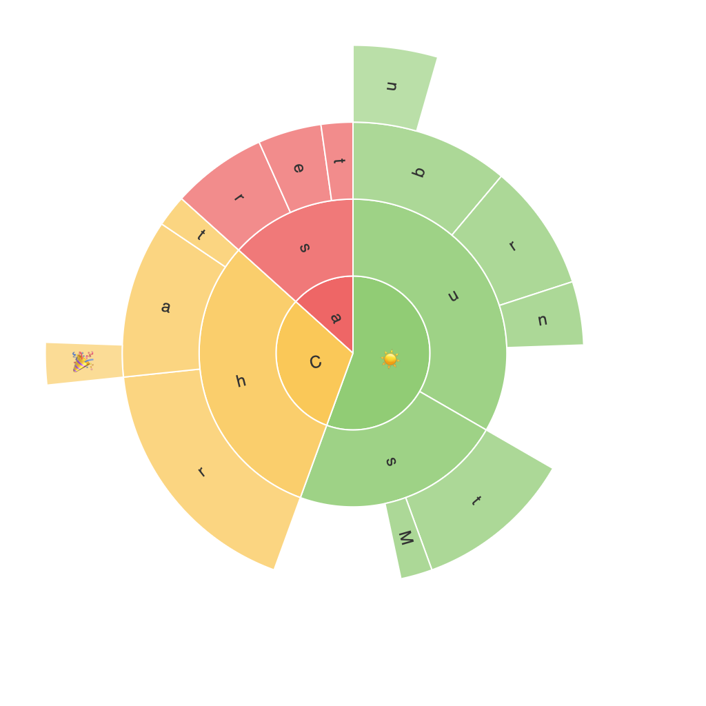
Sunburst charts, also known as nested pie charts or radial treemaps, are radial diagrams where a central circle represents the total value, usually 100%. Radiating outwards are segments representing parts of the total, with each segment further divided into subtier segments, creating a sun-shaped appearance. Each of these segments is proportional to either its angular size or its length along the radius, depending on the chart design.
How they work?
Sunburst charts work by taking a hierarchical dataset, typically structured in a tree-like manner, as input. The top level or root node occupies the inner part of the chart while child nodes extend outwards. Segments within segments allow for further breakdown of categories, creating a visually dense chart capable of handling multilevel data structures.
Benefits of Sunburst Charts
Sunburst charts offer several key benefits over conventional visualization methods:
**Insight into Hierarchical Data**: The radial structure makes it easy to visualize and compare relationships between different categories on multiple levels within a single dataset. This is incredibly useful when a significant portion of your data has an inherent hierarchy.
**Space Efficiency**: Sunburst charts utilize space extremely efficiently, especially as the number of categories grows. Their space-efficient layout makes them ideal for datasets with a high number of categories compared to alternatives like stacked column charts.
**Detail and Clarity**: Sunburst charts can display a significant amount of detail without cluttering the viewer; however, they must be used with caution to maintain clarity. The hierarchical structure encourages clean, step-by-step interpretation of the data, avoiding the overwhelming confusion that might occur with more data-intensive methods like treemaps.
**Color Coding and Filtering**: Sunburst charts offer a natural way to apply color coding and employ filtering to highlight specific data points or reveal underlying patterns of data. These features can significantly enhance data analysis by visually identifying trends, outliers, or important categories.
Practical Applications and Case Studies
Sunburst charts find widespread application in various domains, including business intelligence, market research, and web analytics, to illustrate data that has a hierarchical structure, such as product categories, geographic territories, or user navigational paths in digital environments.
In the context of digital analytics, for instance, sunburst charts can represent website navigation patterns, where each level of the hierarchy might show different pages (top level), sections or sections under those pages, down to specific user actions or conversions (sub-levels). This allows web developers and digital marketers to better understand user behavior, identify underperforming sections, and optimize website navigation and content presentation.
Conclusion
Sunburst charts provide a unique and visually rich method for representing hierarchical data, offering a fresh perspective on data analysis compared to more traditional chart types. By exploring their versatility, understanding their working, appreciating their benefits, and considering practical applications, one can effectively leverage sunburst charts to uncover insights and tell compelling stories with complex datasets. As data becomes increasingly complex, the need for sophisticated representations like sunburst charts increases, making them a valuable tool in the data visualization toolkit.
