Exploring the Power and Versatility of Sunburst Charts: A Comprehensive Guide to Data Visualization
Sunburst charts offer a visually appealing and intuitive means of representing hierarchical data. This form of visualization, a type of hierarchical ring chart, provides a unique avenue for displaying complex datasets in a simplified and accessible manner for data analysis and presentation. This comprehensive guide aims to delve into the depth of sunburst charts, discussing their construction, applications, and potential, to help users harness the power of this versatile data visualization method.
### Construction of Sunburst Charts
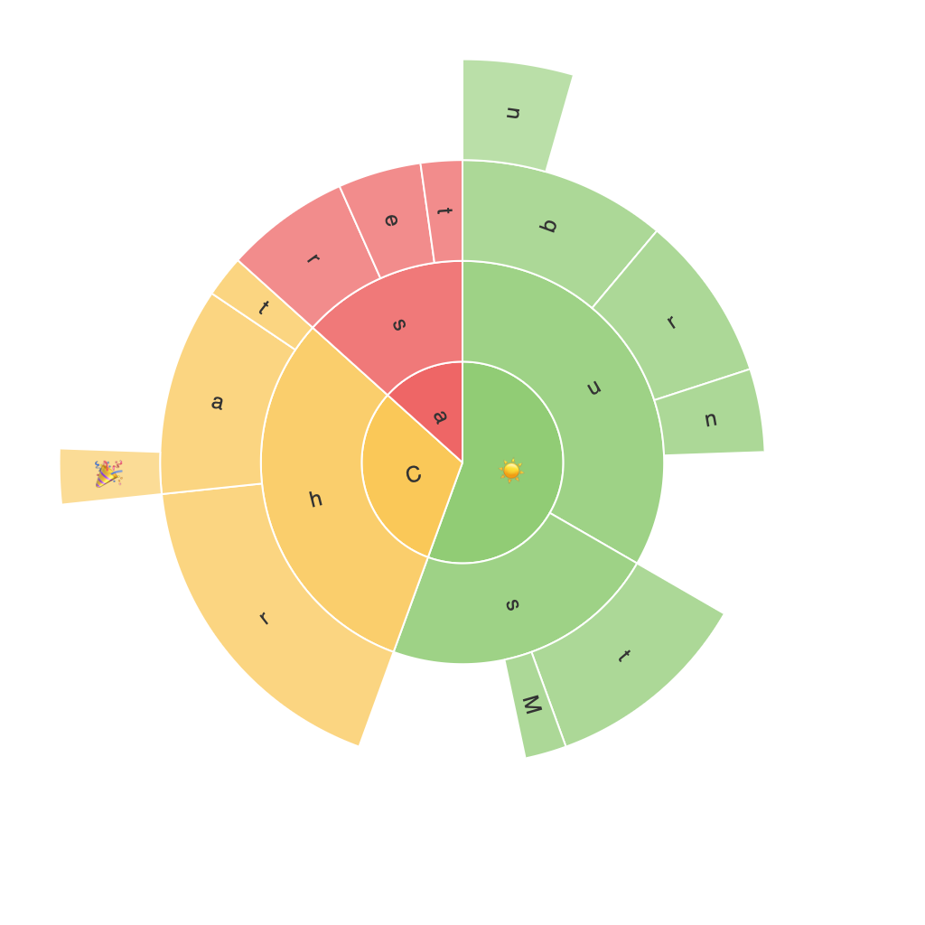
The sunburst chart, also known as a hierarchical ring chart, comprises concentric circles, each sector representing a category, and subtending sectors representing subcategories. Color coding and different sizes facilitate the comparison and identification of elements, making it easy for viewers to understand the proportions and relationships within the data. Nodes, typically represented as sectors, act as junctions between categories. This structure makes it possible to visualize multiple levels of data hierarchy in a single graph, showing subsets as segments of parent categories.
### Key Components of Sunburst Charts
1. **Root Node**: The largest circle at the center, often representing the most significant category such as overall totals or top-level categories.
2. **Intermediate Nodes (Branches)**: The sectors that appear in the first circle or outer rings, each representing a medium-level category that expands outwards from the root node.
3. **Leaf Nodes (Segments)**: The smallest circles that represent the final, smallest units of the hierarchy, at the outer rings of the chart.
### Applications and Benefits
#### 1. **Eradicating Complexity**
Sunburst charts excel in simplifying complex, multi-dimensional data, making it easier to grasp intricate datasets without overwhelming the viewer. The hierarchical structure provides a clear visual cue of the data relationships, enhancing understanding at a glance.
#### 2. **Comparing Hierarchical Relationships**
In applications where the relationships between higher-level and lower-level categories are crucial, sunburst charts offer an effective way to compare these relationships visually. It simplifies the identification of category contributions, emphasizing dominant categories and subcategories.
#### 3. **Resource Allocation Visualization**
In sectors such as financial planning, corporate strategy, and marketing, sunburst charts are incredibly useful for visualizing how resources are allocated across different categories, highlighting areas that consume the most resources and those in need of attention.
#### 4. **Understanding Website Navigation Structure**
Web designers and analysts can use sunburst charts to visualize the navigation structure of websites, revealing popular versus less used sections of the site. This insight aids in optimizing user experience and improving website architecture.
### Advanced Features
– **Interactive Elements**: Advanced sunburst charts integrate interactive elements like tooltips, clickable sectors, and zoom functionalities. These features provide immediate information upon cursor hover and enable users to drill down into detailed data.
– **Color Schemes**: Strategic use of color can differentiate and emphasize certain categories or highlight trends within the data. This makes the chart not only visually appealing but also aids in conveying information quickly.
### Limitations
Despite their power and versatility, sunburst charts have limitations. The complexity arises with more hierarchical levels, potentially making the chart hard to read or interpret. Additionally, the chart design might not be the most conducive for quick comparisons, and large datasets can make it challenging to fit all the necessary data meaningfully into the chart without overcrowding.
### Conclusion
In conclusion, the sunburst chart stands as a powerful and versatile tool within the data visualization arsenal. Its ability to convey hierarchical relationships in a visually appealing manner makes it an excellent choice for various applications ranging from complex data analysis to website structure assessment. By leveraging its components effectively, including strategic color use, interactive elements, and careful data selection, users can unlock the full potential of this chart type, enhancing their ability to explain and interpret complex data simply and engagingly.
