### Exploring the Insightful Universe of Sunburst Charts: A Comprehensive Guide to Visualization and Data Interpretation
Sunburst charts represent a step beyond conventional visualization techniques, diving deep into the universe of hierarchical data structures. Unlike pie charts that flatten dimension relationships, sunburst charts showcase the intricate and hierarchical nature of datasets in a way that is both visually engaging and meticulously informative. This article delves into the essence of sunburst charts, their construction, key advantages, and a practical approach to utilizing them effectively for data interpretation.
#### **Understanding Sunburst Charts**
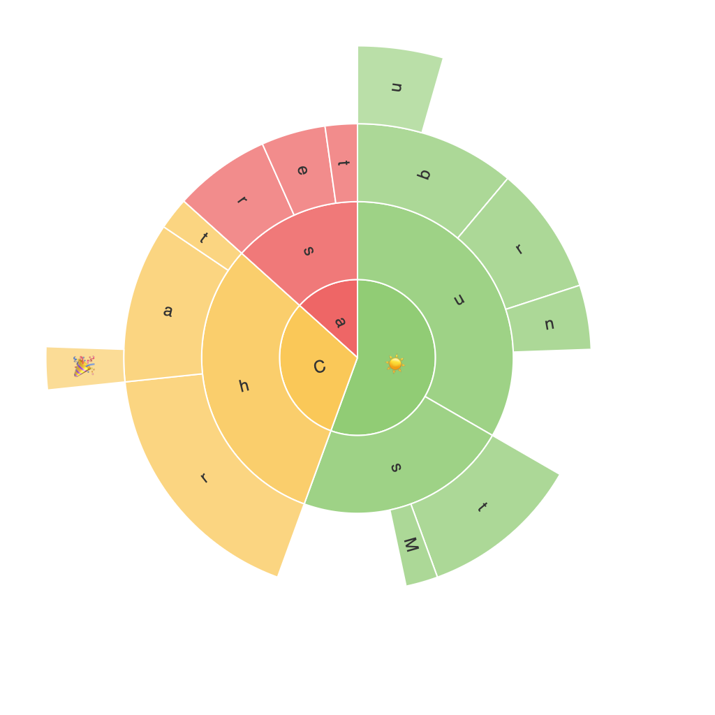
Sunburst charts are visual representations of hierarchical data, where each level of the hierarchy is depicted by concentric rings. Central to this visualization is the ability to see the breakdown of categories within categories, with each ring representing a different level of the hierarchy’s depth. Typically, the outermost ring displays the top-level categories, and as you move inward, you peel back the levels, revealing deeper tiers of categories.
#### **Advantages of Sunburst Charts**
1. **Hierarchical Clarity**: Sunburst charts excel in conveying structured hierarchical data, making complex relationships easily interpretable. This provides a bird’s-eye view of the hierarchy, enhancing comprehension and insight discovery.
2. **Comparative Analysis**: By visualizing the sizes of sections in each ring, the relationship between different categories can be quantified and analyzed, aiding in comparative studies across different levels.
3. **Space Efficiency**: With a circular layout, these charts make optimal use of space, allowing for the display of larger numbers of categories in a compact form, reducing clutter often found in more traditional rectangular charts.
4. **Color and Labeling**: Colors and labels can be customized for each section, helping to differentiate categories for better visibility and highlighting critical data points. This customization enables the chart to be tailored to specific needs, enhancing its interpretability.
#### **Creating a Sunburst Chart**
To create a sunburst chart, start with a dataset that structures your data in a hierarchical format. This could be a dataset detailing sales by categories, geographical regions, or customer segments, for instance. Most data visualization tools, such as Tableau, Microsoft Power BI, or even Python libraries like Plotly and Matplotlib, support the creation of sunburst charts.
#### **Tips for Effective Sunburst Chart Visualization**
1. **Prioritize Categories**: Organize the categories to highlight the most significant segments or hierarchies. This can be based on specific criteria like revenue contribution, frequency, or another relevant measure.
2. **Annotate Key Components**: Adding labels or tooltips for specific parts can help users understand the exact breakdown and values associated with each category. This ensures that the chart is not only visually appealing but also informative.
3. **Use Color Effectively**: Employ a color scheme that complements the existing branding or theme while aiding in distinguishing between categories. Consider using color to highlight the most important parts or to visually separate major categories from subcategories.
4. **Reduce Depth**: Be cautious not to include too many levels in your hierarchy, as this can make the chart overly complex and hard to read. Focus on the most relevant and meaningful levels that provide actionable insights.
5. **Interactive Elements**: Incorporate interactive options such as tooltips, drill-down capabilities, or filter options to enhance user engagement and facilitate deeper exploration of the data.
#### **Conclusion**
Sunburst charts are a robust tool in the arsenal of data visualization. They offer a comprehensive view of hierarchical data, simplifying complex relationships and providing a clear comparison pathway through their concentric ring structure. Their detailed and interactive nature makes them particularly suitable for scenarios requiring a deep dive into data structures, such as business intelligence, market research, or any application where hierarchical data is prevalent. By leveraging techniques for effective data organization and customization, these charts can transform raw data into actionable insights, aiding in decision-making processes across various industries.
