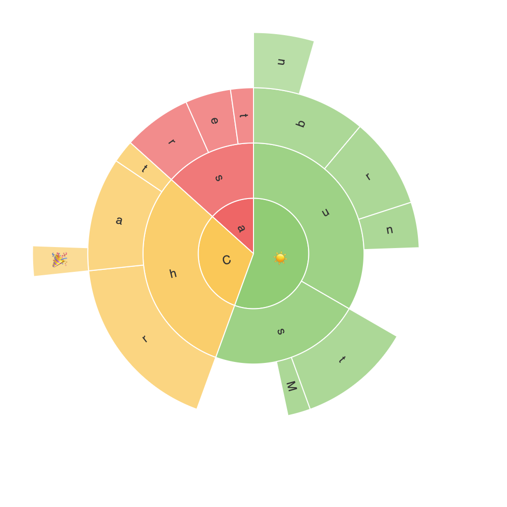
Expanding Visual Insights: Unleashing the Power of Sunburst Charts in Data Visualization
In the realm of data analysis and dashboard design, chart types serve as visual bridges that illuminate complex datasets, making information easily understandable. Among these chart types, the sunburst chart stands out as an innovative way of presenting hierarchical data, offering more than just aesthetic appeal but also deep insights into the composition and dynamics of the data at hand. This article delves into the power of sunburst charts, how they work, their advantages, and how they can enhance the depth of data visualization.
Understanding the Structure: What is a Sunburst Chart?
A sunburst chart is a type of hierarchical data visualization, visually displaying information in a radial layout, with concentric circles representing different levels of the hierarchy. Each segment emerges from the centre, reflecting a percentage of its parent segment’s value. This structure enables the viewer to visualize the proportions and relationships between different levels of the hierarchy seamlessly.
The Radial and Circular Format
One of the most striking aspects of sunburst charts is their use of the radial and circular format. Each level of the hierarchy is represented by a different circle or ring, allowing for a natural grouping of related data. The radial layout not only provides a compact display but also follows a logical progression, from the root of the hierarchy to the leaf nodes, facilitating easier comprehension of the data’s structure.
Comparing and Contrasting: Highlighting Key Information
Sunburst charts excel in highlighting contrast and patterns while comparing different levels of data. Thanks to the radial stacking of segments, it is easier to spot trends and shifts in values between different levels. This feature is particularly useful in discovering patterns that might be obscured in more linear or tabular representations of data. It can dramatically show the dominance of certain categories over others, the depth of subcategories within major categories, or the distribution of parts within a whole.
Effective Data Exploration
Sunburst charts are adaptable for various fields, including market analysis, financial modeling, organizational charts, and any data with hierarchical relationships. This versatility allows businesses to explore data in a unique and intuitive way. By visually mapping out the hierarchy, stakeholders can quickly identify the largest contributors within the data, understand the relative importance of various segments, and uncover underlying patterns that inform decision-making.
Interactive Elements for Enhanced Engagement
Incorporating interactive elements into sunburst charts significantly enhances its utility and engagement. Users can click on sections to drill down into more detailed information, hover over segments for tooltips to appear, and even sort or filter data based on various criteria. These interactive features not only make data exploration more engaging but also enable users to gain deeper insights into the data quickly and efficiently.
Limitations and Best Practices
While sunburst charts are powerful tools for data visualization, there are limitations to their application. One major limitation is their complexity at higher hierarchical levels, which might make it challenging for non-specialized audiences to interpret. It is therefore best to use them for data with fewer levels and appropriate categorization. Additionally, color and labels used in charts should be carefully considered to ensure clarity and ease of understanding.
Conclusion
Sunburst charts offer a visually captivating and data-rich alternative for representing hierarchical data. Their ability to clearly depict proportions, relationships, and trends within complex datasets makes them invaluable for businesses and data analysts. Whether exploring market share across various segments, understanding the structure of an organization, or analyzing a product’s components, sunburst charts effectively expand our visual insights and enhance the overall data visualization experience. As such, embracing this tool can significantly enrich the way we understand and communicate hierarchical data in our fast-paced, data-driven world.
