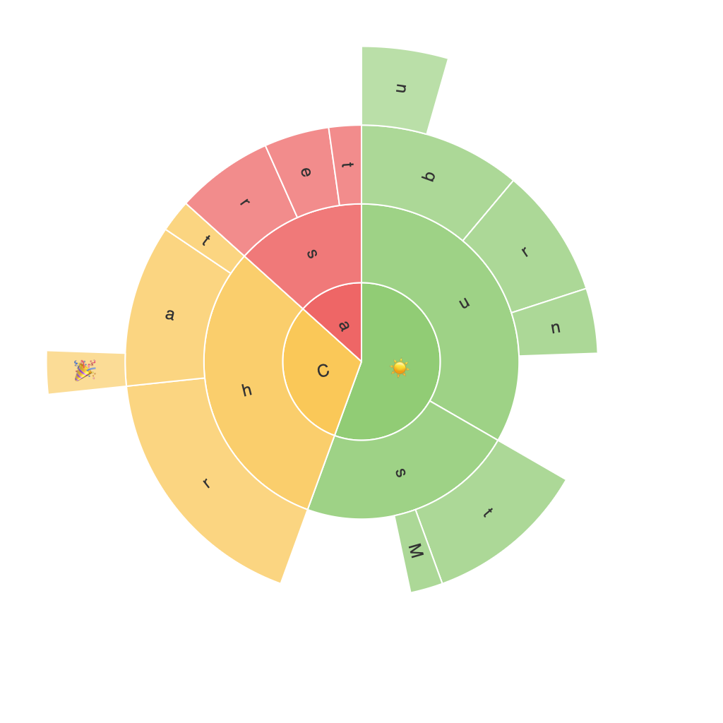
In the ever-expanding world of data visualization, one approach emerges as a highly effective tool for conveying complex narratives through visual complexity: the sunburst chart. This versatile and sophisticated presentation method transcends traditional graphical constraints, offering an unparalleled way to understand hierarchical data, relationships, and correlations unseen in other chart types. Let’s delve into the power and practicalities that make the sunburst chart a valuable addition to the data analyst’s toolkit.
### Understanding Sunburst Charts: Visual Brilliance of Hierarchies
Sunburst charts are a powerful alternative to traditional tree maps, pie charts, and other common visualization methods. They excel in representing hierarchical data, breaking down large datasets into manageable segments that highlight interrelations between components at different levels. Each level of hierarchy in a sunburst chart is depicted as concentric rings, with each ring segmented to represent sub-categories. This nested design promotes an intuitive, “peel-back” effect through the layers, facilitating a deeper dive into data complexity without sacrificing clarity or comprehension.
### Aesthetic Appeal Meets Functional Utility
One of the most notable advantages of sunburst charts is their aesthetic appeal, which enhances user engagement without overwhelming the viewer. The visual coherence provided by the chart’s radial layout minimizes clutter, making it easier and faster to discern significant trends, patterns, or anomalies. The inclusion of arc lengths, labels, and other visual elements like color coding, ensures that data insights are not only visually appealing but also analytically informative. Sunburst charts’ unique display of pie chart-like segments along concentric circles offers a fresh perspective compared to traditional charts, attracting curiosity and engaging a broader audience.
### Scalability and Adaptability
Versatility in handling large datasets and multi-level hierarchies is another key strength. Sunburst charts can effectively represent thousands of data points or extensive hierarchies without sacrificing readability. Whether you’re analyzing sales data across various categories, products, regions, or market segments, a sunburst chart provides a comprehensive view that simplifies complex information into digestible visual components. This scalability makes sunburst charts a useful tool across industries, from IT to finance and beyond, where multi-layered data analysis is essential.
### Implementation Techniques and Best Practices
To effectively leverage the power of sunburst charts, several implementation techniques and best practices are recommended. Firstly, ensure clarity and readability by using consistent color schemes for segments at the same level, which helps in distinguishing between categories without overwhelming the viewer. Secondly, incorporating interactive features such as hover effects for additional data insights or clickable segments for drilling down into details, greatly enhances user engagement. Additionally, optimizing layout for mobile and digital platforms ensures accessibility across a wide audience, from quick glances on smartphones to in-depth analysis on desktops.
### Conclusion
In conclusion, the sunburst chart’s ability to decode visual complexity offers remarkable benefits in making hierarchical data more accessible and comprehensible. From its aesthetic appeal to scalability, this chart type redefines the landscape of data presentation. Whether you’re dealing with complex datasets or exploring intricate relationships within your organization, the sunburst chart stands as a testament to the amalgamation of visual brilliance, functional utility, and analytical power. Embrace this chart type for an elevated data visualization experience, unlocking new dimensions in understanding and interpreting data.
