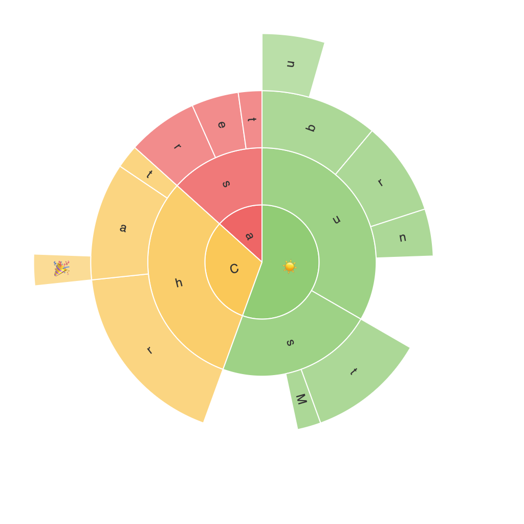
Decoding the Visual Power of Sunburst Charts: A Comprehensive Guide to Enhancing Data Interpretation
Sunburst charts, an innovative addition to the realm of data visualization, have captured the attention of data analysts, visualization enthusiasts, and students alike. These diagrams, capable of encapsulating a plethora of hierarchical information in a visually inviting way, have significantly transformed the approach to understanding complex datasets. In this comprehensive guide, we delve into the intricacies of sunburst charts, their unique contributions to data interpretation, and their practical applications across various fields.
Understanding the Basics
A sunburst chart, also known as a radial tree chart, is a circle divided into segments or sectors that represent higher segments of data in the hierarchy. Each ring of the chart layers represent different levels in the hierarchy, providing a radial and intuitive view of relationships between data points. The size of each segment visually corresponds to its importance, thus offering a quick snapshot of the underlying data.
Enhancing Visual Power
The visual power of sunburst charts lies in their ability to efficiently communicate information across different hierarchical layers. Here are a few techniques for enhancing their effectiveness:
1. **Color Usage**: Incorporating a consistent color scheme helps in differentiating between categories. Additionally, using contrasting colors for high-value segments can draw attention to them, facilitating faster comprehension and decision-making.
2. **Size and Placement Adjustments**: The sizes of segments can accurately represent the proportion of values at each level of the hierarchy. Careful placement of segments relative to each other ensures clear visualization of nested relationships, which is key to understanding complex data structures.
3. **Interactive Elements**: Engaging with data through interactive sunburst charts allows users to navigate through different levels of the hierarchy with ease. Interactive features such as zooming, filtering, and hovering over segments to reveal more data can significantly enhance engagement and facilitate deeper insights.
4. **Data Simplification**: While sunburst charts are adept at handling complex data, they should not be overused. Ensuring that the chart is not overly cluttered prevents confusion and ensures that the essential relationships are not obscured.
Applications and Use Cases
Sunburst charts find applications in a wide range of industries and fields. From business analytics to data science and beyond, the versatile nature of these visualizations allows them to enhance data interpretation in various contexts:
– **Web Analytics**: Sunburst charts can illustrate the flow of users through a website, showing how they traverse different sections from high-level landing pages to specific web pages.
– **Financial Analysis**: These charts help in mapping out an organization’s revenue streams or profits, highlighting key contributors across different product or service segments.
– **Market Research**: They provide a comprehensive view of consumer behavior across multiple categories, enabling businesses to identify trends and patterns that can inform their strategies.
– **Healthcare**: In the medical field, sunburst charts can be used to represent the hierarchical structure of symptoms or different types of diseases, aiding in understanding correlations and causal relationships.
Conclusion
The visual power of sunburst charts lies in their ability to simplify complex hierarchical data into an easily digestible format. They offer a unique blend of visual aesthetics and analytical depth, making them invaluable tools for data analysts and decision-makers. By leveraging their capabilities through strategic color usage, interactive features, and clean design principles, users can unlock the full potential of sunburst charts, elevating their data interpretation skills and achieving greater insights into the data landscape.
