Decoding the Sunburst Chart: A Comprehensive Guide to Enhancing Data Visualization and Understanding Complex Hierarchies
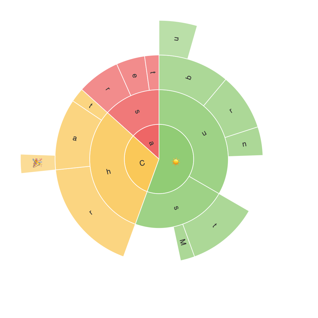
The sunburst chart, also known as a sun plot or a hierarchical donut chart, represents data in a circular format with concentric circles radiating outwards. It is an effective tool for visualizing hierarchical data, offering a visually engaging way to display data relationships and complex structures. In this article, I will discuss how to create and decode a sunburst chart, exploring its various components and the techniques to improve the chart’s readability and enhance its impact.
Understanding the Structure of the Chart
The sunburst chart’s basic structure comprises:
1. **Root node**: The biggest circle represents the root, which can also be referred to as the highest-level hierarchy in the data. This circle is generally the starting point and contains no further details but serves as an anchor to build the rest of the chart’s structure around it.
2. **Succinct circles or segments**: These represent the intermediate or sub-level hierarchies in the data. In each circle, the radii corresponding to each segment are proportional to the value associated with that segment. So, larger radii indicate higher values.
3. **Leaf nodes**: The smallest, individual segments are the leaf or end nodes. They generally represent the leaf or minimal level in the hierarchy. Each leaf node can be easily associated with a specific value or data point.
Components and Their Roles
The chart components include segments, connectors, and labels, which play key roles in enhancing the chart’s readability and understandability.
1. **Segments**: These represent data categories. The size of the segment visually corresponds to the value or weight of the category it represents.
2. **Connectors**: Connects a segment to the circle that contains it. These can be useful in showing hierarchy or indicating sub-categories. Colored connectors can be used to highlight specific sub-relationships.
3. **Labels**: Provide detailed information about the segment or category. They can be customized to include percentage, value, or any other descriptive information.
Enhancing Readability and Understanding
To effectively use the sunburst chart, consider the following tips:
1. **Color Coding**: Assign distinct colors to each level of hierarchy, including the root node, primary segments, and secondary segments. This helps in easily distinguishing between different categories.
2. **Sorting**: Organize or sort categories within each circle based on meaningful criteria such as size, value, or alphabetical order. Sorting can be applied from the root outwards, within primary segments, or within secondary segments.
3. **Zoom and Expand**: Implement interactive features that allow users to zoom in and out of the chart, showing or hiding more or less detail depending on their focus.
4. **Animations**: Use animations to enhance user interaction and engagement, such as highlighting the path from the root to a leaf node, emphasizing data changes over time, or explaining complex hierarchies in an engaging manner.
5. **Interactive Legends**: Provide an interactive legend that clarifies the color-coding used in the chart, making it easy for users to understand the color schema without navigating the chart.
Choosing the Right Data and Application
The sunburst chart is particularly beneficial for visualizing data with a hierarchical structure, where you have several levels of categories. It is a great choice for organizations that have an easily understandable data hierarchy, such as product categories, organizational structures, or geographic data.
Examples:
– **Website Navigation**: Visualizing a website’s navigation structure, where each circle represents a main category, its segments are secondary categories, and its connectors represent which category falls under what other category.
– **Sales Distribution**: Demonstrating sales distribution or contribution by breaking down a company’s sales into product categories, then subcategories, and again into individual products or regions.
– **Organizational Structure**: Mapping out an organizational structure, where the root node is the company’s name, the main circles represent its main divisions, each segment is a department, and the leaves are individual executives or roles.
In conclusion, the sunburst chart provides a visually appealing and comprehensible way to explore hierarchical data. By understanding its structure and principles, you can effectively design and implement a chart that highlights important data points, reveals complex relationships, and caters to diverse audiences in various industries and applications.
