Sunburst Charts: Decoding Complexity For Enhanced Data Visualization and Information Storytelling
Sunburst charts, also known as multi-level ring charts, sun charts, or rose diagrams, are an innovative form of data visualization that has found widespread application in various industries and disciplines due to their capacity to illustrate hierarchical data models in a visually intuitive and engaging manner.
### Key Features of Sunburst Charts
Understanding and implementing a sunburst chart effectively hinges on recognizing the distinct components of the structure, including:
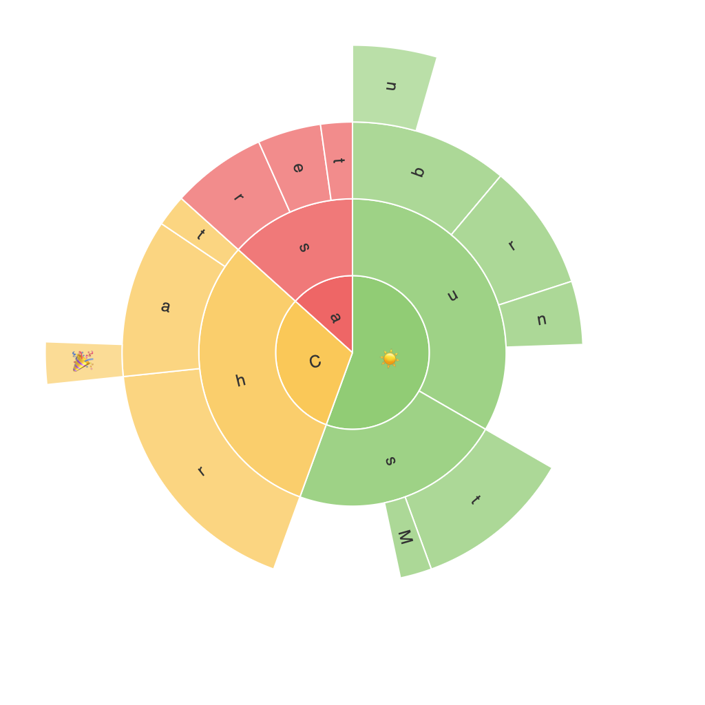
– **Central Core**: This is the root node, representing the top category or overall dataset, often the starting point for all other nodes.
– **Radiating Rings**: Each ring represents a level in the hierarchical structure. These rings progressively break down the data into finer categories, with each sector within a ring representing a specific subcategory.
– **Leaf Sector Sections**: At the outermost ring of a sunburst chart, the smallest sections, also known as leaves, represent the most detailed, granular data.
### Enhancing Visual Clarity
The effectiveness of a sunburst chart lies in its ability to condense hierarchical information into a visually comprehensible format. Here are some strategies for enhancing the readability and comprehension of sunburst charts:
– **Consistent Color Coding**: Utilizing a consistent color scheme across the chart not only enhances the visual appeal but also aids in differentiating between categories, making it easier for viewers to track the data flow and hierarchy.
– **Optimal Data Density**: While the complexity and depth of a sunburst chart can be very informative, it can also overwhelm the viewer. Careful selection and trimming of data ensure that the chart remains clear and not overly crowded, thereby maintaining the chart’s readability.
– **Interactivity**: Incorporating interactive elements, such as clickable sectors or animations that reveal the hierarchy on hover, can significantly enhance user engagement and data comprehension.
### Enhancing Storytelling with Sunburst Charts
Sunburst charts are an invaluable tool in storytelling due to their unique ability to visually represent complex relationships and hierarchies. Here’s how to leverage this aspect effectively:
– **Focus on the Narrative**: Every dataset has a story to tell – identify the main narrative and prioritize the hierarchy that best supports this central message. This involves choosing data that highlights trends, outliers, or significant changes in the information being presented.
– **Highlighting Key Data Points**: Use color, size, or other visual attributes to draw attention to critical data points. This not only makes the chart more engaging but also steers the audience’s focus towards the most important aspects of the data.
– **Contextualization**: Provide a brief introduction or legend that clarifies the chart’s hierarchy and data source. This contextual information is crucial for interpreting the chart correctly and understanding the significance of the story being told.
### Conclusion
Sunburst charts present a unique opportunity to transform complex hierarchical data into an accessible and engaging narrative. By leveraging the right design principles—clear visual presentation, effective use of colors, and strategic interactivity—we can not only streamline our data visualization but also significantly enhance the audience’s understanding and appreciation of the underlying data and its implications.
Mastering the art of creating compelling sunburst charts involves a blend of technical know-how and storytelling skills. With the right approach, these charts can become powerful tools for uncovering insights, communicating information, and compellingly telling data-driven stories.
