Exploring the Visual Brilliance: A Comprehensive Guide to Understanding and Creating Sunburst Charts
Sunburst charts are an intriguing addition to one’s armamentarium of data visualization tools, combining the aesthetics and complexity of a pie chart with the hierarchical depth offered by tree diagrams. This unique type of Radial Visualization is designed to reveal hierarchical structures, making it particularly useful for understanding multi-tiered data and comparing different entities across a range of categories. In an era where data is abundant and complex, the sunburst chart stands as a potent ally in unlocking insights that would otherwise remain hidden in the depths of raw figures.
### What is a Sunburst Chart?
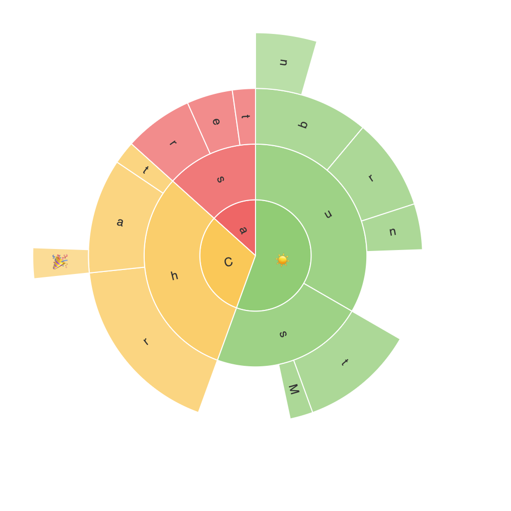
A sunburst chart is a visual representation that illustrates hierarchical data, using concentric circles to display different levels of the hierarchy. Each branch emanates from the center, radiating outwards into sub-branches and potentially further levels of sub-branches, until one arrives at the most detailed categories. The size of each segment radiating from the centre is proportional to its value, providing an immediate visual cue to its importance in the overall structure.
### Understanding the Anatomy of a Sunburst Chart
– **Root Node**: This is the focal point of the chart, often representing the total value or a singular aspect of the hierarchy. It is typically depicted as a full circle in the centre of the chart.
– **Interior Segments**: These represent the sub-categories or sub-slices that belong to each node. Each segment’s size indicates its contribution or value relative to the parent node.
– **Leaf Nodes**: At the furthest points of the chart, these represent the smallest units of the hierarchy, such as specific instances or categories.
### Pros of Using Sunburst Charts
1. **Hierarchical Insight**: Sunburst charts excel at displaying hierarchical data, making it easier to discern relationships and understand complex structures at a glance.
2. **Comparative Visualization**: By visually comparing the size of segments, viewers can quickly gauge the significance, diversity, and inter-relationships of different categories.
3. **Multi-Level Detail**: Unlike traditional pie charts, sunburst charts can reveal multi-tiered information, providing deeper insights into data organization.
4. **Aesthetic Attraction**: With its eye-catching radial layout, sunburst charts can draw attention and make data more engaging.
### Design Considerations for Effective Sunburst Charts
1. **Color Usage**: Employ a clear and distinct color scheme that helps differentiate levels and categories. The color can also add emotional context or categorization.
2. **Layer Separation**: Ensure proper separation between layers and segments to avoid clutter and ensure readability. This is crucial as the chart grows with more data or layers.
3. **Legend and Labels**: Include a legend if the chart is complex or if the labels on the segments overlap. Accurate labels help in clearly conveying the values associated with each segment.
4. **Interactive Elements**: In digital formats, interactive features like hover-over effects, clickable segments, or drill-down functionalities can enhance user engagement and comprehension.
### Creating a Sunburst Chart
Creating a sunburst chart from an Excel file typically involves the following steps:
1. **Data Preparation**: Organize hierarchical data in a tabular format, ensuring each level has a parent-child relationship clearly established.
2. **Creating a Tree Map**: Use Excel’s Tree Map feature to generate an initial visual representation. This can serve as a starting point for converting into a sunburst chart.
3. **Conversion to Sunburst**: Convert your tree map into a sunburst format, which may require external tools or specific Excel add-ins that support such transformations.
4. **Customization**: Adjust colors, labels, and any other design elements to improve clarity and visual appeal.
5. **Review and Revise**: Ensure that the chart is readable and effectively communicates the intended data hierarchy. Iterate on the design until satisfied with the outcome.
In conclusion, sunburst charts offer a powerful alternative to traditional data visualization methods by providing deep insights into hierarchical structures in an aesthetically pleasing manner. By carefully considering their design and implementation, one can harness their full potential for detailed analysis and effective communication.
