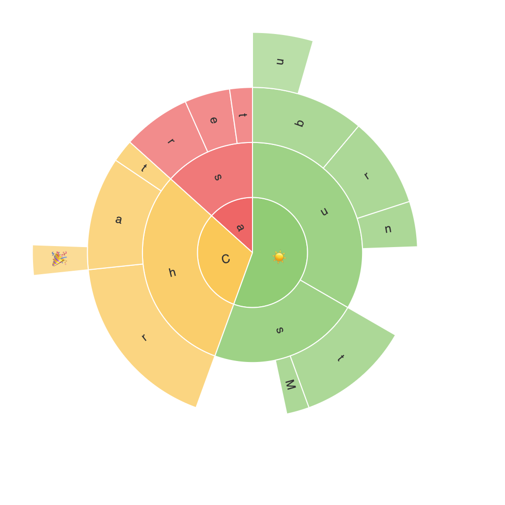
Decoding the Power of Sunburst Charts: A Detailed Guide to Enhancing Data Visualization and Insight Discovery
Sunburst charts are a type of data visualization tool that offer a distinct and intuitive way of understanding complex hierarchical data. Born out of the realm of information graphics, these charts help users uncover patterns, trends, and relationships that might be obscured in other forms of data representation. By decoding the intricacies and potential of sunburst charts, one can significantly enhance one’s ability to visualize and discover valuable insights within datasets. In this comprehensive guide, we will delve into the details of sunburst charts, their distinct advantages, common applications, and best practices for effective implementation.
### Understanding the Structure
**Basic Components**
Sunburst charts are characterized by their circular, multi-level structure, with each level representing a layer of the hierarchy. The innermost circle typically represents the root or the highest-level categories, with subsequent rings expanding outwards, showing subcategories within each level.
**Radiating Lines and Arcs**
Radiating lines emanate from the center, linking points on each ring to the root. Their presence aids in visual identification of the hierarchy and subcategories at each level, making the structure more easily interpretable.
**Color Coding**
Colors are used to distinguish between multiple categories, subcategories, or hierarchical levels, enhancing the chart’s readability and making it easier to follow the relationships between different segments of the data.
### Advantages of Sunburst Charts
**Clarity in Complex Hierarchies**
One of the main advantages of sunburst charts is their ability to simplify and clearly visualize complex hierarchical data sets. This makes them particularly useful in domains with intricate data structures, such as organizational charts, product category trees, or geographical data.
**Insight Discovery**
With their radial layout, sunburst charts make it easier to spot patterns and trends that might not be as evident in tabular data or other forms of visualizations. For example, identifying which subcategory is the largest within each category can be straightforward, aiding in decision-making and strategic planning.
**Efficient Use of Space**
By leveraging the concentric circles, sunburst charts can effectively use a small amount of space to represent a large amount of data, making them a space-efficient choice for presentations and dashboards.
### Common Applications
**Website Navigation**
Sunburst charts are handy in visualizing website navigation patterns or the structure of websites, where they can show which pages are most visited in the hierarchy.
**E-commerce**
In e-commerce, they can illustrate product categories or subcategories, showing how customers explore the product hierarchy and identifying the most popular categories.
**Education and Learning Pathways**
For educational institutions, sunburst charts can outline course structures or learning pathways, helping to visualize the potential paths students might take through a curriculum.
### Best Practices
1. **Limit the Number of Levels**
Keep the chart’s depth manageable. Too many levels can make the chart cluttered and hard to read. Typically, fewer than three hierarchical levels are ideal.
2. **Use Color Wisely**
Employ distinct colors for different categories and maintain a consistent color scheme to enhance readability. Consider the color contrast for accessibility, making sure colors are easily distinguishable and accessible for users with color vision deficiencies.
3. **Add Legends and Tooltips**
Since sunburst charts can be challenging to read fully at a glance, providing legends and tooltips can greatly enhance their usability. Legends help categorize colors, while tooltips can provide additional information about a specific segment when hovered over.
4. **Focus on Hierarchical Data**
Sunburst charts are most effective when applied to hierarchical data. Their structural limitations may detract from their effectiveness when visualizing non-hierarchical data types.
5. **Keep the Data Intuitive**
Ensure that the data is structured in a manner that aligns naturally with the hierarchical layout. Complex or irregular data structures can lead to misleading or misinterpreted visualizations.
### Conclusion
Sunburst charts stand as a potent tool in data visualization, offering a captivating and comprehensive approach to understanding complex hierarchical data. By leveraging their unique layout and design principles, users can not only enhance the visual appeal of their data but also significantly improve insights discovery. Incorporating best practices recommended herein can ensure that sunburst charts are effectively utilized, providing a rich and insightful visualization experience. Whether for academic research, corporate strategy planning, or user experience analysis, the versatility of sunburst charts makes them a valuable addition to the data analyst’s toolkit.
