## Exploring the Visual Potential of Sunburst Charts: A Comprehensive Guide to Data Representation and Analysis
Data visualization techniques are essential tools for turning raw, complex data into understandable information that can be useful for analysis, decision-making, and insight generation. Sunburst charts, also known as ring charts or sun charts, are a distinctive type of visualization that offer an innovative approach to displaying hierarchical data in a visually appealing, easily accessible format. This article aims to explore the depth and versatility of sunburst charts, detailing their construction, unique features, best practices for implementation, and applications across various fields.
### Construction and Unique Features
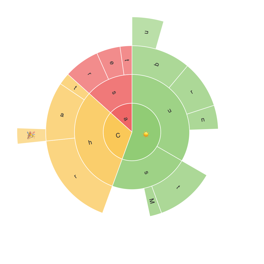
A sunburst chart is a layered visualization where hierarchical data is represented in concentric circles. Unlike pie charts, sunburst charts add additional layers, reflecting the hierarchical structure of the data. Each circle in the chart represents a level in the hierarchy, with the entire structure radiating out from the center, representing the root node. Segments within each circle are typically colored differently to represent categories, with their size based on attributes such as value, count, or other significant metrics within that category.
### Hierarchical Structure Visualization
What sets sunburst charts apart is their ability to display multi-level hierarchical relationships clearly and effectively. The layers of concentric circles help distinguish the levels of the hierarchy, with the outermost circle representing the highest level and the inner circles deeper levels within the hierarchy. This makes it easier for viewers to grasp the relationship between different levels, such as parent and child nodes in tree-like structures.
### Design and Aesthetic Appeal
Sunburst charts are not just powerful but also aesthetically pleasing. The radial layout allows for a compact display of data, making it easy to view many data points without overcrowding the visual space. This feature is particularly beneficial when dealing with large datasets or when the goal is to present data in a space-limited environment, such as dashboards or reports.
### Best Practices for Implementation
When creating a sunburst chart, it’s important to consider a few best practices to ensure clarity and effectiveness:
1. **Hierarchy Clarity**: Clearly define and emphasize the hierarchical structure. The parent-child relationships should be immediately identifiable, guiding the viewer on how the data should be understood.
2. **Color Usage**: Use distinct colors for different segments to aid in quick identification and distinguish between categories. Ensure there’s a good contrast to maintain readability across various visual strengths.
3. **Data Complexity**: Limit the number of levels in the hierarchy to avoid clutter and keep the visualization readable. For very deep hierarchies, consider using additional visual cues like hover text to reveal detailed data.
4. **Layout and Scaling**: Ensure the chart’s radial symmetry is maintained to emphasize the hierarchical layout. Proper scaling of the concentric circles and segment widths is crucial to provide a clear representation without overwhelming the viewer.
### Applications Across Fields
Sunburst charts have a wide range of applications across various fields:
– **Business and Finance**: For visualizing company structures, sales breakdowns, and segment-wise performance analysis.
– **Healthcare**: To explore relationships within patient data, treatment efficacy across different demographic segments, or hospitalization statistics.
– **IT and Software**: In visualizing software architecture, dependency graphs, or traffic analysis in network diagrams.
– **Education**: For mapping educational pathways, student progress levels, or categorizing research outcomes based on themes or subjects.
### Conclusion
The visual potential of sunburst charts lies in their unique capability to visually represent hierarchical data in a compact, readable, and aesthetically pleasing manner. They are a valuable addition to the data visualization toolkit, offering insights that traditional charts can’t convey as effectively. By adhering to best practices and considering the specific needs of the data and the intended audience, you can leverage sunburst charts to enhance the clarity and visual impact of complex data sets.
