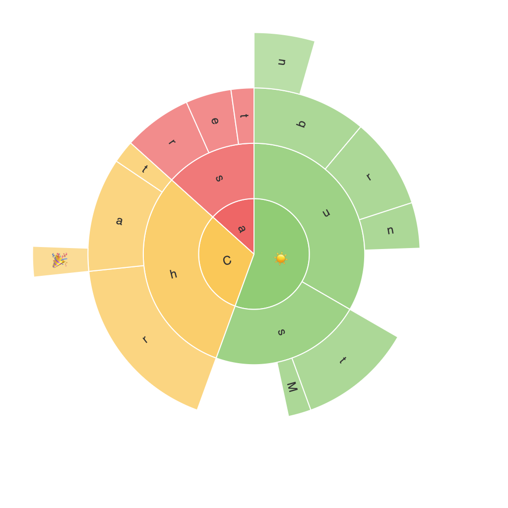
Unlocking Insights with Sunburst Charts: A Comprehensive Guide to Data Visualization with Hierarchical Data
Sunburst charts, a relatively new and innovative form of data representation, have gained much traction in the data visualization domain. With their unique approach to displaying hierarchical data, these charts provide a visually captivating and insightful way to explore, analyze, and communicate complex structures. In this article, we will delve into the intricacies of sunburst charts, their benefits, and how they can be utilized effectively in data visualization to unlock deeper insights from hierarchical datasets.
### What are Sunburst Charts?
Sunburst charts, also known as hierarchical ring charts, display hierarchical data within concentric circles. The outermost circle represents the top-level categories, followed by nested segments for subcategories beneath it, and so on. This nested structure makes it easy to visualize the hierarchical relationships between the various levels of data.
### Key Features and Benefits
1. **Visualization of Hierarchical Structure**: Sunburst charts excel at showing the hierarchical relationships inherent in the data. The hierarchical structure is immediately apparent from the concentric circles and segments, making it easier to understand the data’s organization.
2. **Color Coding**: Colors in sunburst charts can be used to represent different segments, values, or categories. Effective use of color coding can help distinguish between different categories and highlight key data points.
3. **Comparison of Hierarchical Levels**: At each level of the hierarchy, you can compare values across different segments. This comparison is facilitated by the visual proximity and the size of the segments, which helps in identifying significant differences and relationships.
4. **Compact and Space Saving**: Unlike tree maps or other complex visualizations, sunburst charts use space efficiently. They can display a lot of data with a small footprint, making them an excellent choice for visualizing datasets with multiple levels of hierarchy.
5. **Interactive Tools**: In digital formats, sunburst charts can be highly interactive. Users can click on segments to expand them, revealing more detailed information, and tooltips can provide additional context when hovering over segments.
6. **Improved Storytelling**: Sunburst charts are particularly powerful in storytelling because they can narrate the story of the data by visually showing the relationships, proportions, and patterns within the hierarchy.
### How to Create a Sunburst Chart
Creating a sunburst chart typically involves the following steps, whether using software like Tableau, Power BI, or a programming library like D3.js:
1. **Prepare Your Data**: Organize your data in a hierarchical format, with each level clearly defined. Typically, you’ll need columns representing the categories and their subcategories.
2. **Data Import**: Import your data into the chosen tool or platform that supports sunburst charts.
3. **Chart Creation**: Select the sunburst chart creation option. Typically, you would assign the highest level category to the outermost circle, then gradually assign subcategories to nested segments.
4. **Customization**: Customize the chart by adjusting colors, labels, tooltips, and interactivity. This can include adding labels to the segments, adjusting the color palette, and enabling interactive features like drill-down capabilities.
5. **Review and Adjust**: Preview the chart, and adjust the visualization as needed to ensure the data is presented clearly and effectively. Pay attention to the clarity of the data representation and the accessibility to the audience.
### Conclusion
Sunburst charts provide a visually engaging and informative way to explore and present hierarchical data. Their unique structure not only enhances the aesthetic appeal of data visualization but also unlocks deeper insights by illustrating relationships, proportions, and patterns that might be more difficult to discern in tabular or simpler graphical formats. Whether you’re working in data analytics, business intelligence, or any field that deals with hierarchical data structures, incorporating sunburst charts into your analyses can significantly enhance your ability to communicate complex datasets effectively to stakeholders.
