Unlocking Insights with Sunburst Charts: A Comprehensive Guide to Data Visualization and Analysis
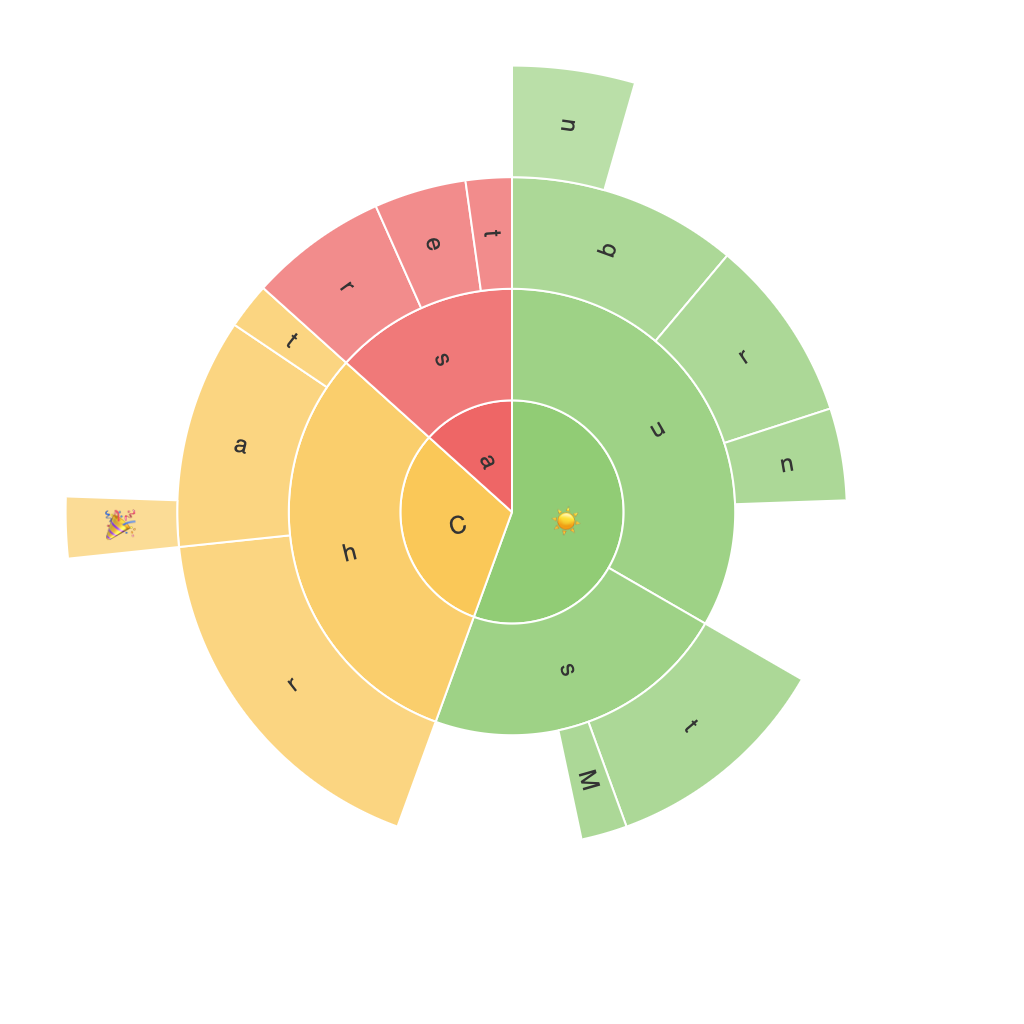
Sunburst charts—also known as treemaps—are a powerful visualization tool for representing hierarchical data in a compact, multi-tiered display. These charts provide an in-depth view, elucidating complex relationships and patterns that might not be evident in other types of charts, such as tree or pie charts. This article provides a comprehensive guide to understanding, creating, and using sunburst charts to unlock insights from your data.
**Understanding Sunburst Charts**
Sunburst charts use concentric circles to represent multiple levels in a hierarchy. Each level splits the outer circle into segments, which are colored differently to distinguish distinct categories or entities. The size of each segment can be adjusted based on the measurement associated with the data it represents, allowing for easy comparison and visualization of significance at each level.
**Creation of Sunburst Charts**
Creating a sunburst chart involves a few key steps:
1. **Data Preparation**: Gather hierarchical data, typically structured in a tree format with parent-child relationships. Ensure your data is organized by category and has quantitative figures to represent, such as sales, growth rates, or customer segments.
2. **Choosing the Right Software**: Several visualization tools support the creation of sunburst charts, including tools like Tableau, Power BI, Microsoft Excel, R, and Python libraries like Plotly and matplotlib.
3. **Mapping Data to Chart Elements**: Assign each category to a segment in each circle level, color segments to differentiate categories, and use size variation to depict different measurements within each level.
4. **Customization**: Adjust visual elements like colors, labels, and transparency to enhance readability and focus on specific data points.
**Benefits of Using Sunburst Charts**
1. **Efficient Visualization of Hierarchical Data**: As mentioned, sunburst charts are ideal for visualizing multiple levels of hierarchy, making it easier to spot trends and patterns in large datasets.
2. **Comparative Analysis**: Due to the radial layout, sunburst charts facilitate quick comparisons across categories within each level, even with a high number of categories.
3. **Space Utilization**: These charts maximize space efficiency, fitting many categories into a small space without overcrowding.
4. **Audience Accessibility**: Sunburst charts are intuitive and don’t require advanced analytical skills to understand, making them useful for both technical and non-technical audiences.
**Examples of Use Cases**
Sunburst charts find application in sectors such as:
– **Business Analysis**: To visualize product categories, sales by product, and individual product sales within categories.
– **Marketing Insights**: Mapping audience segments, customer journey stages, and marketing channel effectiveness across demographics.
– **E-commerce**: Representing categories, subcategories, and individual products with their sales volumes or ratings.
– **Public Sector**: Analyzing budget allocations across departments, agencies, and programs to reveal potential redundancies or disparities.
**Key Tips for Effective Use**
– **Limit Categories at Each Level**: Too many categories can obscure insights due to overlapping segments. Aim for no more than 10 categories per level for clarity.
– **Focus on Key Metrics**: When size is used to represent a metric, it’s crucial that this size corresponds directly to meaningful data to avoid misinterpretation.
– **Use Hover Features**: Implement hover over functionality to display more detailed information as users move around the chart, enhancing interactivity.
– **Annotate Key Insights**: Directly label or indicate parts of the sunburst chart that represent significant findings or changes.
### Conclusion
Sunburst charts offer a unique way to delve into and understand hierarchical data. By leveraging their multi-level design, color-coding, and adjustable sizing, these charts provide sophisticated insights that are often missed in conventional visualizations. Whether you’re analyzing business performance, marketing strategies, or any data with a hierarchy, sunburst charts can serve as a valuable tool in your data analysis arsenal. With proper preparation and strategic use, they can effectively communicate complex data relationships, bringing clarity to decision-making processes.
