Exploring the Visual Power of Sunburst Charts: A Comprehensive Guide to Data Representation and Analysis
Sunburst charts are a type of data visualization tool that can significantly enhance the effectiveness of data representation. These charts are also known as ring charts or sun charts, and they display hierarchical data in a visually appealing and understandable way. By exploring the principles behind sunburst charts, understanding their advantages, and learning how to create them efficiently, data analysts and enthusiasts can unlock the full potential of this powerful visualization technique. This article provides a comprehensive guide to the best practices of data representation and analysis through the lens of sunburst charts.
### What are Sunburst Charts?
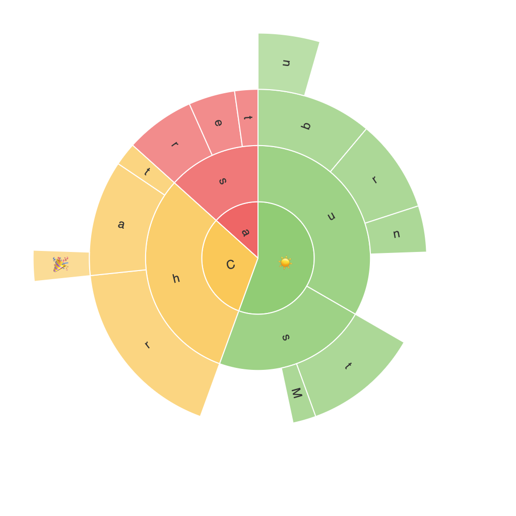
Sunburst charts are radial charts that display hierarchical data as nested segments in concentric rings. Each level of the hierarchy is represented by a ring, with the outermost ring depicting the highest-level category, followed by the next ring for subcategories, and so on. The segments within each ring represent individual items within the hierarchy, with the size of the segment often proportional to specific values (for example, total sales, quantity of items, etc.).
### Advantages of Sunburst Charts
#### 1. Hierarchical Data Visualization
One of the primary strengths of sunburst charts is their ability to represent hierarchical data in a clear and compact manner. This makes it easier to identify and understand relationships between different categories and subcategories at a glance, which can be challenging in other types of charts.
#### 2. Effective Space Utilization
Sunburst charts can pack a large amount of data in a relatively small space, making them an effective choice for comparing multiple complex hierarchies in a single chart. This compact representation can be particularly useful in dashboards or presentations where space is at a premium.
#### 3. Enhanced Visual Hierarchy
By placing more prominent categories closer to the center of the chart, users can easily distinguish between higher and lower ranks, leading to faster comprehension and ease of navigation through the data. This visual hierarchy can guide users’ attention to the most significant items without explicitly marking them.
### How to Read Sunburst Charts
#### Understanding the Layers
In a sunburst chart, each layer (ring) represents a different level in the hierarchy. The root node is at the center of the chart, with its children spread out at the first ring. Each segment in a ring then contains segments of its own children, creating a branching structure. This allows viewers to understand the structure and relationships between items easily.
#### Segment Size and Color
The size of a segment typically corresponds to a specific value, such as the volume or magnitude of the data it represents. Custom colors can be used to highlight specific segments or categories, which can draw attention to important data points or patterns in the data.
### Setting up and Creating Sunburst Charts
There are several tools and software available to create sunburst charts, including Tableau, Power BI, and advanced versions of Excel. Here is a general guide on how to create them:
#### 1. Data Preparation
Organize your data into a hierarchical format, where categories are listed in a parent-child relationship. Ensure that each level is correctly nested to reflect the hierarchy.
#### 2. Selecting the Right Software
Choose a tool that supports sunburst charts. Most modern data visualization software includes this feature.
#### 3. Inputting Data
Import your data into the software and configure the chart settings to reflect the hierarchy. Most tools will allow you to drag and drop fields to define the structure of the chart.
#### 4. Customization
Customize the appearance of your chart. This includes adjusting segment colors, adding labels, and potentially modifying the size of segments based on specific criteria.
#### 5. Review and Analyze
Once the chart is set up, review it for any data inconsistencies or visual errors. Analyze the insights that the visual representation offers – a well-designed sunburst chart can quickly highlight trends, outliers, and patterns in complex data sets.
### Conclusion
Sunburst charts offer a unique way to visualize hierarchical data in graphical form, providing a clear and aesthetically pleasing presentation that enhances data comprehension. By understanding the principles behind these charts and knowing how to create them effectively, analysts and data enthusiasts can make the most out of this powerful tool for enhancing the presentation and understanding of complex, hierarchical datasets.
