### Exploring the Visual Power of Sunburst Charts: A Comprehensive Guide to Enhancing Data Interpretation
Sunburst charts serve as an innovative tool in data visualization, providing a unique way to present hierarchical data and offering significant insights through their visually rich structure. This article aims to delve into the comprehensive exploration of sunburst charts, discussing their definition, significance, construction, implementation, and broader usage scenarios to unveil their potential in enhancing the interpretation of complex data sets.
#### Definition and Significance
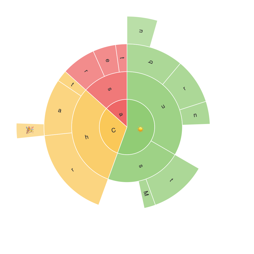
Sunburst charts, also known as hierarchical ring charts, are a type of circular diagram that offers a three-dimensional perspective to represent hierarchical data. Each concentric ring in a sunburst chart symbolizes a layer of the hierarchy, with the outermost ring typically displaying the highest level of categorization, decreasing inward toward the center. This visual representation allows for the easy identification of subcategories and the relationships between different levels, making it particularly useful for datasets that have multiple levels of categorization.
The significance of sunburst charts lies in their ability to simplify the understanding of complex hierarchical relationships, thereby enhancing data interpretation. They are especially effective in areas that require the analysis of multi-level structures, such as company organizational structures, website navigation, product category compositions, and more.
#### Construction of Sunburst Charts
Creating a sunburst chart typically involves the following steps:
1. **Data Preparation**: Gather and organize your data in a hierarchical format. Each item or node in the hierarchy should be assigned a category, parent node, and value. Values could represent the size of each node when it is expanded, allowing the chart to dynamically adjust its area and color intensity based on quantity or importance.
2. **Using Software or Tools**: Utilize visualization tools like Tableau, Power BI, or programming libraries such as D3.js for web development, or Python libraries like Matplotlib or Plotly, to build the chart. These tools provide functionalities to easily input your hierarchical data and configure the visual elements of the sunburst chart.
3. **Design Customization**: Customize the appearance of the chart to enhance readability and aesthetics. This can include adjusting colors, fonts, and label positions, ensuring that the chart is not only informative but also visually appealing.
4. **Interactive Capabilities**: For an enhanced user experience, enable interactivity. This could involve drilling down and expanding nodes to reveal more detailed information or utilizing tooltips to display information on hover.
#### Implementation and Usage Scenarios
Sunburst charts find application across a wide array of industries and fields:
– **Business Intelligence**: Analyzing company sales structures by department, region, or product categories.
– **Web Analytics**: Displaying website navigation patterns by user journey stages, allowing insights into user behavior and preferences.
– **Marketing**: Mapping campaign success by different customer demographics, product tiers, or media channels.
– **E-commerce**: Visualizing product trees to illustrate combinations and variations within product categories.
– **Project Management**: Overseeing the allocation of resources across different project phases or departmental expenditures.
### Conclusion
The power of sunburst charts in enhancing data interpretation stems from their ability to visualize intricate hierarchical relationships in a compact, intuitive, and aesthetically pleasing manner. By following their definition, understanding their significance, crafting their construction, implementing them in various scenarios, and leveraging their interactive features, one can effectively leverage this visualization technique to gain deeper insights and make data-driven decisions. Whether analyzing corporate structures, web navigation paths, or complex product compositions, sunburst charts serve as a powerful tool in the data visualization arsenal, enhancing our understanding of hierarchical information.
