Exploring the Radiant Insights of Sunburst Charts: A Comprehensive Guide to Visualizing Hierarchical Data
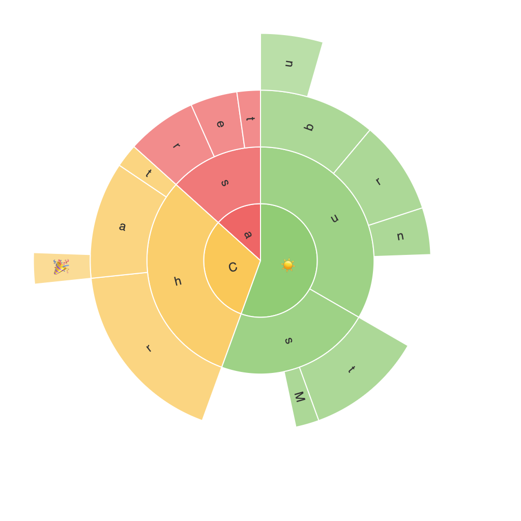
Sunburst charts are a form of circular diagrams used for visualizing hierarchical or nested data. This chart type is an extension of a simple pie chart that adds additional dimensions, making them versatile tools in data visualization. By displaying hierarchical data in a radial format, sunburst charts offer unique insights that make them suitable for a wide range of data analysis tasks.
### Key Components of a Sunburst Chart
#### 1. Root
At the center of the chart is the root node, which acts as the starting point for all hierarchical relationships and often represents the category that contains all the data being visualized.
#### 2. Segments (Wedges)
The segments or wedges emanating from the root represent each child node within the hierarchy. The size of the segment usually corresponds to a specific measure or value associated with the node.
#### 3. Sub-Segments
Within each segment, you can display sub-segments to represent child nodes of the parent nodes. This multilevel branching structure allows for detailed exploration of nested relationships within the data.
#### 4. Colors
Colors are commonly used to distinguish different categories and subcategories, making it easier to identify patterns, differences, or similarities within the data structure.
### Utilizing Sunburst Charts for Hierarchical Data Visualization
Sunburst charts are particularly advantageous for organizing data into clear, comprehensible layers, making hierarchical relationships easier to identify and interpret. Here are some common use cases for utilizing sunburst charts:
#### 1. **Financial Analysis**
Sunburst charts are ideal for illustrating income or expense breakdowns, where the root node might represent overall profits or costs, and the branches represent different categories, and the sub-branches represent subcategories or detail levels.
#### 2. **Marketing Analysis**
For analyzing product categories, sunburst charts can display primary categories (e.g., Electronics, Furniture, Clothing) and under each, secondary categories (Smartphones, Laptops, Home Decor), and tertiary categories with the specific products.
#### 3. **Web Analytics**
In digital marketing, sunburst charts can effectively display page flows, click paths, or user journey navigation across different sections, channels, or funnels on a website.
#### 4. **Sales Performance**
Visualizing sales by product categories and subcategories, with top-performing items clearly indicated, can offer insights into market trends, product popularity, and sales performance.
### Tips for Enhancing Readability and Insight
– **Limit the Depth**: Keep the number of hierarchical levels manageable to avoid clutter. Typically, a sunburst chart should not exceed four levels to maintain readability.
– **Use Consistent Colors**: Assign unique color codes to represent categories without overloading. This helps in quickly identifying different segments and understanding the hierarchy.
– **Highlight Important Data Points**: Utilize different sizes, bold texts, or contrasting colors for key data points or categories to draw attention to them.
– **Interactive Elements**: Implement interactive features such as tooltips, zooming, or hovering effects to explain details more efficiently and keep users engaged.
### Conclusion
Sunburst charts offer a visually engaging and informative method for understanding complex hierarchical data sets. They are particularly useful for conveying multiple levels of relationships and dimensions in a compact, intuitive format. By leveraging their unique structure, data analysts, business managers, and decision-makers can uncover trends, patterns, and relationships that might be obscured in less sophisticated visualizations. As with all data visualization tools, the key to success in using sunburst charts lies in thoughtful design and the strategic choice of information to display.
