—
## Exploring the Visual Power of Sunburst Charts: A Comprehensive Guide to Data Representation and Interpretation
Sunburst charts, with their unique appearance, have emerged as a powerful alternative in the visualization arsenal for data representation. This article aims to explore the visual power of sunburst charts, their characteristics, applications, and how they can be leveraged for effective data interpretation.
### Understanding Sunburst Charts
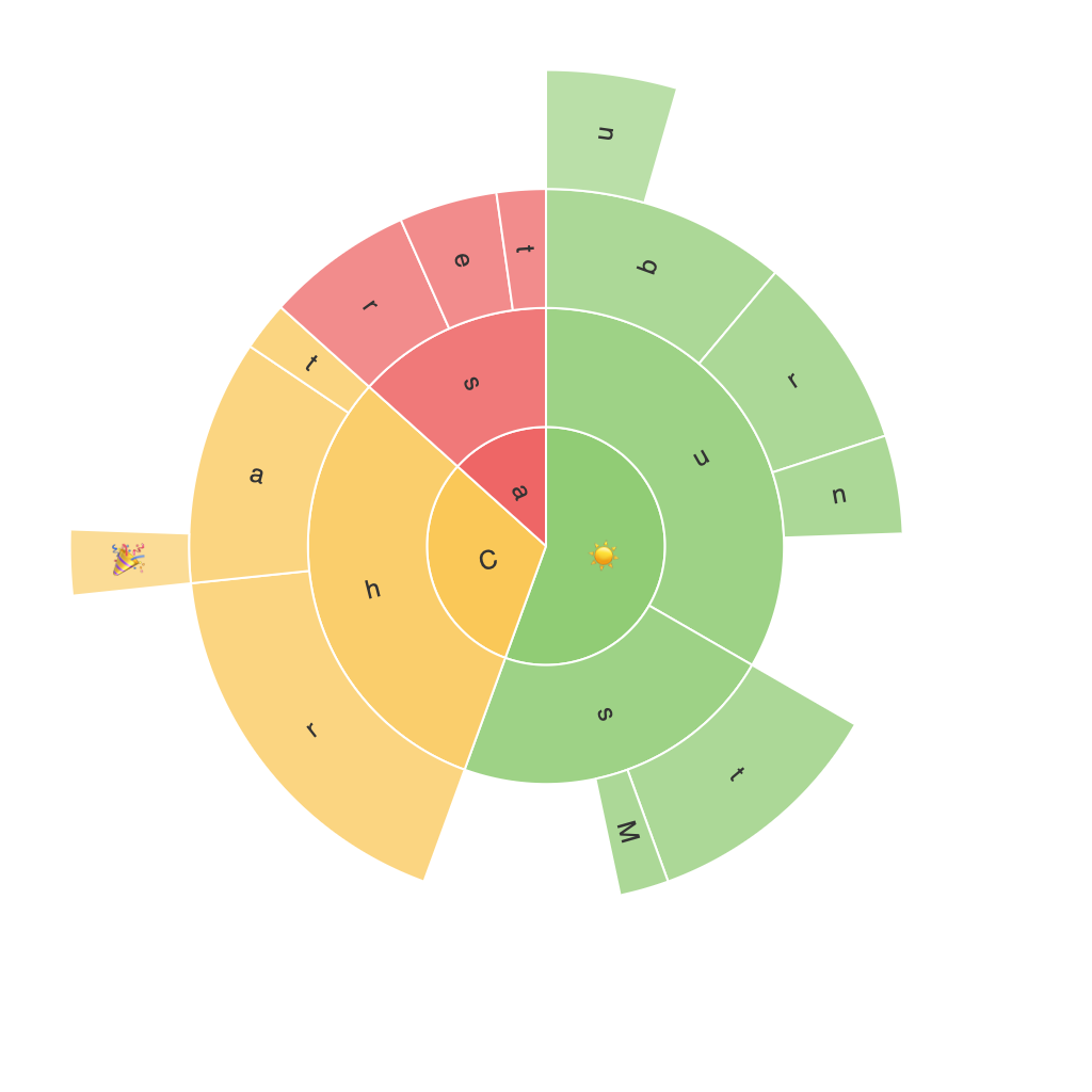
Sunburst charts, or radial treemaps, display hierarchical data in a visually appealing manner. They start from a central point, expanding outward in concentric rings, which mirror the hierarchical structure of the data they represent. Each ring is divided into segments—sectors within sectors—where the size of each sector can correspond to a specific metric, such as quantity, percentage, or scale, depending on the data.
### Key Features of Sunburst Charts
1. **Hierarchical Data Visualization**: Sunburst charts are perfect for displaying data across multiple levels of depth, making complex hierarchical data more accessible. This feature enables users to see how parts contribute to totals across different levels of a hierarchy.
2. **Color Coding**: Each segment of the chart can be assigned a color, further distinguishing parts of the data and helping in visual comparisons and categorizations.
3. **Interactive Exploration**: In digital formats, sunburst charts can be highly interactive, allowing users to zoom in on specific parts of the chart, hover over sectors for details, or split rings to explore subsections in more depth.
4. **Space Efficiency**: Unlike other hierarchical visualization methods that can become cluttered with complexity, sunburst charts make use of the available space to reduce visual clutter while still conveying hierarchical structure.
### Applications of Sunburst Charts
Sunburst charts are versatile and find their applications across various fields, such as:
– **Healthcare**: Analyzing data to understand the breakdown of expenditures in healthcare services or patient demographics.
– **Business Intelligence**: Examining revenue data across different market segments or product categories to identify trends and patterns.
– **Financial Services**: Visualizing the allocation of assets across various investment categories to gain insights into financial structures and performance.
### Interpreting Sunburst Charts
**Identification of Domains and Subdomains**: Users can easily identify major categories (domains) and their subdivisions (subdomains), making it easier to see how smaller parts contribute to the whole.
**Comparison of Contributions**: Sunburst charts allow for quick comparison of contributions between different parts, aiding in identifying the most significant contributors to a given total.
**Hierarchical Insights**: The radial structure of sunburst charts helps in understanding the relationships and dependencies within hierarchical data, revealing insights that might not be apparent in traditional bar charts or tree maps.
### Creating Effective Sunburst Charts
To create an effective sunburst chart, consider the following tips:
1. **Choose Appropriate Metrics**: Assign meaningful metrics to each level of the hierarchy, focusing on metrics that best represent the data and the insights you wish to draw.
2. **Keep it Simple**: Avoid overly complex hierarchies that can confuse the viewer. Opt for a manageable depth where the chart remains clear and visually accessible.
3. **Apply Color Strategically**: Use color to enhance readability and highlight important data points or categories. Ensure color distinctions are accessible to users with color blindness.
4. **Incorporate Interactivity**: If using digital platforms, incorporate interactive features like tooltips, zoom, and split functionality to engage users and make exploration of data more intuitive.
5. **Use Adequate Spacing**: Ensure there is enough space between sectors to avoid clutter and maintain clarity, which can enhance the overall readability and aesthetics of the chart.
### Conclusion
In summary, sunburst charts offer a visually engaging and powerful method for representing hierarchical data. Their unique radial design not only enhances visual appeal but also provides insights into complex structures through easily digestible, interactive visualizations. By leveraging the features of sunburst charts effectively, organizations can gain deeper understanding and make more informed decisions based on complex data sets. Whether used in business intelligence, finance, healthcare, or any other field requiring nuanced analysis of hierarchical data, the visual power of sunburst charts shines as a valuable tool in data representation and interpretation.
