Exploring the Visual Power of Sunburst Charts: A Comprehensive Guide to Understanding, Creation, and Application
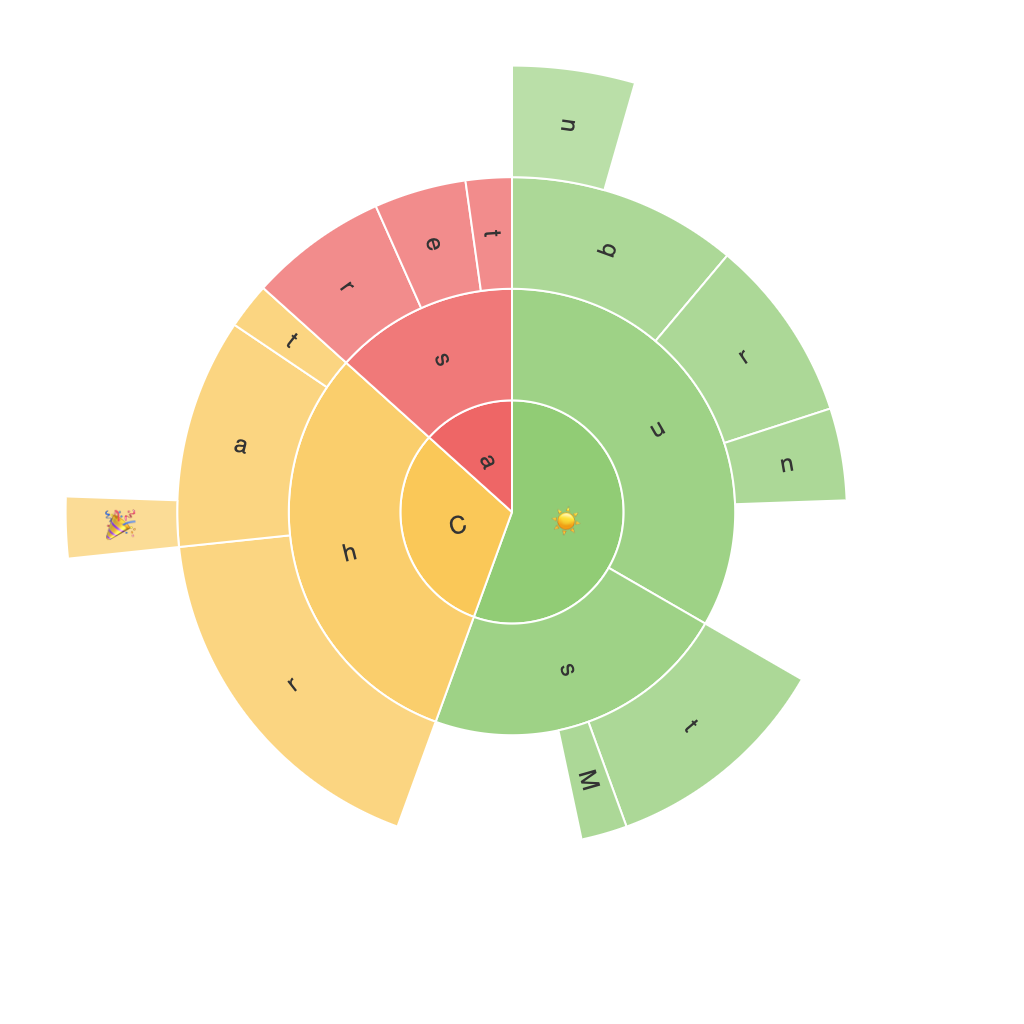
Sunburst charts are an interesting and unconventional form of visual representation capable of displaying hierarchical data in an aesthetically pleasing manner. Unlike traditional pie charts, sunburst charts offer an intuitive, multi-leveled view enabling users to understand and analyze complex data structures with ease. This comprehensive guide dives deep into the understanding, creation, and application of sunburst charts, illuminating their unique advantages and offering practical insights for data visualization enthusiasts.
### Understanding Sunburst Charts
A sunburst chart is essentially a radial tree diagram, featuring a central hub from which segments radiate outwards. Each segment represents a category, with its size corresponding to the category’s importance or value. Sub-segments nested within represent subcategories, offering a visual hierarchy that allows for the representation of multiple levels of data complexity within a single chart. The visual appeal and hierarchical structure make it particularly useful for visualizing relationships in data across different levels of abstraction.
### Key Features
**Hierarchical Structure:** Sunburst charts excel in visualizing data with hierarchical relationships, displaying both top-level categories and their subcategories within concentric rings.
**Size Proportional Elements:** The area of the segments is proportional to the value they represent, providing a quick visual comparison between categories.
**Flexible Customization:** The number of levels and visual elements can be varied according to the data. This scalability makes them applicable across different data volumes and complexities.
**Interactive Elements:** Modern tools allow users to click or hover over segments to reveal more data or drill down into subcategories, enhancing user engagement and interaction.
### Creation of Sunburst Charts
#### Preparation of Data
Before creating a sunburst chart, ensure your data is organized hierarchically, with each row denoting a category, and columns for the names of parent categories and the category values.
#### Tool Selection
Select a data visualization tool that supports the creation of sunburst charts. Tools like Tableau, Power BI, or software libraries such as D3.js for web applications provide robust options for both creating and customizing sunburst displays.
#### Chart Setup
1. **Define Categories**: Input your categories and specify the hierarchy in the tool’s dataset or attribute panel.
2. **Select Hierarchical Column**: Choose the column representing your categories’ hierarchy, ensuring that each category is nested within a parent to maintain the hierarchy structure.
3. **Define Value Column**: Specify the column that contains the values to be represented by the size of each segment.
4. **Customize Style**: Adjust colors, labels, and other visual elements as per your requirements. Customizing these elements can improve readability and enhance the chart’s aesthetic appeal.
### Application in Data Analysis
#### Business Intelligence
In the realm of business intelligence, sunburst charts can provide stakeholders with a clear, holistic view of organizational data, such as revenue breakdowns across different departments or product categories.
#### Marketing Analysis
For marketing teams, sunburst charts can visualize customer purchase journeys, product assortments, and campaign performances, showing how various factors intersect to affect outcomes.
#### Information Architecture
In fields that deal with information architecture, like web development or information design, sunburst charts can help map complex data structures or categorize content, improving user navigation and accessibility.
#### Educational Purposes
Educators can use sunburst charts to demonstrate hierarchical data structures in a subject like economics, biology, or even literature, providing students with a visual understanding of complex concepts.
### Conclusion
Sunburst charts are a powerful tool for presenting hierarchical data in an engaging and easy-to-understand manner. By offering a unique visual interface that allows for the exploration of data at multiple levels of detail, they facilitate deeper insights and more effective communication within various professional and educational contexts. Mastering the intricacies of creating and interpreting sunburst charts can lead to more sophisticated data analysis and more compelling data presentations.
