Title: Unleashing the Power of Sunburst Charts: A Comprehensive Guide to Visualization and Data Analysis In the era of big data, finding effective ways to visualize and interpret complex data sets has never been more important. One innovative method gaining prominence in the data visualization landscape is the sunburst chart. This article delves into the world of sunburst charts, exploring their unique features, applications, and benefits in the realm of data analysis. ### Introduction to Sunburst Charts A sunburst chart, also often referred to as a doughnut chart or a multi-level pie chart, is a radial visualization that presents hierarchical data. Each level of the chart represents a different category in the data, with the innermost circle showing the top-level categories and subsequent levels providing increasingly detailed breakdowns. ### Key Features of Sunburst Charts **Hierarchical Representation**: Unlike traditional pie charts, sunburst charts excel in displaying data in a hierarchy. This makes it easier to perceive relationships between categories and subcategories. **Space Efficiency**: Sunburst charts utilize the radial space efficiently, allowing for the display of a significant amount of hierarchical data within a relatively compact space on a single chart. **Customizability**: The visual design of sunburst charts is highly customizable, offering options to color code different sections, alter the display order, and adjust various visualization parameters to enhance readability and engagement. ### Practical Applications Sunburst charts are particularly effective in industries that require deep analysis of complex data structures, such as: – **Market Analysis**: Companies can use sunburst charts to visualize market shares across different product categories, breaking down sales data by territory, industry, and product type. – **Organizational Structure**: In human resource management, these charts can illustrate the hierarchy within a company, showing how responsibilities and resources are allocated across departments and teams. – **Data Segmentation**: Sunburst charts are invaluable in data science for segmenting data sets, showing the relationship between various factors such as customer demographics, purchase history, and product categories. ### Benefits and Limitations **Benefits:** – **Enhanced Perceptual Analysis**: Sunburst charts facilitate the identification of patterns, trends, and anomalies within complex data hierarchies, making them particularly useful for detailed analysis. – **Aesthetic Appeal**: With customizable visual aesthetics, including color schemes and tooltips, sunburst charts can engage the viewer and make data more accessible. **Limitations:** – **Complex Data**: Sunburst charts can become cluttered with too much data at higher levels, potentially confusing the viewer. It’s crucial to maintain a balance between data inclusion and chart clarity. – **Interpretation Difficulty**: For viewers who are not familiar with the format, interpreting the chart may be more challenging than reading a simple pie chart or bar chart. ### Conclusion As data complexity continues to increase, the demand for versatile and insightful data visualization methods also grows. Sunburst charts offer a powerful tool for those tasked with creating clear, hierarchical representations of data. By harnessing the unique features and applications of this chart type, users can gain a deeper understanding of their datasets, uncover new insights, and communicate information more effectively. For professionals and enthusiasts looking to enhance their data analysis toolkit, the sunburst chart is an emerging gem that deserves significant attention.

Unleashing the Power of Sunburst Charts: A Comprehensive Guide to Visualization and Data Analysis

In today’s data-driven world, the ability to visualize and interpret complex datasets effectively is a highly sought-after skill. A rising star in the data visualization landscape is the sunburst chart, a type of chart that represents hierarchical data using a radial layout. This article delves into the unique features, applications, and benefits of sunburst charts in data analysis.

### Introduction to Sunburst Charts

A sunburst chart is a type of graphical representation that is similar to both a pie chart and a doughnut chart but with a hierarchical twist. Circles of varying radii are formed concentrically, with each level representing different attributes in the data. The inner circle contains the top-level categories, while subsequent circles progressively add more detail. This radial shape provides a distinctive way to perceive relationships among different levels of data.

### Key Features of Sunburst Charts

Sunburst charts offer several advantages:

**Hierarchical Representation:** This feature allows users to view data through a lens of organization, making it easy to identify relationships among high-level variables and their subcategories.

**Space Efficiency:** One of the unique characteristics of sunburst charts is their ability to conserve space, enabling the visualization of a large amount of hierarchical data in a compact layout.

**High Customizability:** Sunburst charts offer a high degree of customization, including color customization, layer arrangement, and interactive features, which enhance data presentation and user engagement.

### Applications of Sunburst Charts

Sunburst charts find applications in various fields, including:

– **Market Analysis:** For businesses, sunburst charts aid in understanding market segments and their shares, breaking down the data by parameters such as location, industry, or product categories.

– **Organizational Structure Analysis:** In the field of human resources, these diagrams help in visualizing the hierarchy of an organization, illustrating the allocation of responsibility and resources across departments and levels.

– **Data Segmentation:** In data science, the charts are used for data segmentation, analyzing relationships between different factors, such as demographics and purchase history.

### Advantages and Limitations of Sunburst Charts

**Advantages:**

– **Enhanced Perceptual Analysis:** Sunburst charts enable users to perceive patterns, trends, and anomalies within complex hierarchical data, making detailed analysis much more accessible.

– **Aesthetic Appeal:** With customizable visual elements, such as colors and tooltips, these charts can significantly enhance user engagement and make data presentation more appealing.

**Limitations:**

– **Managing Complexity:** As the number of categories increases, the visualization can become cluttered and may confuse viewers. Balancing content and clarity is key.

– **Interpretation Difficulty:** Since sunburst charts might not be as familiar to all audiences, they might require additional explanation to provide full context and ensure accurate interpretation.

### Conclusion

In summary, sunburst charts provide a unique and powerful visualization tool for handling highly structured and hierarchical data. The ability to present complex information in a visually intuitive manner makes them increasingly popular for both analytical and illustrative purposes. Users interested in enhancing their data visualization capabilities should consider incorporating sunburst charts into their data analysis toolkit to gain deeper insights and effectively communicate data complexities to various audiences.
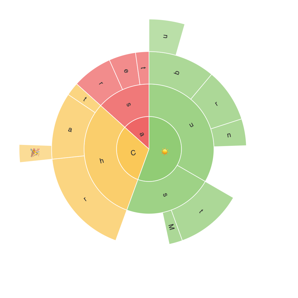
SunBurstMaster | Ultimate sunburst chart maker!