Exploring the Depth and Richness of Sunburst Charts: A Comprehensive Guide to Mastering this Advanced Data Visualization Technique
The world of data visualization holds a key to unlocking hidden patterns and insights often submerged beneath layers of abstract information. Among the various visualization techniques, the sunburst chart stands out for its effectiveness in providing a clear and engaging way to represent hierarchical data. This article serves as an in-depth guide to understanding and utilizing sunburst charts, demystifying their complexities and elucidating their true potential in enhancing data analysis.
### Introduction to Sunburst Charts
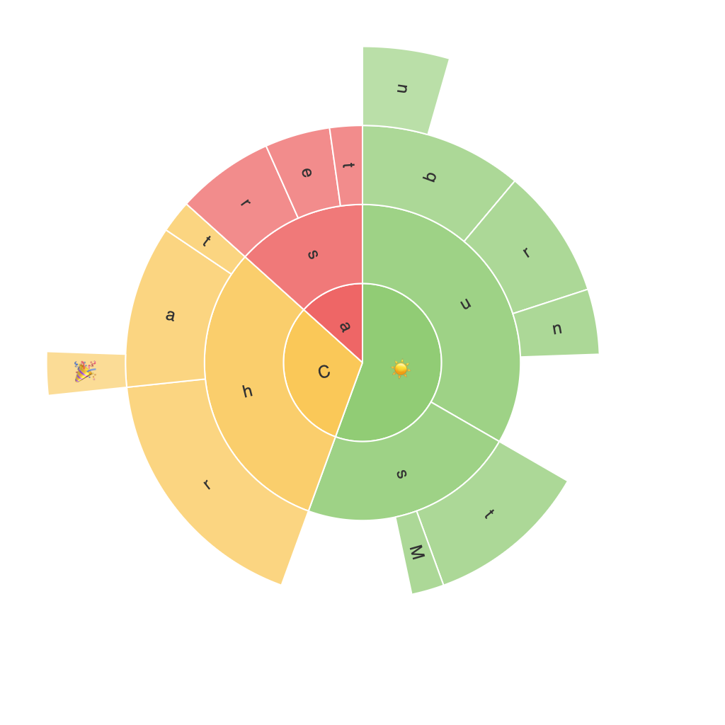
Sunburst charts, also known as sun charts or multi-level pie charts, are graphical representations that use concentric circles to display hierarchical data. The central circle represents the root node of the hierarchy, and as the chart branches out, smaller circles represent subgroups or children of the nodes, forming a bouquet-like structure.
### Advantages of Sunburst Charts
1. **Visual Clarity**: Sunburst charts excel at showcasing the relationships between parts and the whole, making it easier to understand hierarchical structures.
2. **Efficient Space Utilization**: Unlike some comparative visual aids, sunburst charts do not scale with the addition of more data points, making them suitable for large datasets with many levels.
3. **Unique Insights**: The radial positioning of data elements allows for the visualization of patterns in the distribution of categories, which might not be as apparent in traditional flat charts or tables.
### Construction of a Sunburst Chart
To create a sunburst chart effectively, the first step involves defining the hierarchical structure of your data. The root category becomes the central circle, while categories under it populate concentric circles sequentially. Each circle segment’s size represents the proportion of that category within its parent, and further segments within can represent subcategories under each of those.
### Best Practices for Utilizing Sunburst Charts
#### 1. **Data Organization**: Ensure your data is structured hierarchically, with clear levels and subcategories. Tools like Excel, R, Python with libraries such as Plotly or Bokeh, or web-based platforms like Tableau are well-suited for creating sunburst charts.
#### 2. **Effective Label Placement**: Make sure the labels are not overcrowded. Consider using hover effects for labels on interactive charts, showing detailed information upon hovering over a segment.
#### 3. **Color Coding**: Use distinct colors for each level, which not only enhances readability but also improves visual appeal, making it easier to distinguish between different categories and levels in the hierarchy.
#### 4. **Interactive Elements**: Interactive versions of sunburst charts allow users to drill down into different levels of the hierarchy. Adding hover effects, tooltips, and clickable sections can provide a more engaging and immersive experience, enabling users to explore data in detail at their own pace.
#### 5. **Avoid Complexity**: While sunburst charts excel in complexity, they can quickly become overwhelming if there are too many levels and categories. Consider using a tree map for deeply nested categories or focusing on more significant hierarchical segments only.
### Conclusion
Sunburst charts are a powerful tool in a data analyst’s arsenal, serving as a unique and visually engaging way to explore and understand hierarchical data. By mastering their construction, organization, and presentation, you can leverage these charts to uncover valuable insights and communicate complex structures effectively to a wide range of stakeholders. Whether used in business intelligence, academic research, or consumer analytics, the ability to turn hierarchy into an easily digestible visual format is a significant advantage in making data accessible and actionable.
