Unlocking Insights with Sunburst Charts: A Comprehensive Guide to Visualizing Hierarchical Data
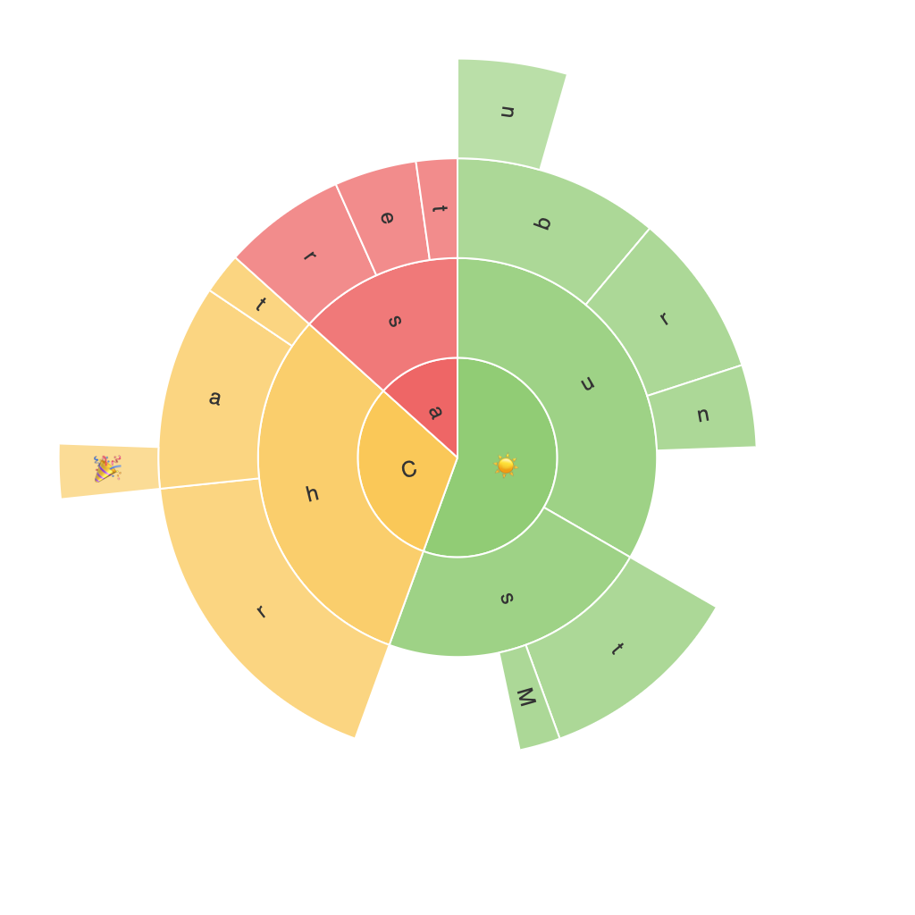
Sunburst charts are a visually-engaging way to represent hierarchical data, allowing you to explore complex and layered information in an easily digestible format. Unlike traditional pie charts, which display one level of hierarchy, sunburst charts can illustrate multiple hierarchical layers simultaneously. This article will take you through the basics of creating, analyzing, and interpreting sunburst charts, providing you with the tools you need to unlock insights from your data.
### Step 1: Understanding the Basics
A sunburst chart is a hierarchical version of a doughnut chart, where the outermost ring represents the highest level of hierarchy, and each inner ring represents a subsequent level. The segments within each ring represent the different categories at that level, and their contribution to the whole is easily visualized by their size. This structure is especially useful when visualizing data with a tree-like structure.
### Step 2: Data Preparation
To create a sunburst chart, you first need to prepare your data. Your data should be structured in a hierarchical format, with each level of hierarchy represented by one or more columns in your dataset. Typically, you have an outermost column representing the top-level categories, followed by additional columns for the next levels, and so on.
### Step 3: Creating the Chart
#### Software Tools:
1. **Tableau:** Offering a drag-and-drop interface for creating sunburst charts, Tableau is a user-friendly choice for those new to the visual analytics tool.
2. **Datavisualization.cc:** This online tool can generate sunburst charts directly from your data, making it easy for non-technical users to create charts.
3. **R (ggplot2 package):** For users comfortable with coding, R provides extensive customization options and powerful libraries like ggplot2 to create and modify sunburst plots.
### Step 4: Enhancing Your Sunburst Chart
**Customization:**
– **Color Schemes:** Choose colors to represent different categories or levels, enhancing readability and adding thematic relevance.
– **Sizing and Labeling:** Adjust the size of segments based on the number of subcategories or the value of data, and label segments clearly, both visually and by tooltips or legends.
**Comparing Data:**
– Use sunburst chart animations to compare changes over time or to emphasize relationships between different levels.
### Step 5: Analyzing the Data
#### Key Observations:
– **Relative Sizes:** The relative sizes of segments can quickly reveal dominant categories or small contributors within larger ones.
– **Patterns and Relationships:** Analyze the overlapping patterns of rings and segments to uncover relationships and dependencies between categories.
– **Trends Over Time:** If working with time series data, the layering in a sunburst chart can highlight trends across different time periods.
### Step 6: Best Practices for Effective Communication
– **Clarity:** Ensure that the chart conveys the necessary information clearly. Avoid overcrowded segments.
– **Consistency:** Keep labels and color schemes consistent to support easy reading and comparison.
– **Accessibility:** Consider the needs of your audience and use color blindness-friendly color palettes if necessary.
### Conclusion
Sunburst charts transform mundane hierarchical data into visually engaging insights. By understanding their structure, leveraging the right tools, and following best practices, you can unlock valuable information from your hierarchy data, making it accessible and comprehensible to all stakeholders. Experiment with different data sets and chart configurations to find the optimal way to tell your data’s story with a sunburst plot.
