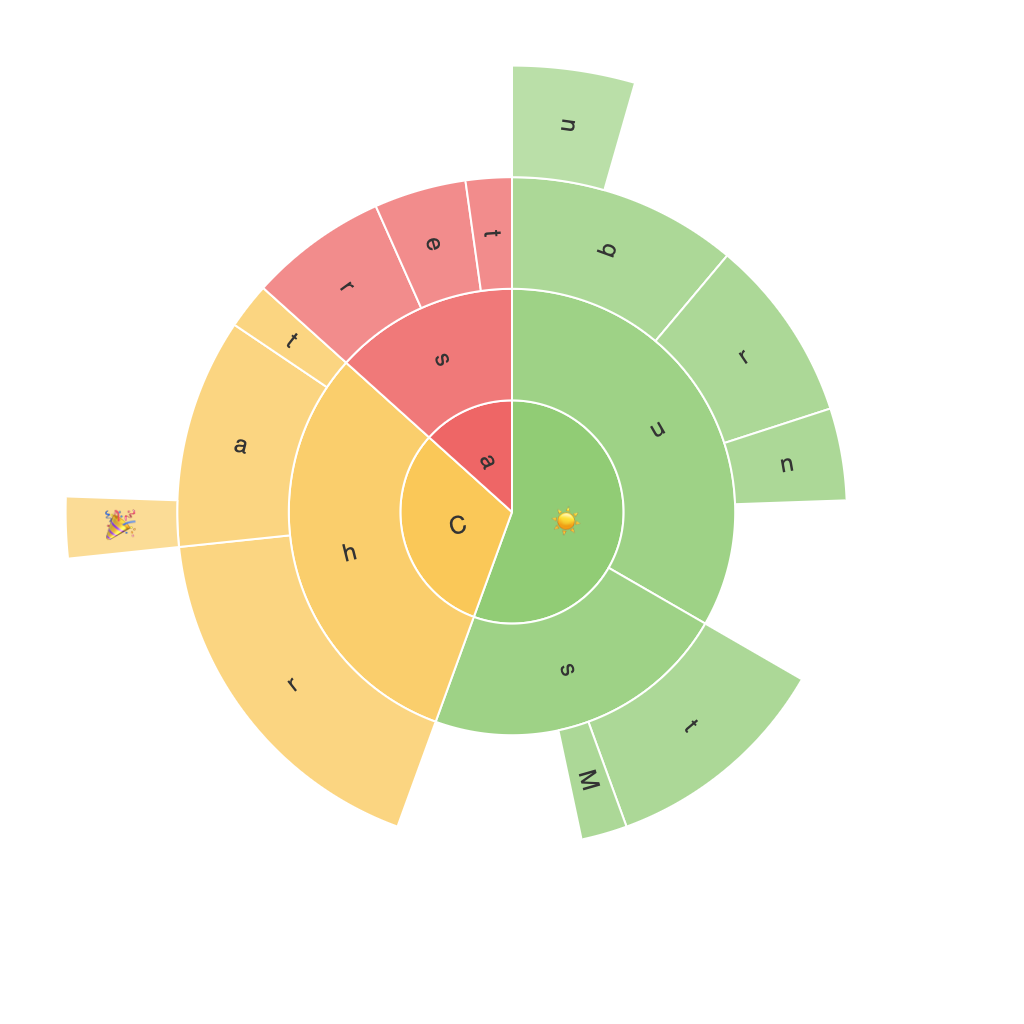
Unleashing the Power of Sunburst Charts: A Comprehensive Guide to Visualizing Hierarchical Data
Sunburst charts, also known as sun charts or sun charts, are a type of data visualization method that are especially suited for representing hierarchical data. In this article, we will explore the concept of Sunburst charts, their unique features, benefits, and applications, as well as provide a comprehensive guide on how to use them effectively.
**Understanding Sunburst Charts**
Sunburst charts, also known as radial treemaps, are circular charts that display hierarchical data. Each level in the hierarchy is visualized as a ring, with the innermost ring representing the top-level category, and subsequent layers representing the subcategories. This type of visualization allows for the representation of multiple dimensions within the data, which can be beneficial for comparative analysis.
**Components and Features of a Sunburst Chart**
A Sunburst chart typically consists of three main components:
1. **Root Node**: The outermost layer of the chart that contains the highest-level category.
2. **Branch/Sub-branches**: These represent the immediate subcategories under the root node, with a branch for each subcategory.
3. **Leaf Nodes (Slices)**: These are the smallest units of the chart and represent the final categories or individual data points.
The radius of each ring usually decreases as it moves inward, visually emphasizing the hierarchical structure of the data.
**Advantages of Sunburst Charts**
1. **Structure and Clarity**: Sunburst charts effectively show the hierarchical structure of data. This makes it easier for users to understand complex relationships between different categories.
2. **Comparative Analysis**: With a Sunburst chart, comparing the sizes and relationships among categories is more intuitive, making it simpler to identify trends and patterns.
3. **Interactive Enhancements**: Sunburst charts can be designed with interactive features, like drilling down to see more detailed data beneath a subcategory, or tooltips that provide additional information on hover.
**Applications of Sunburst Charts**
Sunburst charts are widely used in various fields, including finance, business, e-commerce, and data analytics. They are particularly useful where there is a need to represent sub-level relationships within data or to illustrate proportions in a clear and visually appealing way.
**Creating Sunburst Charts**
Creating a Sunburst chart can be done using various tools or software, notably Microsoft Excel, Tableau, Power BI, and Python libraries like Plotly or Matplotlib.
1. **Data Preparation**: First, organize your data into a hierarchical format with the root node, its subcategories, and the corresponding values for each level.
2. **Tool Selection**: Choose a tool or software that supports Sunburst charts and input your data according to the software’s requirements.
3. **Customization**: Once the data is successfully imported, you can customize the appearance of the chart. This can include adjusting colors to improve readability, adding labels, and enhancing interactivity through tooltips and drill-down features.
**Conclusion**
In conclusion, Sunburst charts, with their unique visualization style, offer a comprehensive and visually engaging method for displaying hierarchical data. They are powerful tools for businesses, researchers, and data scientists seeking to analyze and present complex information in a clear, accessible way. Their ability to enhance understanding, facilitate comparisons, and support interactive exploration make them undeniably valuable within the realm of data visualization.
