Unlocking the Power of Visualization: A Comprehensive Guide to Creating and Interpreting Sunburst Charts
In the ever-evolving world of data visualization, sunburst charts present an innovative approach to understanding complex hierarchical data. Whether you’re visualizing sector growth, organizational structures, or product sales, sunburst diagrams serve as a potent visual aid that enhances comprehension and analysis. This guide delves into the intricacies of creating and interpreting sunburst charts, highlighting its unique advantages in conveying hierarchical data.
### Understanding Sunburst Charts: Basics and Benefits
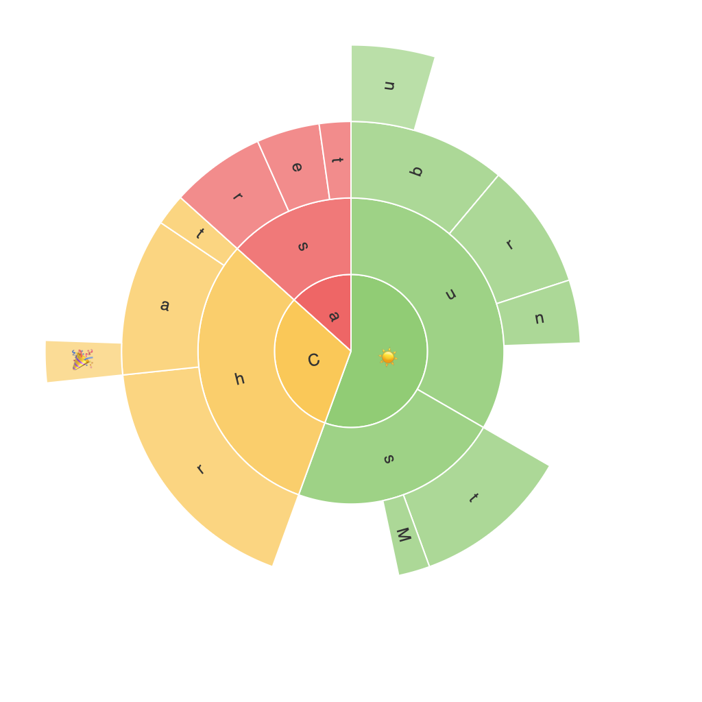
Sunburst charts, also known as radial treemaps, use concentric circles to represent different levels in a hierarchy. Each sector or ring of the chart visually represents a category or node, while the size and color typically depict the value or importance of the data. This method of visualization offers several key benefits:
– **Hierarchical Clarity**: Sunburst charts excel at illustrating the hierarchical relationships between categories or items, making it straightforward to discern how parts relate to the whole and each other.
– **Compact Visualization**: By organizing data into rings and segments, these charts offer a compact way of visualizing large datasets, saving space compared to traditional tabular formats.
– **Intuitive Insights**: The human eye is naturally drawn to patterns and proportions, making it easier to spot significant changes, trends, or outliers at a glance.
– **Effective Communication**: Sunburst charts can effectively communicate complex information, making it an invaluable tool for presentations and reports.
### How to Create a Sunburst Chart
Creating a sunburst chart involves a few essential steps:
1. **Gather and Prepare Data**: Start by collecting the data you wish to visualize. Ensure your data supports hierarchical relationships, such as categories falling under subcategories.
2. **Select Visualization Tool**: Choose a data visualization tool or software that supports sunburst charts. Popular options include Tableau, Microsoft Power BI, and general-purpose programming languages like Python with libraries such as Plotly and matplotlib.
3. **Define Hierarchical Structure**: Assign values and titles for the root, subcategories, and final segments based on your dataset’s hierarchy.
4. **Configure Settings**: In your chosen tool, import your data and designate what columns correspond to the root, levels, and values associated with each segment. Adjust the ‘colors’ for each sector to enhance readability and differentiation.
5. **Customize and Improve Visualization**: Fine-tune the appearance of the chart, including exploding specific segments for emphasis, adjusting the radius to fit the dataset’s scale, and incorporating tooltips to provide additional context on hover.
### Best Practices for Reading Sunburst Charts
To make the most of sunburst charts, remember these key tips when interpreting the data:
– **Focus on Radii**: Each concentric ring represents a deeper level of your data hierarchy. Pay attention to how each ring’s size and proportion change, as this can reveal depth and detail.
– **Utilize Colors Wisely**: Colors often denote categories or importance. Ensure there is sufficient contrast and consideration of color blindness when selecting your color palette.
– **Consider Data Density**: Sunburst charts can become cluttered with too many data points, making them difficult to interpret. Consider filtering or aggregating data to maintain clarity.
– **Explore Non-Salient Sectors**: Don’t overlook smaller sectors as they might carry significant information, especially in categories that are expected to have subcategories.
– **Use Tools for Interaction**: If possible, utilize interactive features of your charting tool to expand or collapse sectors, enhancing the user’s ability to delve deeper into specific areas of interest.
### Conclusion: Harnessing the Power of Sunburst Charts
By understanding the unique features and benefits of sunburst charts, you can unlock a powerful tool for visualizing hierarchical data. Whether used in business intelligence projects, academic presentations, or personal data analysis, sunburst charts offer a visually engaging and informative way to explore complex datasets. Implementing best practices for both creation and interpretation can significantly enhance the utility of these charts, making them an essential addition to your data visualization toolkit.
