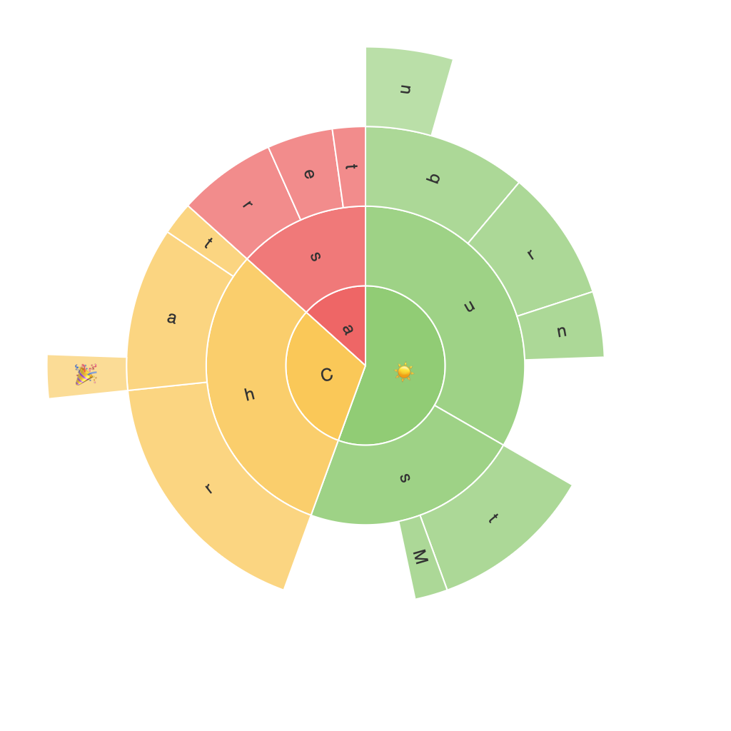
In the realm of data visualization, graphs and charts are the tools that guide our understanding of information. These graphical representations come in countless styles and formats, each with its own strengths and purposes. Among them, the sunburst chart has emerged as a unique and intriguing method for displaying hierarchical data, which offers a feast for the eyes while keeping its informational value intact.
Let’s dive into the world of the sunburst chart, where layers can illustrate the complex relationships and structure of data in a visually captivating manner.
### Definition and Structure
A sunburst chart is essentially a ring plot with concentric rings and connected arcs that represent hierarchical data. The central point, often the center of the sun, corresponds to the top level of the hierarchy. Moving outward, each arc represents a subcategory, and the segments within these arcs show the values or proportions of each subcategory to its parent category.
### Benefits for Data Interpretation
The visual brilliance of sunburst charts lies in their ability to facilitate the interpretation of hierarchical data. They simplify the identification of relationships between categories, such as parent-subsidiary connections, and the comparative values between subcategories. This hierarchical breakdown, spread across concentric layers and radiating segments, makes it easier for viewers to perceive the structure and proportions of data at a glance.
### Enhancing Data Insights
One of the key benefits of sunburst charts is the enhancement they provide to interpret complex hierarchical structures. The layout naturally prioritizes the most significant categories at the outer edges of the chart, allowing for a quick comparison of these categories’ relative importance. This visual emphasis helps in quickly identifying which branches of the hierarchy dominate the data set, fostering a deeper understanding of the underlying relationships and trends.
### Tips for Effective Use
To harness the full potential of sunburst charts, consider the following tips:
1. **Clarity:** Ensure that the chart is not overly cluttered. Limit the depth of the hierarchy and the number of categories to avoid confusion. If the data gets too complex, consider using a hierarchical treemap as an alternative.
2. **Color Usage:** Utilize colors to highlight various categories and to distinguish the inner and outer layers of the hierarchy. Consistent color schemes can aid in the recognition and grouping of related categories.
3. **Labeling:** Make sure to label the key components effectively. Directly labeling segments helps in making the chart more readable and comprehensible, especially for smaller, more specialized audiences.
4. **Interactivity:** For digital formats, interactivity like hover effects or clickable elements can enhance understanding by revealing detailed information about each category, making the chart more engaging and informative.
### Conclusion
In a world where data is abundant and complex, the sunburst chart offers a powerful and visually appealing solution for displaying hierarchical data. Its unique structure and the inherent clarity it provides can significantly enhance the interpretability of data, leading to more insightful and informed decision-making. Whether you’re a data analyst or a casual user of data visualizations, the sunburst chart is a tool worth exploring to enrich your data-driven insights.
