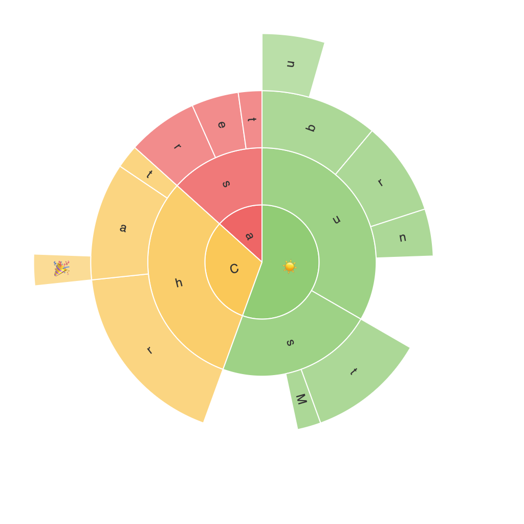
Exploring the Sunburst Chart: A Visual Journey through Complex Data with Clarity and Insight
The Sunburst chart, an unconventional yet informative data visualization tool, offers a compelling approach to analyzing and presenting complex data in a comprehensible and engaging manner. Often overlooked in the vast array of graphical representations, this chart type makes it possible to understand intricate relationships and hierarchies embedded within the datasets, thereby guiding us through detailed insights with stunning clarity.
### What is a Sunburst Chart?
Developed by Michael Bostock, the Sunburst chart is a visually appealing tree diagram that displays hierarchical data using concentric circles. Much like a pie chart with several levels, a Sunburst chart organizes the information by partitioning it into segments in each successive ring, making it versatile for datasets with multiple dimensions.
### Components of a Sunburst Chart
1. **Root Node**: The primary circle, representing the top-level hierarchy.
2. **Main Segments**: These represent broader categories.
3. **Secondary Segments**: Representing subcategories within the main segments.
4. **Tertiary Segments**: Continues the pattern, representing even finer subcategories, creating a multi-layered structure.
5. **Radii**: The space separating each level of data, allowing clear distinction between different categories and subcategories.
### Key Benefits of Sunburst Charts
– **Clear Hierarchical Structure**: Sunburst charts naturally illustrate the hierarchical relationship between data points, making it easy to understand the flow and connections between different parts of the dataset.
– **Visual Clarity**: By distributing the data across different segments in concentric rings, the layout allows comparisons between various proportions and sizes of data values.
– **Efficient Space Utilization**: Designed for both on-screen display and print, the sunburst chart is highly efficient in making the most out of available space, offering a detailed visual summary without overcrowding.
– **Color Coding and Legends**: The choice of colors for each sector provides an intuitive visual cue to distinguish categories, aiding quick comprehension. Legends can further aid users unfamiliar with the chart’s structure.
### Usage and Application
Sunburst charts are particularly beneficial in business analytics, where they can be used to analyze products at various stages of a production line or the structure of a company’s expenses. In marketing, they can illustrate customer navigation through an online product hierarchy or the composition of media channels in a marketing budget. They are also incredibly useful in data science for visualizing hierarchical cluster analysis or taxonomies.
### Limitations and Considerations
While Sunburst charts excel in illustrating hierarchical data, they can become overwhelming with too many levels or data points, potentially making it more difficult for the audience to discern patterns. Therefore, it is crucial to maintain the balance between information density and readability. Additionally, users may have to be educated about understanding such complex visual layouts, as they are not as universally familiar as more traditional charts like bar graphs or pie charts.
### Conclusion
In the realm of visual analytics, the Sunburst chart stands as a unique gateway to uncovering insights within complex data. By leveraging its hierarchical visualization capabilities, it offers a clear, engaging way to understand intricate datasets, making it a valuable addition to any data visualization toolkit. As data complexity continues to grow, the versatility and comprehensiveness of the Sunburst chart are likely to become even more essential, providing a visual journey through the intricacies of data with both clarity and insight.
