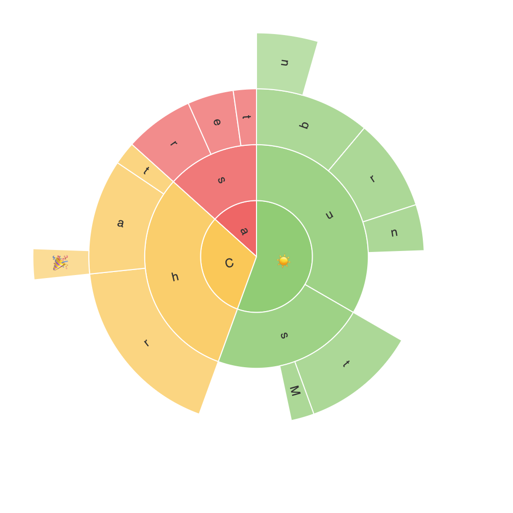
Unleashing the Power of Visualization: A Comprehensive Guide to Mastering Sunburst Charts
In the vast and diverse universe of data visualization, one tool that has witnessed an increasing popularity due to its ability to present hierarchical relationships in a visually appealing manner is the sunburst chart. Often used in business intelligence, analytics, and even social science research, mastering the art of crafting effective sunburst charts can provide numerous benefits. This guide aims to demystify the concept of sunburst charts, offering a comprehensive overview of their usage, design nuances, and best practices to help you unleash their full potential.
### Understanding Sunburst Charts
At the heart of a sunburst chart is its radial structure, emanating from a central point known as the root. Each ring or circle represents a level of hierarchy, with the segments or slices indicating branches and sub-branches. The size of a segment is proportional to the category it represents, while the angle of the segment reveals the value or weight of the data it embodies. This unique layout makes it particularly adept at visualizing multi-level data relationships.
### Key Features and Implementation
Sunburst charts are typically implemented using data visualization libraries such as D3.js, Plotly, or even simpler tools like Google Charts. Essential features that make these charts dynamic and versatile include:
– **Hierarchical Data Handling**: The ability to organize and display data with multiple levels of depth, making complex structures easier to comprehend.
– **Customizability**: Options for adjusting color schemes, tooltips, and other design elements to enhance user interaction and aesthetics.
– **Interactive Elements**: Features such as hover effects and click events that can trigger additional information or actions, increasing the depth of user engagement.
### Design Nuances: Crafting Effective Sunburst Charts
#### 1. Clarity and Simplicity
Start by ensuring that the hierarchy is clearly defined and easy to follow. Avoid clutter by limiting the number of levels or collapsing less significant categories.
#### 2. Color Usage
Select a color palette that reflects the importance or quantity of the data. Different colors can also help categorize data easily and highlight important subsets.
#### 3. Scalability
Design the chart to maintain readability even as the number of data points increases. This might involve using color keys, legends, or zoom features.
#### 4. User Interaction
Implement intuitive interactions like tooltips, click events, and responsive navigation, which not only make exploration easier but also enhance the user experience.
### Real-world Applications and Best Practices
##### Example: Product Analytics
In an e-commerce setting, a sunburst chart could be used to visualize sales data across different categories, subcategories, and products. By identifying which segments contribute most to total sales, businesses can make informed decisions about resource allocation and product development.
##### Example: Project Management
In project management, a sunburst chart could illustrate the allocation of resources (e.g., time, budget) across various tasks and their subtasks, providing a comprehensive view of project priorities and resource distribution.
### Conclusion
Mastering the art of sunburst charts involves understanding how to harness their inherent ability to represent hierarchical data accurately while engaging your audience effectively through design and interactivity. By following the guidelines outlined in this guide, you can create visual representations that not only showcase your data in the best light but also facilitate deeper insights and meaningful decision-making processes. Whether you’re creating visualizations for business intelligence, academic reports, or interactive dashboards, the power of visualization through sunburst charts should not be underestimated.
