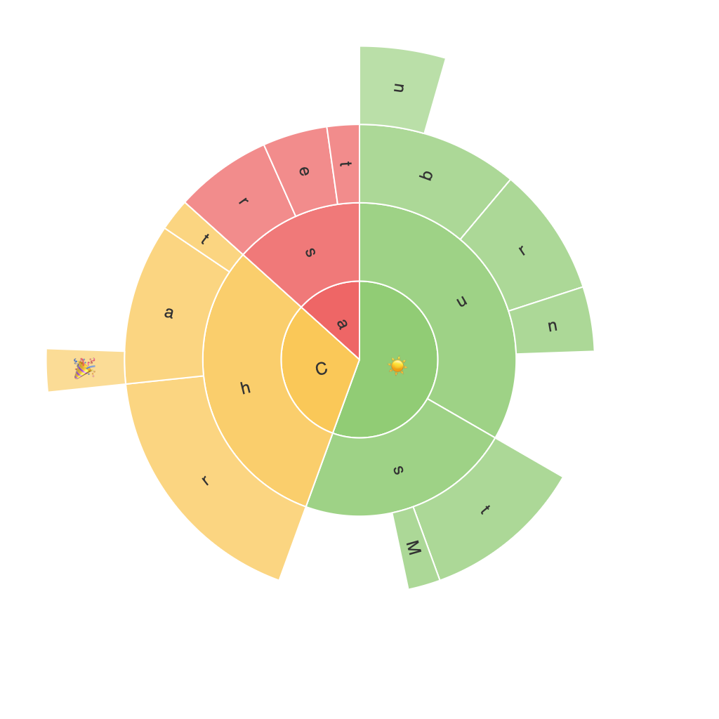
Unlocking Insights with Sunburst Chart: A Comprehensive Guide to Visualization and Data Analysis
Sunburst charts, also known as Multilevel Treemaps or Rose Charts, provide a unique and visually engaging way to represent hierarchical data. These charts are particularly advantageous for revealing patterns and insights in complex datasets that would be nearly impossible to discern through traditional tabular or bar chart visualizations. In this comprehensive guide, we’ll delve into the benefits of using sunburst charts, how to create one using a popular data visualization tool like Tableau or Python libraries such as Matplotlib, and the various techniques to maximize their effectiveness in data analysis.
### Benefits of Using Sunburst Charts
Sunburst charts excel in displaying hierarchical information, giving a clear visual representation of the relationships between parent and child categories with each level. Key advantages include:
1. **Hierarchical Insights**: They provide a clear visualization of the parts-to-whole relationship, with nested layers revealing data at different levels of granularity.
2. **Space Efficiency**: Unlike treemaps or doughnut charts, sunburst charts maximize the use of space by stacking multiple layers in a compact manner, making them ideal for visualizing larger datasets.
3. **Color and Size Encoding**: Each layer can be given its own color, while the size of the segments can represent values, or even the angle which can represent importance or frequency, offering an aesthetically rich and informative experience.
4. **Comparative Analysis**: Easy to compare categories between layers, which is particularly useful when analyzing data across different dimensions or periods.
### Creating a Sunburst Chart
#### Using Tableau
1. **Prepare Your Data**: Organize your data in a format where each level of hierarchy is represented in fields. The data should include at least three columns representing the hierarchy levels and the values or dimensions of interest.
2. **Connect Data**: Load your data into Tableau. Drag one field to the ‘Columns’ shelf and another to the ‘Rows’ shelf. This initial setup will allow Tableau to understand the structure of your hierarchy.
3. **Add the Sunburst**: Drag your third field to the ‘Color’ shelf of one of the measures in the view (typically, a sum or a count). Then, right-click on the chart type in the Marks card and select ‘Sunburst’.
4. **Customization**: Use Tableau’s customization tools to adjust colors, add labels, and modify the structure of the chart. This includes changing the angle, adding tooltips, and adjusting the zoom level for exploration.
#### Using Python with Matplotlib
“`python
import matplotlib.pyplot as plt
import pandas as pd
# Import your data
data = pd.read_csv(‘path_to_your_data.csv’)
# Prepare your data
hierarchy = [category.split(‘#’) for category in data[‘Category’]]
values = data[‘Value’]
# Flatten the hierarchy if necessary and reshape it to match the structure needed for Matplotlib’s sunburst
# (Implementation specific to dataset structure varies)
# Create the sunburst
plt.figure(figsize=(12, 24))
sunburst = plt.sphinx_sunburst_chart(labels=data[‘Category’].unique(),
sizes=values,
values=’Value’,
color=’category’)
plt.title(‘Example Sunburst Chart’)
plt.show()
“`
### Advanced Techniques and Customization
1. **Labeling**: Precisely place labels to prevent overlap and ensure they are easily readable. Utilize hover effects to provide on-demand information without cluttering the main visualization.
2. **Animation**: Introduce animation for interactions, such as when rolling over segments, to add a dynamic element and enhance user engagement.
3. **Adjusting Density**: Adjust colors, sizes, and angles to optimize the chart’s aesthetic appeal and readability, especially in dense charts with many layers.
4. **Dynamic Data**: Make the sunburst chart interactive, allowing users to drill down into specific segments or aggregate data across layers, facilitating detailed analysis and exploration.
In conclusion, sunburst charts are a powerful tool in the data scientist’s arsenal, particularly when dealing with hierarchical information or when aiming to present complex data in an engaging and accessible way. By understanding the principles of how to create and customize these charts, users can unlock deeper insights and foster a more intuitive understanding of their datasets.
