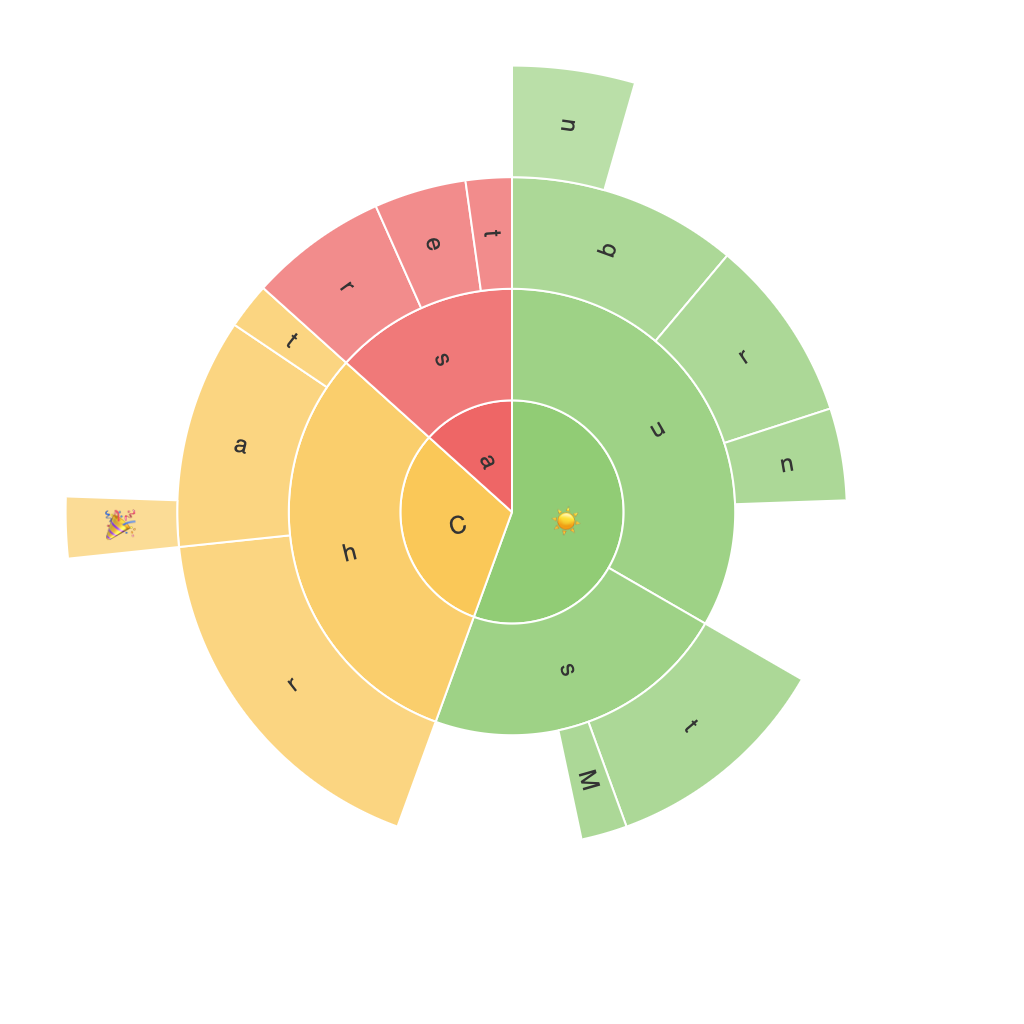
Exploring the Radiant Visuals: A Comprehensive Guide to Understanding and Creating Sunburst Charts
Sunburst charts, a visually enchanting type of hierarchical data visualization, have become popular in recent times. Primarily, they are used to represent multilevel categorization, offering a hierarchical view into complex data sets in an enjoyable and comprehensible format. This article dives into the essence of sunburst charts, exploring their creation, understanding their components, and uncovering techniques for utilizing them effectively in presenting data insights.
### Understanding Sunburst Charts: Components and Their Significance
#### **Degrees and Segments**
Sunburst charts have concentric rings, each representing a level of the hierarchy. The angular degrees and segments within these rings illustrate the relative contribution of each category to the whole, with angle proportions directly influencing the perception of magnitude.
#### **Colors**
Colors play a critical role in enhancing readability and making patterns easy to spot. They not only represent categorical types but also guide the viewer in distinguishing parts that might be close in angle but far apart in data importance.
#### **Labels**
Labels specify what each colored area represents, providing context to the segments. They are vital for information clarity and understanding the specific categories at each level of the hierarchy.
### **Creation of Sunburst Charts**
#### **Selecting a Software or Tool**
Creation tools and software abound, including Tableau, Microsoft Power BI, and data visualization libraries like Plotly and D3.js. Choosing the right tool depends on your project’s complexity and your familiarity with the software.
#### **Data Preparation**
Organize the data into hierarchical structure, ensuring the category tree aligns with the visualization layout. This might involve using software-specific functions for data transformation.
#### **Designing the Chart**
Customize the chart’s appearance, including colors, labels, and tooltips, to enhance readability and user interaction. Pay attention to maintaining a balance between visual appeal and clarity.
#### **Interactivity**
Increase the chart’s utility and engagement by implementing interactive features, such as drill-down options, clickable segments, or tooltips revealing further data details based on user interaction.
### **Effective Use Cases for Sunburst Charts**
Sunburst charts are versatile and find application in various domains such as:
– **Business Analytics**: Displaying company revenue distribution among product categories, sales channels, geographical regions, etc.
– **Marketing Analysis**: Revealing customer segmentation based on behaviors, preferences, and loyalty.
– **Web Analytics**: Analyzing user navigation patterns on websites or applications.
### **Tips for Best Practices**
1. **Keep it Simple**: Avoid overcrowding the chart with too many categories, which can lead to clutter and reduced readability.
2. **Use Consistent Color Schemes**: Color coding should be predictable to easily distinguish between types without overwhelming the viewer.
3. **Focus on Key Metrics**: Highlight the most significant segments to quickly convey the most critical data points.
4. **Accessibility Considerations**: Ensure color contrasts are sufficient for viewers with color vision deficiencies, incorporating text labels where necessary.
### **Conclusion**
Sunburst charts offer a visually engaging and informative approach to data presentation, ideal for revealing hierarchical structures and complex data relationships. With its customizable features, interactive capabilities, and applicable use cases across various industries, the sunburst chart remains a powerful tool in the data visualization arsenal. Understanding its components, best practices, and effective use scenarios can harness its true potential in making data-driven decisions more accessible and intuitive.
