Title: Unlocking Insights with Sunburst Charts: A Comprehensive Guide to Enhancing Data Visualization
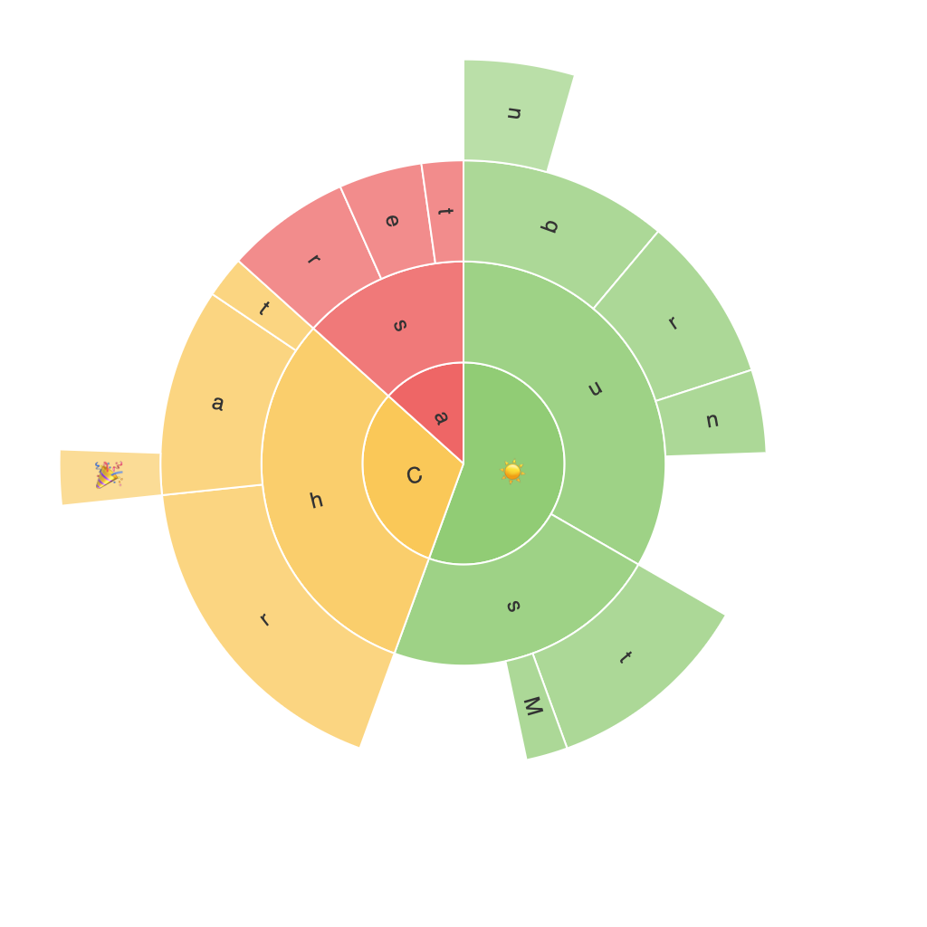
Sunburst charts, sometimes also known as radial treemaps, are an incredibly innovative and efficient method of data visualization that offer a unique way to understand complex data sets. They serve as an extension of the commonly known treemap method but feature a circular layout providing users with multi-dimension insights. The purpose of this article is to dive deeply into the world of sunburst charts, exploring the key concepts behind them, how they’re constructed, how to enhance their effectiveness, as well as the applications they have in various industries.
### Creating Sunburst Charts
Sunburst charts start with a central circle, which can represent the total value you’re visualizing. From the center, smaller circles (or ‘segments’) expand outward, each representing a proportion of the whole. These can further split into sectors (or ‘slices’) representing subcategories of the parent segment. The layers of circles and sectors can then continue outwards, allowing for the visualization of multiple hierarchical levels in the data.
### Key Features and Enhancements
#### Dynamic Data Presentation
One of the key features of sunburst charts is their ability to show hierarchical relationships in a compact form. This makes it easy to see the relationships between different elements within a dataset.
#### Hover Effects
Sunburst charts can be enhanced by adding hover effects that provide extra information, either through tooltips showing detailed breakdowns or through changing colors and text upon hovering over a segment.
#### Color Coding
Intelligent color coding can be used to highlight different categories or levels of the hierarchy, making the chart visually appealing and easy to understand. Different colors can also be used to encode additional information, such as performance metrics.
#### Interactivity
Through interactive components such as clickable segments or the ability to drill down into the data, user engagement can be significantly increased. This makes the process of exploring the data more engaging and efficient.
### Applications of Sunburst Charts
#### Business Intelligence
In business intelligence, sunburst charts can be used to show the breakdown of a key metric across multiple categories. For instance, company revenues might be split down by product lines, then by individual products or geographies, providing a clear view of where revenues are sourced from.
#### Website Analytics
In website analytics, sunburst charts can help in visualizing visits, sessions, or the most popular pages within sections of a website. This understanding can be crucial in improving website navigation and enhancing user experience.
#### Social Network Analysis
Sunburst charts are also useful for understanding the structure of social networks. Users can be represented at the center, with relationships and connections spreading outward, offering insights into community structures and influence patterns.
#### Geographic Data
For geographic data, sunburst charts can provide a comprehensive view of data distributed across different geographic regions, including sub-regions, aiding in regional market analysis or understanding territorial data distribution.
### Conclusion
Sunburst charts offer an incredibly rich way to explore and analyze complex data, providing insights that might be obscured in more traditional charts or graphs. Their ability to visually display hierarchical data at multiple levels makes them a powerful tool in the realm of data visualization. Whether in business, academia, or website analytics, utilizing sunburst charts opens the door to more nuanced and detailed data interpretations, enhancing decision-making processes across various industries.
By embracing the creation and enhancement of sunburst charts, one can unlock a world of insights, making the data more accessible and understandable. These visual aids, with their unique style and functionality, are a testament to the ongoing evolution of data visualization techniques, pushing boundaries and offering new perspectives on how we interpret and present data.
