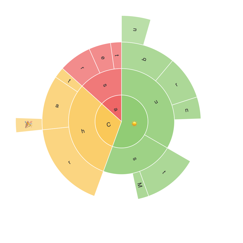
Untangling Complexity with Sunburst Charts: A Comprehensive Guide to Data Visualization and Interpretation
In today’s data-driven world, understanding and interpreting large and intricate datasets requires effective visualization tools. Sunburst charts emerge as a powerful, yet often underutilized, method for organizing and presenting hierarchical data. This comprehensive guide delves into the intricacies of sunburst charts, offering insights into their creation, understanding, and application.
### The Structure of Sunburst Charts
Sunburst charts, also known as环形图 in Chinese, represent hierarchical data as a series of concentric circles, where the arcs within each circle branch off and represent different levels of the hierarchy. Typically, the outermost circle represents the highest level of the hierarchy, while the inner circles represent subtending levels. Each segment’s size visually represents the relative importance of the category or value it represents.
### Key Components of Sunburst Charts
1. **Root/Central Circle (Innermost Circle)**: Displays the top-level categories.
2. **Mid-Level Circles**: Represents subcategories of the root categories.
3. **Leaf/Circular Segments**: Smallest segments represent the lowest level of detail in the hierarchy, often individual data points.
### Constructing a Sunburst Chart
**Step 1: Identifying the Hierarchical Structure**
Determine the highest level of the hierarchy and ensure your data set includes the requisite hierarchical arrangement. The root category must be defined clearly.
**Step 2: Designing Your Chart**
Use data visualization software (like Tableau, Power BI, or even specialized tools like旭日图王) to design your sunburst chart. Input your data, define the categories, and let the software automatically create the first hierarchical level of circles.
**Step 3: Customization**
Customize colors, labels, and interactive elements to enhance readability and engagement. Ensure that the chart includes labels clearly identifying each segment, especially for smaller, more detailed segments.
### Utilizing Sunburst Charts for Effective Interpretation
**1. Comparing Hierarchical Data**: Sunburst charts are particularly adept at showing how different levels of data are related within a hierarchy. For example, comparing revenue by department (outer circle) and division (mid-circles) can provide insights missed by traditional charts.
**2. Detecting Anomalies**: When looking at data distributions, unusual peaks or valleys in segment sizes can point to anomalies or trends worth investigating.
**3. Interactive Exploration**: Sunburst charts are ideal for interactive interfaces, allowing users to click on segments to drill down into more detailed information.
### Conclusion
In the realm of modern data analysis, sunburst charts offer a unique and insightful way to deconstruct and re-examine hierarchical data. By providing a visual, hierarchical representation, they enable users to untangle complex data sets, making it easier to understand, analyze, and draw meaningful insights. Whether you’re a data analyst, a business executive, or a casual data enthusiast, incorporating sunburst charts into your visualization toolkit can significantly enhance your ability to interpret data effectively and efficiently.
To get the most out of sunburst charts, remember to:
– Choose the right level of detail.
– Use contrasting colors for easy differentiation.
– Incorporate labels appropriately to maintain clarity.
– Keep the hierarchy simple to avoid clutter.
These charts are not just a pretty face; they’re a powerful tool for unlocking deeper insights within your data, helping you make data-driven decisions with confidence.
