**Unleashing Insights with a Sunburst Chart: The Visual Guide to Radial Hierarchical Data Analysis**
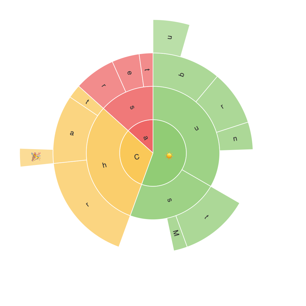
Sunburst charts, an innovative and visually intuitive graphical representation that has gained recognition within data visualization circles, offer a unique approach to understanding hierarchical data. These intricate charts, which resemble concentric circles with rays to illustrate different levels of categories, provide an elegant solution for those seeking to decode complex information structures. This article aims to serve as a comprehensive guide, demystifying the power and potential of sunburst charts in unveiling insightful trends, relationships, and patterns within diverse datasets.
### What are Sunburst Charts?
Sunburst charts, also known as ring charts, are a radial version of the treemap visualization. Each slice of the sunburst represents a category or subclassification, allowing users to easily compare and analyze the proportions of elements across various hierarchical levels. This type of chart is especially beneficial for datasets containing several layers of categories, making it a valuable tool in fields that demand a nuanced analysis of relationships and hierarchy.
### Key Features of Sunburst Charts
#### Hierarchical Structure Displayed Visually
Sunburst charts beautifully translate the complexity of hierarchical data into a visually comprehensible format. The layers of the chart reflect the nesting of categories, and rays extend from the center to different radii, each representing a hierarchical level. This visual arrangement helps users grasp the relationships and proportions between data elements at a glance.
#### Customizable Insights
Unlike traditional charts that might struggle to present multilevel data, sunburst charts offer a customized space for each level of data. This feature enables users to adjust the visibility and detail level of each segment, enhancing the exploration of data patterns and facilitating a deeper understanding.
#### Enhanced Comparison Opportunities
Sunburst charts simplify the process of comparing multiple categories by naturally grouping related data together in sectors or rays. This layout not only reduces cognitive load but also encourages a more intuitive comparison of data attributes, making it ideal for spotting trends and making informed decisions.
### Creating and Utilizing Sunburst Charts
#### Data Preparation
Before diving into creating a sunburst chart, it’s essential to ensure your data is appropriately structured. You should have a clear hierarchy defined with parent-child relationships among data elements. Tools like Excel, Tableau, and more advanced software such as R or Python offer customizable options to set up these hierarchical datasets.
#### Visualization Tools
A variety of software tools support the creation of sunburst charts, each offering unique advantages and customization options:
– **Tools like Tableau** offer interactive and real-time data visualization, allowing for dynamic exploration of your data and real-time adjustments to your chart design.
– **PowerBI and Microsoft Excel** provide user-friendly interfaces to easily create sunburst charts, incorporating various data types and allowing for embedding these charts within reports or dashboards.
– **Python libraries such as Plotly** offer high flexibility and customization, making it a preferred choice for developers seeking detailed control over chart design elements.
#### Analyzing and Enhancing Insights
Sunburst charts are not just a visual tool; they are designed to enhance your data analysis process. By utilizing software features like highlighting, filtering, and animation, you can reveal deeper insights that might not be apparent with conventional charting techniques. This capability is particularly valuable in exploratory data analysis, where the goal is to discover trends rather than confirm existing hypotheses.
### Conclusions
In conclusion, sunburst charts represent a significant advancement in the realm of hierarchical data visualization. Their ability to display complex information in an aesthetically pleasing, easily digestible format makes them a powerful tool in a data analyst’s arsenal. Whether you’re a seasoned data professional or just beginning to explore data visualization, the versatility and insight potential of sunburst charts offer endless opportunities for meaningful, impactful data analysis and communication.
