## Expanding Insight: The Comprehensive Guide to Sunburst Charts – Unveiling Hierarchical Data Through Vivid Visuals
### Introduction
In the vast landscape of data visualization, a tool shines brightly—Sunburst Charts. These charts have increasingly gained recognition in recent years, as designers look for more engaging ways to present hierarchical datasets. This article serves as a comprehensive guide to Sunburst Charts, revealing their intricacies and unique opportunities to illuminate complex datasets for deeper insights.
### Concept Behind Sunburst Charts
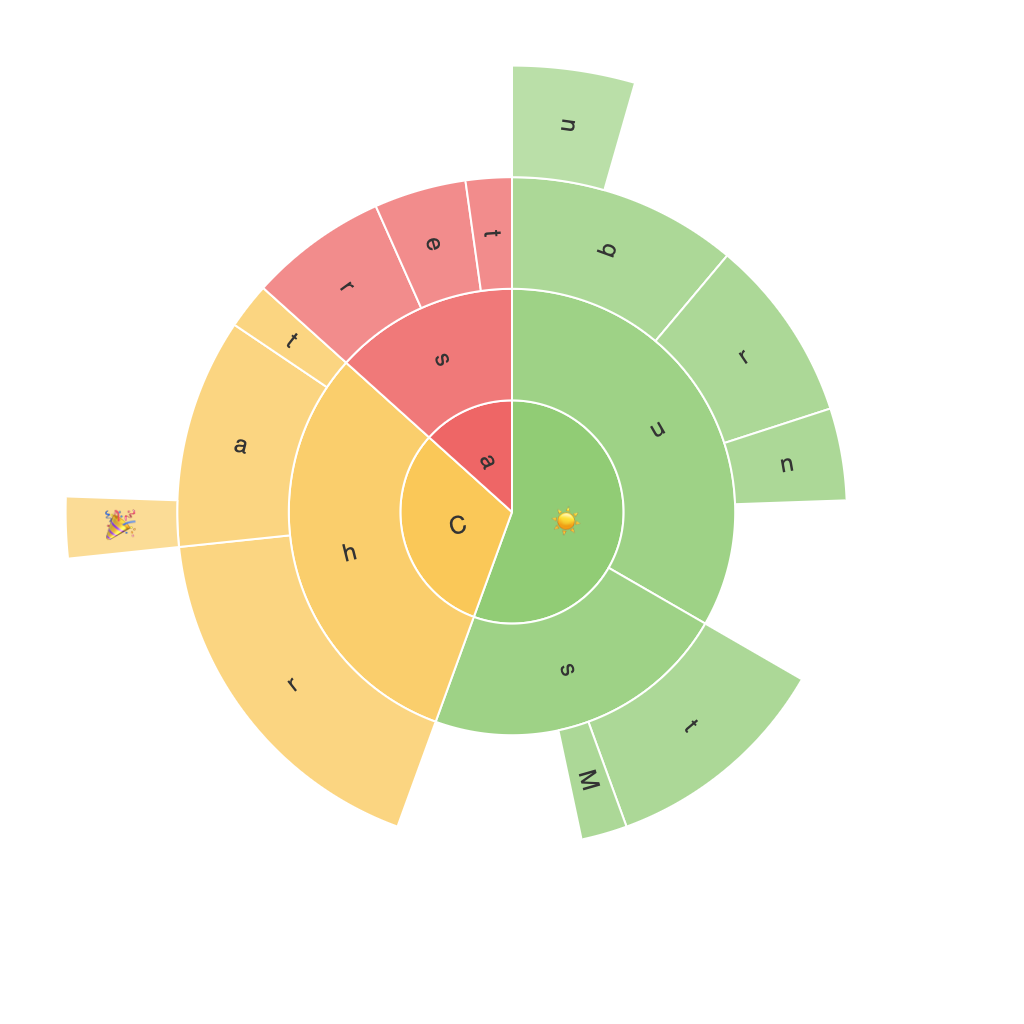
Sunburst Charts, also known as ring charts or multi-level pie charts, serve as a visual representation of a hierarchy, where the central point signifies the root node of the data, and the rings emanating outwards each represent deeper levels of subcategories. This structure enables viewers to see the interrelationships quickly, making it simpler to comprehend the composition of large datasets without overwhelming detail.
### Key Components:
#### Root Node:
Positioned at the center, this component represents the starting point of the hierarchy, essential to understanding the overall structure.
#### Slices:
These radiate from the root, showing primary categories. Each slice represents a segment of the hierarchy.
#### Segments:
Embedded concentrically within the rings, these denote subcategories, allowing for deeper exploration into the data’s granularity.
### Design Elements
1. **Colours**: Vibrant hues add distinctive character and aid in quick differentiation. Cohesive and contrasting palettes should be used to enhance readability.
2. **Layout**: Sunburst charts can be set in radial or linear layouts. Radial, seen as a series of petals, is common, whereas linear uses a zig-zag layout, enhancing visual progression through each level.
3. **Accessibility**: Ensuring readability is crucial. Using simple language labels, including tooltips, and keeping legend clear assists in making the chart accessible to all audiences.
### Application Scenarios
#### Business Intelligence:
Simplify complex sales data, customer segments, or marketing funnel breakdowns, making patterns and growth trends easily identifiable.
#### Human Resources:
Explore employee structure, diversity, or performance metrics, revealing insights on organizational composition and employee development.
#### Online Analytics:
Decipher website navigation or customer journeys through a hierarchical structure of pages or steps, offering clear pathways to enhancement.
### Creating a Sunburst Chart
1. **Data Preparation**: Collect hierarchical data, typically in a tree structure, ready to represent each level of the hierarchy accurately.
2. **Chart Design**: Utilize data visualization software or tools like Tableau, Power BI, or even libraries in programming languages like Python’s Matplotlib or Plotly, suitable for your development needs.
3. **Customization**: Experiment with colour schemes, layout, and interactive features to align with your unique visual communication goals.
4. **Iterative refining**: Feedback from initial presentations can guide adjustments for better clarity, user engagement, and information depth.
### Conclusion
Sunburst charts offer a unique way to visualize hierarchical data, providing a clearer visualization of complex datasets’ composition while enhancing user engagement. From business intelligence to human resources, online analytics, and beyond, this versatile tool is gaining popularity for its ability to distill intricate information into comprehensible visuals. The key lies in thoughtful design and effective data representation, making these charts an indispensable tool for insightful data communication.
