**Unlocking Insights with Sunburst Charts: A Comprehensive Guide to Visualization and Data Analysis**
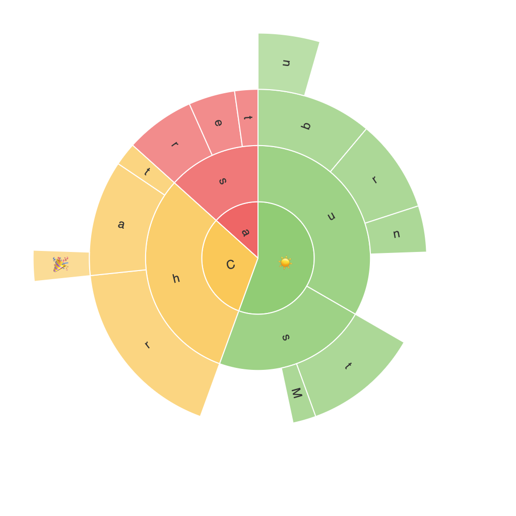
Sunburst charts are a powerful visualization tool, particularly useful for exploring hierarchical data in rich detail. These multi-dimensional radial layouts provide a unique way to visualize subsets of data at various levels, making them an invaluable asset for businesses, researchers, and analysts. In this guide, we delve into the intricacies of sunburst charts, outlining their potential, design principles, and practical applications across different industries.
### **Understanding Sunburst Charts**
At their core, sunburst charts are a layered version of a pie chart, designed to accommodate more complex data structures. The outermost ring represents the highest level of hierarchy, gradually splitting into segments within each subsequent ring to represent further levels of detail. This layout enables users to navigate from the broadest overview down to the most specific data points, facilitating a deeper understanding of the underlying relationships and patterns within the dataset.
### **Key Features and Benefits**
**Hierarchical Data Visualization**: Sunburst charts excel at displaying data with a hierarchical structure, making it easier to identify clusters, trends, and outliers within complex datasets.
**Interactive Navigation**: These charts often incorporate interactive elements, allowing users to zoom in or out, and click through different levels of the hierarchy. This interactivity is particularly advantageous when analyzing datasets with extensive depth.
**Enhanced Comparisons and Insights**: By visually comparing the sizes and colors of segments, viewers can quickly discern the relative importance of different categories, enhancing the discovery of meaningful insights and trends.
### **Design Considerations for Effective Sunburst Charts**
**Color Schemes**: Choosing a color palette that supports readability and highlights distinctions between different segments is crucial. Gradient colors or a sequential color spectrum can help in visually representing the hierarchy.
**Labeling and Text Placement**: To avoid clutter, judicious use of labels is essential. Typically, higher-level segments do not include labels, while lower-level nodes may, especially if they offer additional insights like specific data values.
**Interactive Design**: Implementing responsive design in interactive sunburst charts can enhance user experience. Features such as tooltips, pop-ups with detailed information, and smooth animation transitions between different levels can support intuitive exploration.
### **Practical Applications**
Sunburst charts find wide application in various fields:
**Healthcare** – Analyzing patient data, hospital resource allocation, or vaccine distribution patterns.
**E-commerce** – Understanding customer behavior, product categorization, or sales trends across various product groups.
**Political Science** – Investigating voting patterns, funding sources, or influence within political advocacy networks.
**Finance** – Exploring investment structures, risk allocation, corporate governance, or asset classification in institutional portfolios.
### **Creating a Sunburst Chart**
While there are various tools available for creating sunburst charts, such as D3.js, Tableau, or PowerBI, this process typically involves:
1. **Data Preparation**: Organize your data in a hierarchical format, typically utilizing nested JSON structures or CSV files that can be read by charting libraries.
2. **Tool Selection**: Choose a data visualization library that suits your needs, depending on the complexity of the data and the programming skills at hand.
3. **Chart Customization**: Customize your sunburst chart by selecting colors, adding labels, and adjusting interactive features according to best practices for data visualization.
4. **Implementation**: Implement the chart in your project, integrating it smoothly with other components and ensuring its responsiveness and performance.
### **Conclusion**
Sunburst charts are a potent tool in the arsenal of any data analyst or visualizer, promising to reveal complex hierarchical relationships and patterns with clarity and ease. With thoughtful design and application, these charts can significantly enrich decision-making processes across diverse industries, offering not just a visual representation but a powerful lens through which data insights can be explored and understood.
