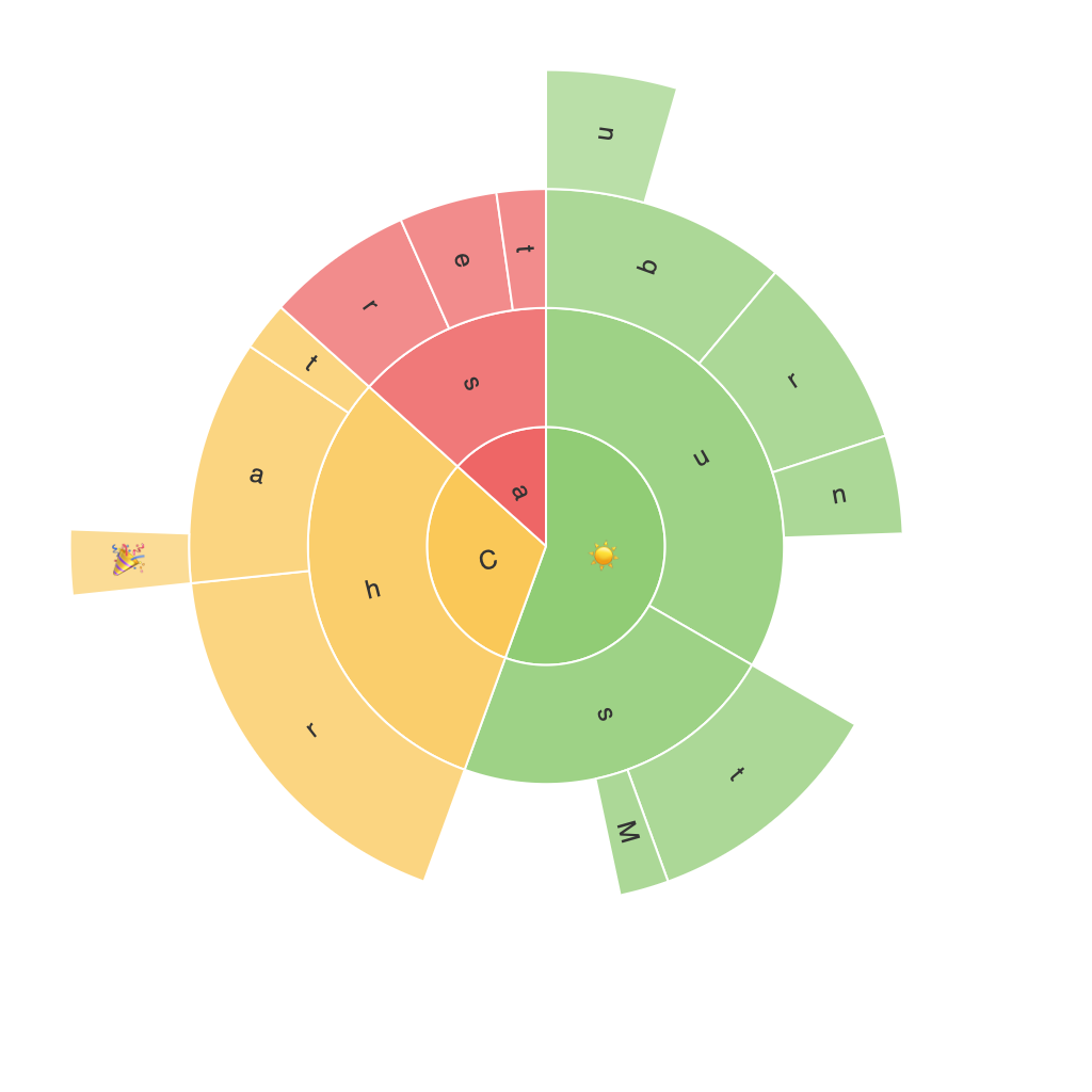
Exploring the Visual Potential of Sunburst Charts: A Comprehensive Guide to Data Visualization
Sunburst Charts – a relatively less explored variation derived from traditional hierarchical tree diagrams – provide a distinctive, visually appealing means of visualizing multiple layers of data and their relationships. This guide will not only delve into the intricacies of these fascinating diagrams but also present a comprehensive overview on how they can be effectively employed for data visualization purposes.
Introduction to Sunburst Charts
Before diving into the application aspects of sunburst charts, a fundamental understanding of their structure is essential. A sunburst chart resembles a sun, with a central circle being the root of the hierarchy, and gradually spreading rays representing the different levels of classification until the leaves (or segments) signify the distinct data categories at the base level.
Each circle’s radius is proportional to its dataset’s total value, while the angles of the segments are proportional to their share of the value. This visual layout makes it easier to comprehend hierarchical data structures than traditional trees or pie charts. Below, let’s delve into the steps of creating an effective sunburst chart:
Creating Effective Sunburst Charts
Choosing Appropriate Data
To create a sunburst diagram, you first need data that is hierarchical in nature, composed of several layers and categorized under each layer. Consider datasets where you want to display classifications such as product categories, demographic breakdowns, or hierarchical business units within an organization.
Data Preparation
It’s crucial that you organize your data appropriately before creation. Ensure that each level of the hierarchy is correctly mapped out and that the categories can be easily categorized and distributed across the chart’s segments.
Drawing the Chart
Once your data is ready, you can use visualization software or tools like Tableau, D3.js, Microsoft PowerBI, or others to create the sunburst chart. Specify the values that correspond to the innermost and outermost segments (if applicable), and let the software automatically distribute each data point’s proportional value across its corresponding segments.
Personalizing and Styling the Chart
Customize your sunburst chart by adjusting colors, fonts, and labels to ensure they’re visually appealing. Choose colors that provide clear segmentation of categories and, if possible, use different colors for different levels of the hierarchy. Ensure that the chart is readable and that labels are positioned in a way that doesn’t overcrowd the graphic.
Interactivity Features
While keeping simplicity as a primary consideration, ensure that interactive features are included. For instance, hovering over a segment could reveal additional information or dynamically expand to illustrate the underlying data further.
Analyzing Patterns
Once the chart is created, use its structure to analyze patterns and trends within the data. Examine how different levels of the hierarchy contribute to the overall dataset, and compare segment sizes to identify key players, areas of concentration, or potential points for development.
Conclusion
In conclusion, sunburst charts provide a compelling alternative to traditional data visualization methods, especially when dealing with complex hierarchical data sets. They foster a clear, visually engaging understanding of category relationships and value distribution. By following the steps outlined above and utilizing suitable visualization software, you can effectively create and implement sunburst charts that not only enhance the comprehension of your data but also serve as powerful tools for communication and presentation.
