Unlocking Insights with Sunburst Charts: A Comprehensive Guide to Data Visualization and Interpretation
When it comes to presenting data in a comprehensible and aesthetically pleasing format, data visualization plays a crucial role. Among various visualization tools, Sunburst charts have gained considerable popularity due to their scalability and efficiency in displaying hierarchical data. This article aims to provide insight into what Sunburst charts are, how they function, and their unique ability to facilitate in-depth data exploration and interpretation.
Understanding Sunburst Charts
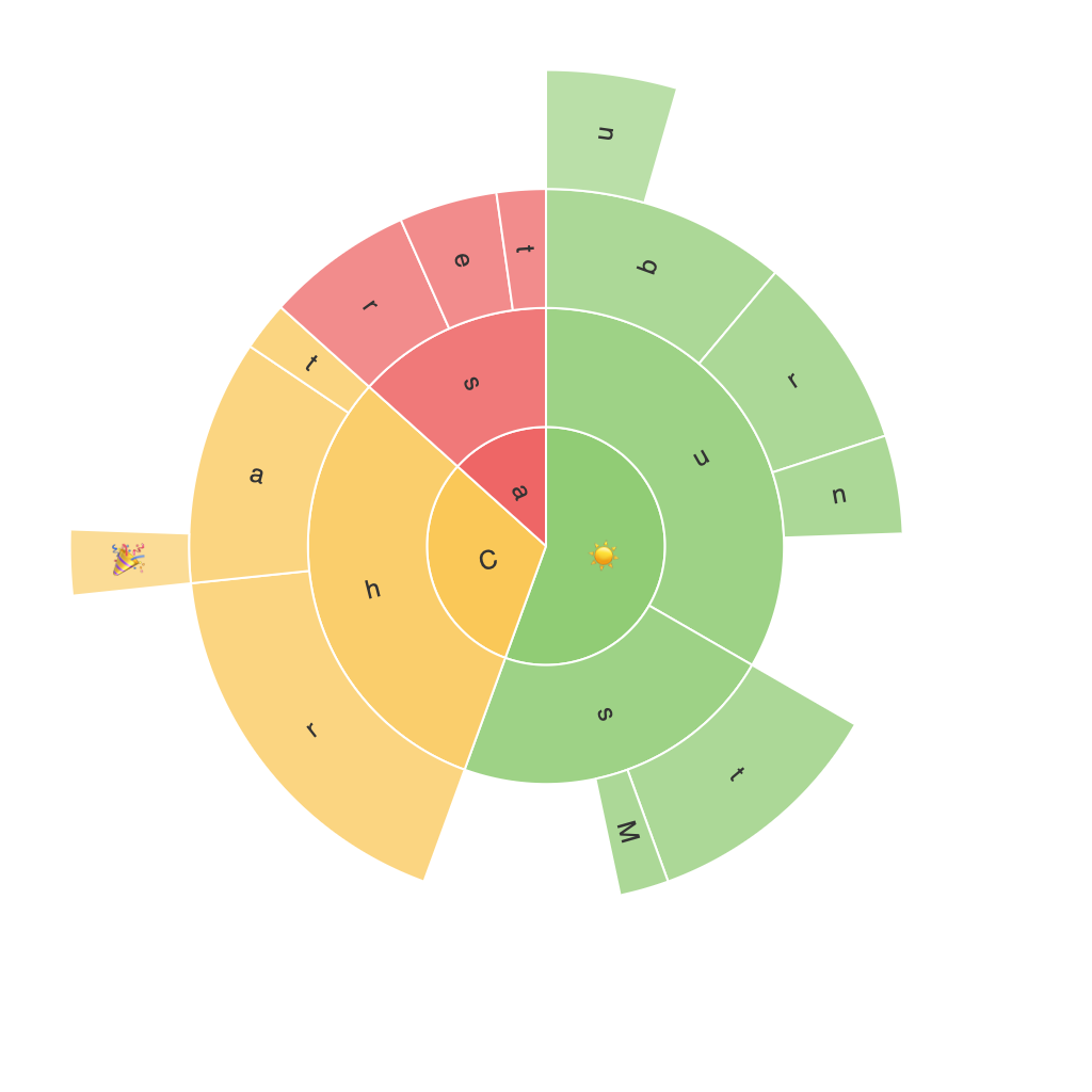
Sunburst charts are a variation of hierarchical treemaps, displaying multiple levels of data in a compact, concentric circle. Each ring within the circle represents a level of the hierarchy, aiding in identifying patterns, relationships, and proportions within large datasets.
Creating a Sunburst Chart
While there are several methods and platforms to create Sunburst charts, most data visualization software, including Power BI, Tableau, and Matplotlib (which supports Python programming), offer comprehensive tools for designing these interactive visualizations. The steps typically involve creating a hierarchical dataset, assigning values to the leaf nodes at the lowest level of the tree, and then formatting the rings and segments accordingly.
Key Features and Benefits of Sunburst Charts
– **Hierarchical Data Visualization**: Sunburst charts excel at displaying complex, multi-level data structures. By breaking down information into concentric rings and segments, these charts allow users to easily perceive relationships and dependencies among different data elements.
– **Space Efficiency**: In comparison with traditional tree diagrams or treemaps, Sunburst charts efficiently utilize space within their circular format. This makes them especially useful when dealing with datasets that have many levels and a large number of categories or subcategories.
– **Interactive Exploration**: Many visualization tools offer interactive features for Sunburst charts, enabling users to drill down into specific categories to gather more detailed insights. Hovering over a particular segment reveals the category values, and interactive features (like zoom and pan) enhance exploration of hierarchical data structures.
– **Color Coding and Aesthetics**: Customizable color palettes can be used to differentiate between categories or emphasize certain data points. This visual aspect aids in making the chart comprehensible for both data analysts and non-technical audiences.
Interpreting Data with Sunburst Charts
Interpreting data in a Sunburst chart primarily involves observing patterns, correlations, and proportions. The layout inherently presents the relative size of the segments, thus enabling quick assessment of each part’s significance within the larger context. However, it’s essential to pair this analysis with additional methods, such as drilling down through interactive features, to gain deeper insights into the relationships between data elements.
Common Challenges and Solutions
Despite their advantages, Sunburst charts can present challenges during data interpretation. The hierarchical nature of these charts can sometimes make it difficult to discern relationships between categories without adequate labels or interactive tools. To overcome this, ensure that your chart includes:
1. **Clear Labels**: Labeling both the ring and segment details is crucial for understanding the chart’s structure.
2. **Optimal Sizing**: Ensuring that segments don’t become too small to distinguish their values can improve readability.
3. **Interactive Enhancements**: Utilizing tooltips, zoom, and pan features to allow users to explore specific segments in detail.
4. **Color Consistency and Contrast**: Maintaining a logical theme in color coding helps distinguish categories more effectively, avoiding confusion and enhancing the visual appeal.
Final Thoughts
In conclusion, Sunburst charts offer a robust method for visualizing hierarchical data, providing a unique perspective for in-depth analysis and interpretation. By considering the distinctive characteristics, features, and potential challenges of these charts, you can harness their power effectively to make your data more accessible and communicable to both technical and non-technical audiences alike. As a tool for exploratory data analysis and complex dataset representation, Sunburst charts are expected to continue to evolve and gain significance in the field of data visualization.
