Title: Unlocking Insights with Sunburst Charts: A Comprehensive Guide to Visualization and Data Exploration
Sunburst charts, a type of hierarchical data visualization, have gained popularity in recent years due to their unique approach to displaying complex data. Originating from tree map charts, sunburst diagrams offer an alternative method to explore hierarchical data than traditional methods such as treemaps, trees, funnels, doughnuts, or pie charts. They are known for their aesthetic design, ability to show multiple levels of categories, and the ease in understanding the entire dataset at a glance.
In this guide, we will dive into the essence of sunburst charts, their advantages, and how to effectively use and create them for insightful data exploration.
### 1. What are Sunburst Charts?
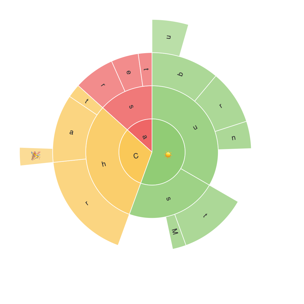
A sunburst chart is a circular graph that has concentric circles symbolizing different hierarchical levels. The innermost circle represents the top-level categories, and as the circles branch outwards, they illustrate the subcategories. Each arc in a circle represents a subcategory, and their lengths visually correlate with their contribution. This characteristic of ‘size in proportions’ makes it an incredible tool for observing hierarchical relationships and their impacts.
### 2. When to Use Sunburst Charts
Sunburst charts find their relevance in various occasions:
– **Understanding Hierarchical Data**: They are ideal for visualizing data with a clear structure such as categories, subcategories, and deeper divisions.
– **Comparative Analysis**: With sunburst charts, you can easily compare different dimensions of the data. The visual layout makes it straightforward to contrast sizes across levels.
– **Visualization of Relationships**: They excel at exposing how different elements are interconnected, particularly useful for demonstrating the distribution of contributions across multiple categories.
### 3. Advantages of Sunburst Charts
1. **Compactness**: Compared to stacked area or bar charts, sunburst charts take up less space, allowing for more content to be displayed in a confined space.
2. **Comprehensive Insight**: The chart provides a holistic view of the data hierarchy, making it easier to understand the relationship between categories and subcategories.
3. **Comparison Ability**: It facilitates quick comparisons of values within the same level and across different levels.
### 4. How to Create a Sunburst Chart
Creating a sunburst chart usually involves specific steps in data visualization software such as Tableau, PowerBI, or even Python libraries like Plotly or matplotlib. Here’s a basic guide using Plotly:
1. **Prepare Your Data**: Ensure your data is structured as a hierarchical dataset with categories, subcategories, and the corresponding values. You’ll typically have three columns: one for the top-level categories, a second for the subcategories, and the third for values.
2. **Mapping Data**: In Plotly or similar tools, map your columns to labels, values, and parents depending on the data source. The parent-child relationship is crucial for the chart’s hierarchical structure.
3. **Rendering the Chart**: Use the specified methods in your chosen visualization tool to create the sunburst chart. Customize the appearance (colors, sizes, labels) to enhance readability and aesthetics.
4. **Interactivity**: Add interactive features if possible, such as hover effects that show detailed information about arcs, or click actions that can reveal more detailed sub-charts beneath.
### 5. Best Practices
– **Limit Depth**: While sunburst charts can handle deep hierarchical data, including too many levels can make the chart difficult to read. Opt for displaying up to three levels for clarity.
– **Choose Appropriate Color Scheme**: Use a color scheme that contrasts well, helping to distinguish between different categories at a glance.
– **Label Wisely**: Keep labels minimalist yet informative. Avoid overcrowding with text, which can detract from data clarity.
### Conclusion
Sunburst charts are a powerful tool in the data visualization arsenal, offering a unique perspective on hierarchical data. Whether you’re dealing with corporate financial reports, product categorization in e-commerce, or any other scenario where hierarchical relationships are critical, a well-designed sunburst chart can lead to insightful observations and enhanced decision-making processes. By understanding the nuances of these charts and applying the right best practices, you can unlock valuable insights hidden in complex datasets, enabling stakeholders to make informed decisions with ease.
