Exploring the Visual Excellence: A Comprehensive Guide to Understanding and Implementing Sunburst Charts for Enhanced Data Interpretation
Throughout the vast landscape of data visualization, one chart type stands out for its unique ability to present complex data in a clear, intuitive manner. Sunburst charts, with their hierarchical structure and colorful visual representation, are particularly adept at illustrating hierarchical data relationships effectively. For those with a quest for deeper understanding or a fascination with enhancing their data interpretation skills, this guide offers a dive into the captivating world of sunburst charts, a journey from conceptual understanding to practical implementation.
### Understanding the Essence: What Are Sunburst Charts?
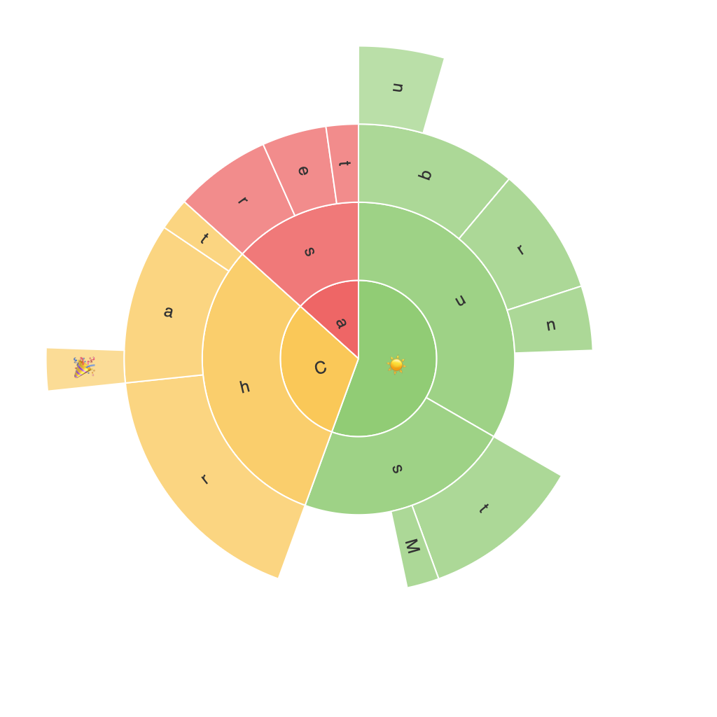
At the core of a sunburst chart, the concept centers around visualizing hierarchical data through concentric rings. Each ring represents a different level within the hierarchy, with arcs or segments showing the parts of each level. The chart’s radial layout, typically emanating from a central axis, not only provides a visually appealing display but also effectively represents the structure of the data in a way that is easy to comprehend. This makes sunburst charts particularly advantageous for analyzing multi-dimensional datasets, especially those with complex, nested categories.
### Key Elements of Sunburst Charts
#### – Central Axis: The central point of the chart serves as a starting point, representing the root node of the hierarchy.
#### – Rings: The rings surrounding the central axis represent the different levels of the hierarchy, each getting progressively wider outward as it moves toward the outer perimeter.
#### – Segments: The segments within each ring represent the nodes at a specific level in the hierarchy, with their size often proportional to a particular attribute (such as quantity, importance, or value), depending on the specific insights you wish to highlight.
#### – Hover Effects: Often, these charts include interactive features such as hover effects on segments, allowing users to gain detailed information about each node with a simple mouseover.
### Benefits of Utilizing Sunburst Charts
1. **Hierarchical Clarity**: Sunburst charts excel in visualizing hierarchical relationships clear and succinctly.
2. **Comparison and Focus**: The compact layout allows for comparisons and focuses on the hierarchical structure without overcrowding the visual space.
3. **Space Efficiency**: These charts are particularly space-efficient, fitting complex data into a limited area without sacrificing information density.
4. **Interactive Insights**: Interactive features like hover effects can significantly enhance user engagement and comprehension, allowing for deeper insights into specific data segments.
### Practical Implementation
To leverage the power of sunburst charts in your data visualization projects, consider the following steps:
1. **Data Preparation**: Ensure your data is structured in a hierarchical format, ideally as a tree or nested object structure, where each level has parent-child relationships.
2. **Tool Selection**: Choose a data visualization tool or software that supports sunburst charts. Popular options include Tableau, Microsoft Power BI, or even libraries such as D3.js for web-based applications.
3. **Data Organization**: Map your data to the chart by associating the hierarchical structure of your dataset to the chart’s rings and segments. Typically, the highest level of your hierarchy starts at the innermost ring, expanding outward to the most specific segments.
4. **Aesthetic Customization**: Utilize color schemes and customization options to enhance readability and enhance the chart’s overall visual appeal. Colors should be chosen to effectively differentiate between segments and highlight key data points.
5. **Interactive Features**: Implement interactive elements, such as tooltips and hover effects, to provide users with additional information about the data segments, enhancing the chart’s usability and user engagement.
### Conclusion
Sunburst charts offer a powerful tool for data visualization, ideal for organizations aiming to interpret complex hierarchical data effectively. By equipping yourself with a comprehensive understanding of how to construct, customize, and leverage these charts, you can significantly enhance your ability to communicate nuanced data elements visually, engaging your audience in deeper insights with clarity and elegance. As with any visual tool, the key lies in tailoring these charts to your specific data and presentation needs, ensuring not only their technical implementation but also their strategic integration in a broader information presentation strategy.
